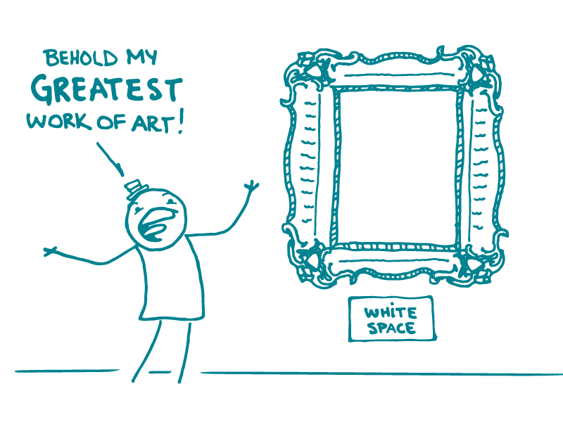
In Episode 1 of our space series, we discussed the importance of using space to improve readability by “chunking” text. Now, in Episode 2, we’re discussing the wonders of including white space in the visual design of your content.
Let’s start with a non-writing example. Think of your closet before and after you clean it. Before, it’s a jumbled, anxiety-provoking mess. After, you can easily find what you need, without getting distracted by things like jeans you haven’t worn since high school.
Content works the same way. If it’s crowded and cluttered, your readers may be turned off. If it’s clean and orderly, your readers are more likely to see it as clear and understandable.
Of course, white space doesn’t always need to be white. The phrase “white space” refers to the background and in-between areas — the space without text or images. To increase white space, add extra space (or padding) around images, call-out boxes, and sections of text.
Adding white space can go a long way toward making your health communication materials more appealing. But don’t just take our word for it, dear readers! Ask yourself: Which of these examples* would you be more likely to pick up and read?
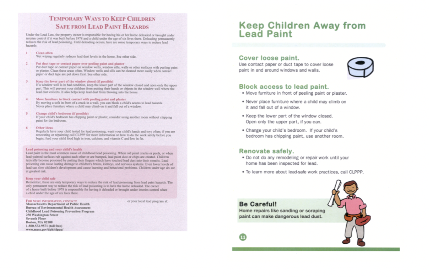
*Courtesy of the Massachusetts Department of Public Health
The bottom line: Make your content more appealing and easier to read by adding white space.
Tweet about it: Why add white space to your next #HealthLit material? It’ll be more attractive and easier to read. http://bit.ly/2GVq2hP via @CommunicateHlth
Browse recent posts