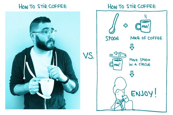
Have you ever had trouble choosing between using photos or illustrations for your health materials? It’s not always black and white (ha!). Here’s a nifty trick to help you decide: think about your main objective. Is it most important to make a personal connection with your readers? Or are you trying to convey something more like an abstract idea or process?
If you answer, “I want to make a personal connection with my readers,” you’re probably better off using a photo. Photos evoke emotions. If the woman on the diabetes website looks like she could be your grandmother, good. That’s the idea. Photos help people feel like they’re in familiar, friendly territory — which can help readers connect with your message.
If you answer, “I want to convey an abstract idea or process,” simple illustrations or icons may work best. At We ❤ Health Literacy Headquarters, we’re often tasked with creating visuals for concepts (like user-centered design) or multi-step actions (like how to safely wipe up lead dust). These concepts can be difficult to convey with photos.
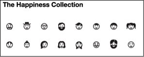
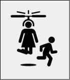
Worried about cost? We know that creating original illustrations and icons can be pricey. The Noun Project is one of our go-to resources for a wide variety of free or low-cost icons and symbols. Whether you need an icon for happiness or a helicopter parent, there’s an option for you.
The bottom line: Visuals are really important. Use an illustration to convey an abstract idea or process. Use a photo to evoke emotion.
Browse recent posts