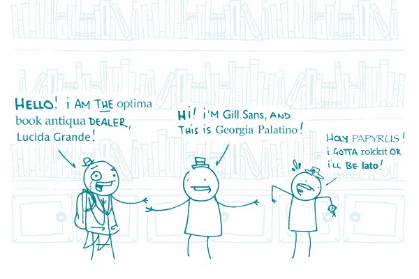
Just a mention of the font Comic Sans makes the designers at We ❤ Health Literacy Headquarters shudder. Some might call this font snobbery, but we prefer to think of it as a necessary part of being a dedicated plain language advocate. That’s because fonts are key to making content easy to read (or not).
Users are more likely to skip over content that looks overwhelming or hard to read — even if it’s written using simple words. Think of it like this: Choosing a font for your content is like choosing an actor to star in a play. The actor needs to look the part.
While there are now thousands of fonts to choose from — thanks to services like Adobe Typekit, Cloud.typography, and Google Fonts — this doesn’t necessarily mean that all available fonts are user friendly.
To improve readability:
- Look for sans serif fonts. They tend to be cleaner and simpler (even though the great debate about the readability of serif vs. sans serif fonts is inconclusive). We like Verdana, Open Sans, and Proxima Nova.
- Make the font large enough to read. For print, use at least a 12-point font — larger if you’re writing for older or low-vision populations. For the web, select 16 pixels or larger.
Lastly, make your font stand out! Show it off by including plenty of white space in the margins and between paragraphs.
The bottom line: For easy-to-read health content, use sans serif fonts and make them at least 12 point or 16 pixels.
Browse recent posts