This week, dear readers, we’re tackling a topic that often comes up in our work: gender and design. Of course, designs don’t actually have genders, but gender is a powerful concept in our culture — and we tend to interpret various design elements as masculine or feminine.
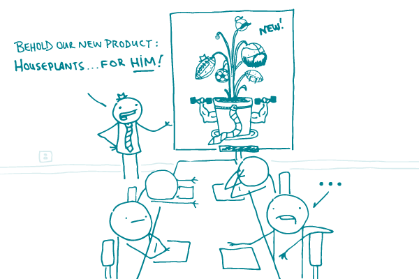
Marketers are especially fond of gender-specific product designs (remember Bic for Her pens?) because targeting a specific group of people can make them more likely to relate to a product. But gendered design has a dark side: it can reinforce stereotypes and even make women pay extra for their “womanly” products.
How does this apply to health communication? As you know, dear readers, it’s important to consider your audience and test your material if you can. But in general, it’s best to steer clear of very gendered design elements — even if you’re designing for a mostly single-gender audience.
Let’s say you’re designing a website for an OB/GYN practice. Before you decide to go with pink and flowers, think: do all women really like those things? Might they feel like you’re pandering to them? How would a transgender patient react to that design?
This isn’t to say that all design needs to be entirely gender neutral. For example, designers trying to evoke a feminine feel might consider using more curvy lines than straight ones — and someone looking for a very masculine feel might choose a bold color palette over a light one. The key is to focus on subtle cues that don’t rely on clichés or stereotypes.
The bottom line: When it comes to gendered design elements in health communication, less is usually more.
Browse recent posts