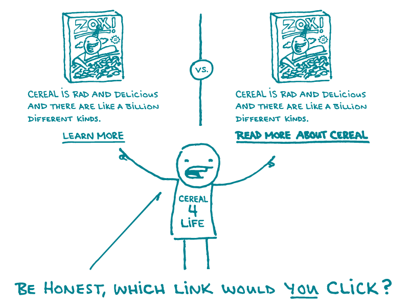
Today, dear readers, we’re talking about links in web content. Links make it easy for people to find more information about a topic of interest — and they can really impact how users navigate your website.
Here are our tips for creating effective links for your awesome plain language health content.
Make links easy to identify. Underlined blue text is the most obvious visual cue for a link. It’s okay to choose a different link design, but make sure it’s distinct from non-linked text — and use a single link design across your site. Don’t forget to choose a different color for visited links — that way, users can easily tell if they’ve already clicked a certain link.
Write helpful link text. The best link text gives users information about where the link will take them. That’s why we’ll ❤ you forever if you banish generic phrases like “click here” from your webcabulary — they tell users nothing about where a link goes.
Helpful link text is especially critical for users who are visually impaired and use screen readers to listen to a list of all linked phrases on a page. Can you imagine how (not) helpful such a list would be if every link said “click here” or “learn more”?
Pro tip: the best link text is both descriptive and actionable. What makes the user experience clearer than link text like, “Read more about diabetes”?
Use links strategically — and beware of link burnout. There’s no magic number for how many links are appropriate on a webpage, but be strategic and keep your users in mind. Try not to have so many links that the content starts to look wonky or difficult to follow.
Also, be mindful of how soon you send users to another page — while they’re reading the introduction of your content probably isn’t the best time for that.
Remember your friends on mobile (which is everyone). It’s always worth taking a look at how content will appear on mobile devices — this gives you a chance to make sure links appear in a way that lets mobile users navigate easily.
The bottom line: How you set up links in your web content really matters.
Tweet about it: Why “click here” just doesn’t click with users — and more #HealthLit tips for creating effective links: bit.ly/2K5zP77 via @CommunicateHlth
Browse recent posts