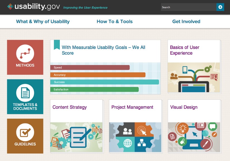
This week, we wanted to share one of our favorite online resources: usability.gov. Usability.gov is the federal government’s leading resource for free user experience (UX) resources, including guidelines, tips, and tools to help you make content easier to use.
So, why are we talking about usability in We ❤ Health Literacy? Because health literacy isn’t just about words — it’s also about how you organize and present those words. Health information needs to be presented in ways that make it easy to find, read, and use — so readers will want to interact with it.
Check out usability.gov (which was recently redesigned), and you’ll see that the site practices what it preaches. Look for:
- Big headers that clearly organize content
- Plenty of white space that makes text easy to read
- Adjustable font size on every page
- Simple navigation with icons that guide users through the site
Today, people get health information in lots of different ways: from smartphones, tablets, computers, and more. Each of these sources presents its own usability challenges. That’s why we’re glad usability.gov is here to help.
Trust us — you’ll never use a yellow font again. Ever.
The bottom line: How you present health content is just as important as the content itself. Get tips at usability.gov.
Browse recent posts