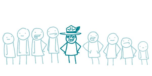
As longtime We ❤︎ Health Literacy readers know, all content is not created equal. Some words, phrases, or ideas are usually more important than others. So how can you draw attention to your high-priority content?
Designers have all kinds of fancy tricks up their (super-fashionable) sleeves. But today we’d like to focus on bolding, a simple visual cue that you can use to emphasize any content — no designer needed.
Bold text is easy to read, and it really stands out on a page. Done right, it can help people find and understand your key ideas and messages — especially readers who are skimming or scanning.
We use bold text for most of our emphasizing needs, including:
- Highlighting the topic of a bullet or paragraph, so readers who skim can quickly see what the section is about
- Calling attention to a particular word, especially if we’re teaching a key word they might see again
- Underscoring key takeaways — 1 or 2 sentences max!
Why do we like bold best? Because it’s head and shoulders above the alternatives:
- ALL CAPS can be hard to read — AND IT LOOKS LIKE YELLING! No thank you.
- Underlining also isn’t great for readability. And, in our digital world, users can easily mistake it for a hyperlink. Next, please.
- Italics can be hard to read for users with lower literacy levels, so we mostly avoid them in plain language materials. For savvier audiences (like you, dear readers), we use ’em sometimes — mostly to stress a single word or to indicate a book title or foreign phrase.
Remember, when you’re bolding, a little goes a long way. It can be tempting to just bold everything — but trust us, it’s not a good look. If everything is emphasized, nothing stands out. And patchy bolding is especially confusing — readers often don’t know where to look, and they can end up feeling googly eyed, woozy, and disoriented.
The bottom line: Bold text draws your readers’ eyes to key messages and ideas. Use it wisely!
Browse recent posts