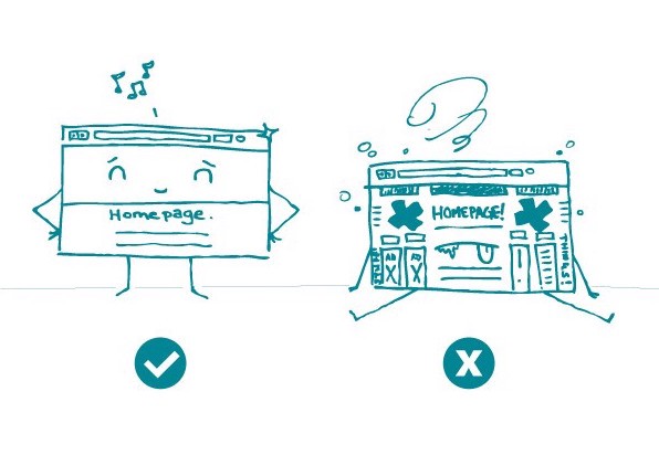
It’s a fact: more and more people are seeking health information online. This means that websites need to be — and look — easy to use. And nowhere on your site is this more important than the homepage.
You can’t judge a book by its cover, but you can judge a website by its homepage.
The homepage is often your audience’s introduction to both your brand and your content. So it needs to make a good first impression, and fast. Research shows that users decide within just 10 seconds of landing on a webpage whether to stay there or go elsewhere.
How can you make your homepage compelling and user friendly? Here are some tips:
- Keep it clean. Brief text and a simple color palette help you create a clutter-free page. In other words, white space is your friend.
- Make your purpose clear. Use text and graphics to clearly state the purpose of your website right there on the homepage.
- Provide a simple navigation. This will enable users to quickly scan and understand the different sections of your website.
- Implement responsive design. Chances are users will access your website from all kinds of devices. Make sure people can easily view it on a computer, phone, tablet, plane, train, or automobile.
But don’t just take our word for it. Test your homepage with your audience and see what they think.
The bottom line: When designing your website’s homepage, keep it simple. This will set the tone for your brand and content.
Tweet about it: Less is more! Find out why @CommunicateHlth recommends keeping #HealthLit homepages clean and simple: https://bit.ly/2MQ3MgV
Browse recent posts