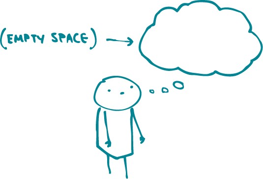
In Episode 3 of our space series, we want you to think about empty space. And no, this isn’t philosophy class or your latest meditation — it’s an important part of communicating health information. When you’re developing health content, think about the space it will occupy ahead of time.
It’s like furniture shopping — you need to know the size of your apartment before you purchase that oversized La-Z-Boy sofa set.
For example, if you’re creating a website, make the navigation labels descriptive but short. Your users want to know what’s in each section of the site — but if they’re viewing it on mobile (as many people do), you don’t want lengthy menu items taking up a lot of space.
On the other hand, if you’re writing a tri-fold brochure, we’re very sorry. Kidding! Make sure your content will fit in each panel with comfortable margins and a readable font — and room to fold the paper.
If you have too much content for your chosen medium, you have 2 choices: cut back your content or pick a new way to present it. Maybe that content you want in an app really belongs on a full website.
As we’ve discussed before, dear readers, white space is incredibly important for health content. So make sure that you’re thinking about space from the beginning.
The bottom line: Design starts with content. Think about how your text will work in its space.
Tweet about it: Think about white space as you write your content. https://bit.ly/2Marlwl via @CommunicateHlth #HealthLit
Browse recent posts