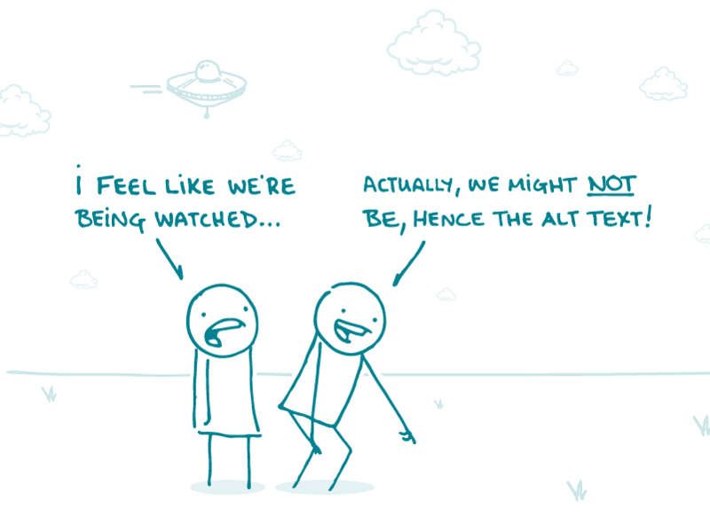
In a break from our regularly scheduled programming, we’re here this week to explain a recent change to our emails. You may have noticed that the alt text for our newsletter image now appears underneath said image at the top of each email, and we thought you might be curious about this change. (Worry not if you need a reminder about what alt text is — we got you.)
After all, one could argue that the new way looks a bit clunky — and we agree that it’s not the ideal alt text scenario. But here’s the thing: on Medium, the site we now use to host We ❤ Health Literacy, it’s the only option. Medium doesn’t offer the standard feature where alt text shows up when you hover over the image.
We don’t know why that is — and we’ve reached out to Medium to plug the importance of alt text capability. We sure hope they’ll add the alt text feature soon, but for now, we have to choose between making our content accessible to all users and living with a slight cosmetic inconvenience.
As you can imagine, dear readers, that’s a no-brainer for us.
The bottom line: Why has alt text started appearing at the top of our emails? Because accessibility, of course.
Tweet about it: Why you’re seeing alt text at the top of @CommnicateHlth’s #HealthLit newsletter: bit.ly/2J62d8k #a11y
Browse recent posts