In this installment of our occasional series of posts about how to build your own website, we’re talking about the almighty “look and feel.”
What’s that, you ask? Well, the “look” of a site refers to its visual design aspects — like the color palette, font choice, and image style. The “feel” refers to interactivity and functionality, like how buttons work, as well as the overall vibe of the site.
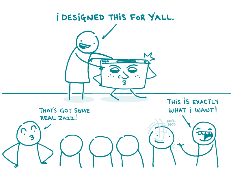
As you know, dear readers, first impressions matter — and that goes for websites, too. How your site looks and functions can cause users to stay and explore . . . or to leave right away. So when you’re planning the look and feel of your site, keep these tips in mind:
- Think about your audience. Who will be visiting this site? If the site’s for kids, think about bright colors and fun animation to keep youngsters engaged. But if you’re building a website for teenagers, consider using a more sophisticated color palette with photographs or realistic illustrations. In other words, give ’em what they want.
- Make it quick. You know what users really ❤? A site with a fast load time (the time it takes a browser to open a webpage). Things like image files and widgets increase load time — so sometimes, it’s best to keep it simple. And don’t forget to factor in the type of device your visitors are likely to be using.
- Be consistent. Stick with the same font choice and icon style throughout — and keep the navigation consistent, too. If you’ve decided that external links should open in a new browser tab, make sure that’s true across the board.
- Design for plain language. Remember, visual design is an important part of effective plain language materials. Use simple, familiar typography — and don’t be afraid of some white space.
Finally, remember it’s a process — and there’s always room for improvement. Consider doing usability testing before and after launch to make sure your website looks and works the way users expect it to.
The bottom line: To keep your website users coming back, take time to develop a look and feel that meets their expectations.
Browse recent posts