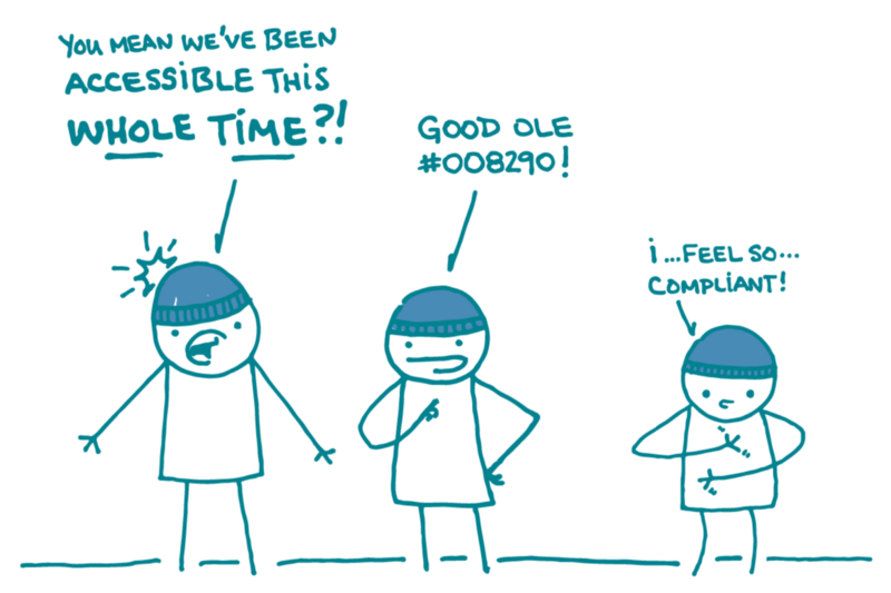
Here at We ❤︎ Health Literacy Headquarters, we always have accessibility in mind — but on this day each year we think about it with a little extra love. That’s because it’s Blue Beanie Day, a worldwide celebration of the importance of web design that makes content accessible to and usable for people with a diverse range of needs. (Hooray!)
As you may know, dear readers, we’ve shared accessibility tips before — on topics like alt text and labeling, designing for keyboard navigation, and accessibility plug-ins. This week, we’d like to draw your attention (get it?) to color contrast.
Color contrast is the difference in color between elements on a page. Things with low contrast (for example, dark blue text on a black background) can be hard to see. Using text with high contrast (like black text on a white background) makes your content easier for everyone to read — and it’s especially important for people with low vision.
So, how much contrast is enough? We recommend using Section 508 guidelines. Check out these tools to make sure your site passes high-contrast muster:
- Not sure if your color contrast is kosher? Try out this nifty Firefox plug-in.
- Working from an existing palette? Use this color palette builder to find 508-compliant color pairs.
- Got a base color? Use COLOR SAFE to find high-contrast matches.
- Starting from scratch? Check out these color-safe combinations.
The bottom line: On Blue Beanie Day (and every day!), a quick color check goes a long way toward making health information as accessible as it can be.
Browse recent posts