As you know, dear readers, people use data to make important decisions about their health every day. But the information we get from data analysis is often complex and hard to understand — especially if it’s talking about numbers.
Enter data visualization! Put simply, data visualization means using images (like graphs, charts, and other visual elements) to help people understand data. There are many things that contribute to an effective data visualization, including how the information is organized and what the visualization is called. Today, we’re focusing on color.
One way to use color is to build on the associations people have with certain hues. This map of fall foliage predictions uses green for “no change” and red for “peak.” These choices match our intuitive understanding of what the labels mean, which makes the visualization effective and easy to grasp.
To show trends or a range of numbers, try using color gradients. The map below shows how many gun laws exist in each state, with lighter shades indicating lower numbers and darker shades indicating higher numbers.
If you’re going with a gradient, keep in mind that color contrast can be an accessibility issue. To increase accessibility, add keyboard focus and mouse hover states with text descriptions. You can also incorporate texture or pattern differences (in addition to color changes) to make the distinctions extra apparent!
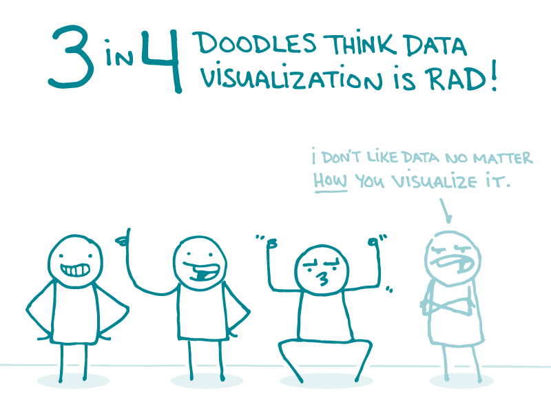
You can also use a lack of color help visualize data. For example — in the image below showing the proportion of people who use technology to track their health, notice how the one colorful person stands out.
To summarize, keep these tips in mind when visualizing data:
- Choose colors that make sense for the data you’re presenting
- Use color gradients to show trends or a range of numbers — and add pattern or texture differences to increase accessibility
- Add keyboard focus and mouse hover states with text descriptions to support understanding
- Contrast bold colors with neutral colors to emphasize information
The bottom line: Colors are your allies for helping people understand data visualizations.
Tweet about it: Data can be complicated, but colors can help! @CommunicateHlth talks about data visualization for #HealthLit: https://bit.ly/2zWlxCK
Browse recent posts