Ever had that moment when you’re talking about a product with a designer and you feel like you’re speaking a different language? Well, that may be because you sort of are! But never fear — we’re here to help you find your way out of design lingo (or limbo).
We ❤ working with designers to create beautiful health literate products here at We ❤ Health Literacy Headquarters. Recently, we talked about how to give designers helpful feedback. Today, we’re digging into some design-related terms that you’re likely to run into if you work with designers on the reg.
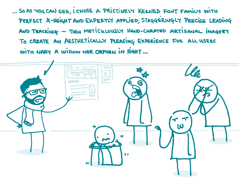
There’s a lot of design jargon out there, so we’ll start by breaking down a few of the most common terms related to typography.
- Font families are collections of related fonts within a single typeface that have a variety of styles and weights. For example, Cooper Hewitt is the name of a typeface, and its font family includes Cooper Hewitt Thin, Light, Book (sometimes Roman or Regular), Medium, Semibold, Bold, Heavy, and Italic. And keep in mind that these days, the term “font” refers to the actual file that contains the typeface, not necessarily the typeface itself — interesting, right?
- Leading (say “ledding,” not “leeding”) is the space between lines of text. You may also hear people refer to it as “line height.” When leading is tight, your content gets hard to read because it looks cramped. But content with too much line spacing can be problematic, too, because readers may get lost. So try to strike a good balance. Standard leading is 120% of the text size, but it’s okay to go beyond that if you think your content needs a bit more room to breathe.
- Tracking refers to word spacing, and kerning refers to the space between individual letters. You may hear these terms when a design team is working on something like a logo because they’ll want lots of control over the typeface. Adjusting spacing can drastically change the overall appearance of the text and really help sell the aesthetic of a piece. That said, any typeface worth its salt will have the tracking and kerning adjusted to complement its aesthetic, so it’s generally A-OK to use the typeface in its natural state.
- Widows and orphans (no, not those widows and orphans) are single words that end up as the only text at the beginning or end of a column or page. Designers try to avoid these stragglers since they leave too much white space and can interfere with reading flow between pages. Luckily, they’re pretty easy to get rid of by realigning the page margins or making very minor content tweaks.
There you have it, dear readers! Understanding these terms can help you collaborate with your design team and create super awesome health communication products.
The bottom line: Wrapping your head around some typography-related design jargon can prove quite useful when collaborating with designers.
Browse recent posts