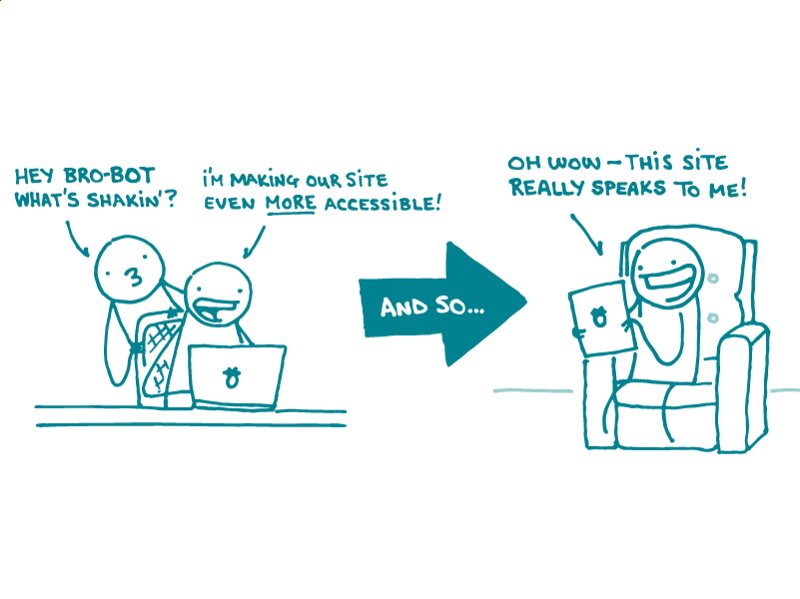
As you may have noticed, we’re all about accessibility here at We ❤ Health Literacy Headquarters. But that’s not only because designing for people with disabilities is the right thing to do — it can also make health materials better for everyone. Win-win!
We’ve shared general web accessibility tips before. But one area that often gets overlooked when it comes to accessibility is designing for people with learning differences like dyslexia.
Up to 1 in 5 people worldwide have dyslexia, which causes problems with reading. That’s a lot of people who could potentially miss out on your content!
Try these tips to make your website more accessible for people with dyslexia:
- Watch your fonts. Large sans serif fonts like Arial, Century Gothic, and Tahoma work best. Or try OpenDyslexic, a font designed specifically for people with dyslexia. (Some people with dyslexia find a much-maligned little font called Comic Sans easy to read — but let’s not go there.)
- Consider color contrast. We’re all for high contrast as a general rule, but black text on a white background can be difficult to read for people with dyslexia. Dark gray text on an off-white or light gray background is a solid compromise.
- Let users customize your site. Provide a few options so users can select the font, text size, text color, and background color that work best for them.
- Say it with visuals. Reinforce written content with icons, photos, and videos. That’s a good idea anyway, but it can really help people with dyslexia work around troublesome text.
- Make search easier. Incorporate suggested search terms so users don’t have to remember or spell a specific term perfectly to find what they’re looking for.
- Keep it short and sweet. Nobody will thank you for huge walls of tiny text — least of all users with dyslexia. So stick to 55-ish characters per line and aim for short sentences.
The bottom line: A few simple design changes can make your website more accessible for users with dyslexia.
Tweet about it: Want to make your website accessible for users with dyslexia? Try these tips from @CommunicateHlth: https://bit.ly/2pDZkap
Browse recent posts