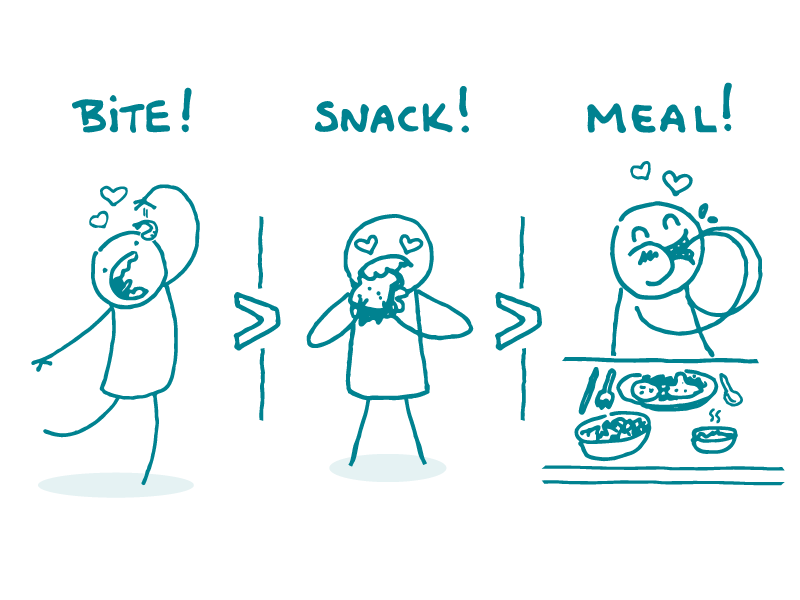
Here at We ❤ Health Literacy Headquarters, we spend a lot of time doing a combination of writing web content and thinking about user needs. As part of this, we always want to make sure we’re not forcing readers to consume more information than they want — but we also don’t want to leave them hungry for more. We want to offer the “just right” amount of information (you know, Goldilocks and porridge and whatnot).
But how do you give many different people a “just right” amount of information? The answer comes from an article by Leslie O’Flahavan called The Bite, the Snack, and the Meal. Sadly, this is not an excuse for midday munchies in the name of health literacy. But it is a great way to think about breaking down content into differently sized “servings” to meet users’ needs.
The article’s author says that, just like guests who come to a dinner party with a variety of appetites, readers are likely interested in different amounts of information on a webpage. The solution? Offer various “serving sizes” of content! Here’s how it works.
- Put the key message in the header. Instead of “HPV Vaccine Guidelines for Parents,” try something like “Get Your Child the HPV Vaccine.” This first nugget of information is the bite. A user who only wants the most important information from a page won’t need to look past the header! Brilliant.
- Put your main message up front. Including a brief summary at the beginning of the page gives readers an introduction to the topic and skips details that some users don’t want. This is perfect for people who want more than a bite but not the whole meal — they want a snack.
- Include detailed content and links to more resources. Some users want the details — all of ’em. Keep these folks in mind when you’re drafting the full webpage. You can even include links to pages with more details or about related topics. And yep, dear readers, this is the meal.
You can also use “bite, snack, meal” to think through content strategy — how related health communication products interact with each other.
For example, let’s say you’re developing an interactive infographic. The infographic, which is relatively easy to digest, is a great snack. You might also create social media posts with key stats from the infographic to serve as bites. And it’s always good to include a link to a webpage that has additional information — that makes the meal.
The bottom line: Keep “bite, snack, meal” in mind to make sure everyone gets what they want out of your health materials — no more, no less.
Browse recent posts