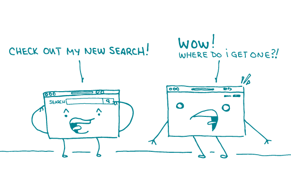
Sometimes, in internet-land, users go to a website with the express goal of just poking around — you know, e-wandering until they find something they’re interested in (or until they don’t and move on). But when it comes to health content, people are usually looking for something specific — like information about a recent diagnosis.
And that, dear readers, is when a well-designed search function can make all the difference.
So, when you’re building a website (or improving an existing site), how can you make sure the search function will improve the user experience? Here are a few best practices that can help.
- Make the search bar prominent. Putting it at the top right of the page is still best, since that’s where users expect to find it. But the days of teeny-tiny search bars hidden in the corner are over. Make sure the search bar is big enough to spot easily — and keep it free of visual clutter.
- Help people out. We ❤︎ autocomplete! Set up the search function to provide spelling suggestions or display common search terms once a user starts typing. This can be especially useful for health content, since some of those medical terms can be hard to remember — and tricky to spell.
- Keep it relevant. A search bar is only helpful if the search results are relevant. This is where “best bets” come in. Best bets allow you to pair specific search terms with key resources. In other words, they let you set which resources display first in the search results.
- Test, test, and test some more! No one knows what your site needs better than your target audience. Getting feedback on your search function is key to understanding which features are the most (and least) desirable to your users.
The bottom line: An effective search function can go a long way toward making your health website easy to use.
Browse recent posts