Let’s say you’re entering information to set up your personal online health tracker. You’re cruising along checking boxes, when suddenly: “Hover over the options below for mouseover prompts to help make your selections. Then continue by navigating to My Health Goals.”
Come again?
Unfortunately, there are a lot of confusing instructions out there in internet-land. In fact, this has prompted one of our readers to ask our advice on how to give useful instructions on the web.
First things first: Ask yourself if you need to give instructions at all. We often assume we need to tell people what to do online. But with the field of user experience gaining traction among web designers, that may not be the case. If your website or app is intuitive and user-friendly, no need to complicate things — just let it speak for itself.
If you do need to give instructions, our (unsurprising) number 1 rule is to keep it simple — the fewer steps, the better. Here are some specific tips:
Include direct links that send users where they need to go. Offer descriptive action links in instructions whenever you can. Skip non-specific conventions like “click here.” For example:
Check the box next to the type of insurance you have. Then <link>answer some quick questions about your health<link>.
Use simple words. Terms like “browser,” “cursor,” “navigate,” and “mouseover” may be easy to understand for computer-savvy folks, but not so much for others. Ditch the jargon — swap “navigate” for “go to” and “cursor” for “mouse.” And if you have to use a word that your audience may not know, explain it in plain language. For example:
Open up your browser to begin the search. A browser is a program on your computer that you use to search the internet. Common browsers include Chrome, Internet Explorer, Firefox, and Safari.
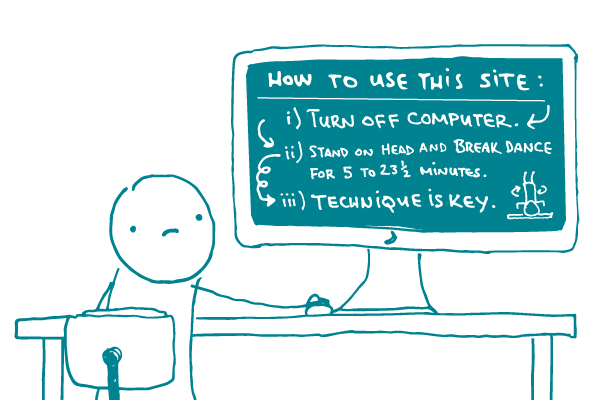
Use pictures. Cliché but true: A picture’s worth a thousand words. Including a screenshot with circles or arrows showing users the step they need to take will help them out a lot more than than wordy explanations. Just check out this example:
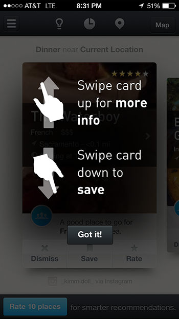
Helpful, right?
The bottom line: Check to make sure you need to give instructions for using your website or app at all. If you do, keep it simple.
Browse recent posts