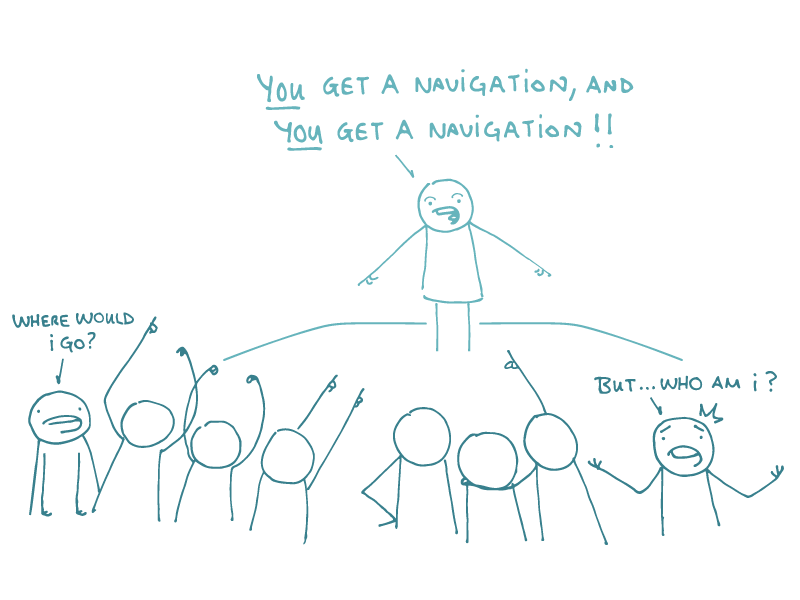
Here at We ❤️︎ Health Literacy Headquarters, one question we get over and over again is: Should my site use topic-based or audience-based navigation?
Let’s back up for a minute and review the basics. Topic-based navigation is when a site is organized into sections based on different topics or user tasks — like HIV.gov. Audience-based navigation, perhaps unsurprisingly, uses sections that are geared toward different audiences — like KidsHealth.org.
The idea behind audience-based navigation is that people will save time by going straight to content designed for them — and they won’t get bogged down in features they don’t find relevant or useful. Great idea, right?
Actually, most of the time it’s not. In practice, audience-based navigation presents a number of problems:
- It forces people to label themselves. This can be a problem for folks who could be part of more than one audience — or who don’t fit into any of the options you give them.
- It’s often downright confusing. People may not be sure whether the information in a section is about the specified audience or for it. Case in point: If you’re a patient looking for a new primary care doctor, why wouldn’t you choose a section labeled “Doctors”?
- It can make people worry that the information they’re seeing is incomplete — and that can mess with your credibility. People may wonder if another section of the site has information theirs doesn’t (think: what do doctors get to know that patients don’t?!). This might cause folks to try switching between sections and end up lost.
- It’s more work to maintain. If you have content that applies to more than one audience, you’ll need to duplicate it in multiple sections — or create a page that you link to from multiple places. Either way, more work for you!
At the end of the day, audience-based navigation just doesn’t represent how people think. Folks typically come to health websites to complete a specific task or learn about a health topic, and that’s what’s on their minds — not which audience they belong to.
So is audience-based navigation completely off limits? Not exactly, dear readers. An audience-based nav might make sense if your audience groups — and the content designed for them — are truly and totally different. (Think of the students, parents, and faculty sections on a university website.)
The bottom line: Skip audience-based navigation — almost all of the time.
Browse recent posts