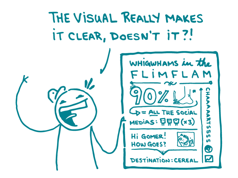
A while back, we talked about the dangers of crummy stock photos. This week, we’re tackling a different variety of dangerous visual: bad illustrations.
It’s no wonder that health communicators love illustrations. Lots of people learn better when information is presented visually, and a good illustration can make your point more elegantly and directly than text alone.
But illustrations can also go so, so wrong. Whether the offender is a cartoon, chart, graph, or infographic, a bad illustration can really muck up your health materials.
[Disclaimer: We’ve probably all created a bad illustration at some point in our careers. People in glass houses, etcetera. But in the name of health literacy, let’s pick on a few.]

We’re pretty sure the message here is: a California Raisin invites yellow peanut M&Ms on a wild ride through your innards. And what do you, the host of this internal-organ slip n’ slide for snack foods, get in return? Hairy, swollen, purple feet — and kidneys where your lungs should be.

The takeaway here? True love means sacrificing your eyes and blasting polka dots from your lungs into your partner’s gaping face hole.
But not all bad illustrations are confusing (or disgusting). Many of them just don’t need to exist. They may look fine at first glance, but then…

When all you’ve got is 2 numbers showing a boring 10 percent difference, spice things up by adding a meaningless x-axis, unnecessary lines, and 4 different colors. Voila! It’s argyle.
Heed these warnings, dear readers. People look to illustrations to help them understand what you’re talking about. So don’t make them waste their time trying to understand nonsense.
The bottom line: Don’t toss in illustrations or infographics just because. Use them carefully — and make sure they communicate your message clearly.
Browse recent posts