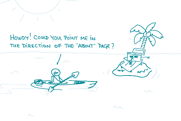
So, you’ve chosen the platform you’re going to use to build your own website, you’ve written some content, and you’re ready to put it all together. How can you help people navigate around your oh-so-engaging and informative webpages?
Never fear, dear readers! We’ve got some tried-and-true tips for you.
First, think about where your content will go and how you’ll organize it. Pro tip: card sorting is a great way to do this.
Next, pay attention to how a URL will look before adding content to a new page. Most website platforms let you control how the link appears. Instead of a gibberish-y collection of numbers and characters, it’s better to have “pretty permalinks” that contain actual words from the title of a webpage. URLs like these are easier to find and share.
It’s also important to design your website so users will know where they are on every page. This is especially helpful when users land somewhere on your site through a search engine (instead of starting on the homepage). You can do this by:
- Adding breadcrumbs (a descending list near the top of the page that shows where a given page is in the overall site structure)
- Designing an active state for navigation menus (for example, highlighting the current page title in the menu)
Finally, once you have well-organized webpages with clear content, link them to each other! Help your readers learn more by adding links to related pages. Keep in mind that this isn’t a substitute for good navigation — but it’s a helpful practice that will encourage readers to dig deeper into your site.
The bottom line: No webpage is an island — so give your users a clear map and multiple ways to get around.
Browse recent posts