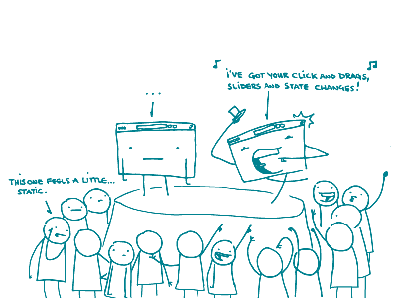
The internet has given us so much: Grumpy Cat, Baby Monkey, and — a recent fave — NPR’s accidental #Ramona phenomenon.
But there’s another reason we’ve been appreciating the web so much lately, dear readers. It offers a ton of options for getting people to pay attention to and engage with health information in new ways. Yep, we’re talking about interactivity.
Unlike static graphics or tables (which, as their name implies, just sit there), interactive graphics and tools do more than just show content or data. They let users make choices about what they see and, often, how they see it.
Interactive elements can give your users the power to:
- Display data in a way that answers their questions — like with this data visualization on progress toward Healthy People 2020 objectives
- See both big-picture trends and specific details — like with these Kaiser Family Foundation maps on the Affordable Care Act and Medicaid enrollment
- Dive deeper if they want more information — like with this graphic from the healthIT.gov Patient Engagement Playbook
But before your design team starts learning the latest animation software, make sure that an interactive format is a good fit for what you’re trying to communicate. For example, if you have a very simple message, you may want to consider a static graphic that packs a punch.
And if you decide to go the interactive route, check out Health Literacy Online — a resource we ❤︎ that has guidance for designing intuitive interactive graphics and tools.
The bottom line: Take advantage of the web by using interactivity to engage users and tell them what they want to know.
Browse recent posts