Have you ever opened a piece of mail from your credit card company and come up against an impenetrable wall of words that no average person could understand? How about going online to see what is and isn’t covered by your health care plan, only to get lost in a maze of confusing webpages?
Of course you have, dear readers — and so have we! Experiences like these are all too common, which makes any letter or website (or brochure or app or email) that is clearly written and well designed shine like a lighthouse over stormy seas.
Wouldn’t it be nice if someone recognized these beacons of clear communication for the exemplars that they are? Well, guess what — someone has!
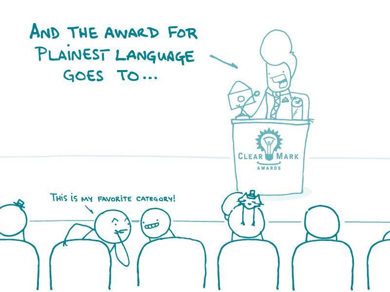
Earlier this month, the Center for Plain Language named 14 winners at the annual ClearMark Awards. These awards recognize effective plain language writing and information design that help people find information, understand it, and act confidently based on what they’ve learned.
This year’s winners include a range of communication materials, from a knee surgery decision aid to a law school’s bylaws — and a peppy little newsletter that has a serious crush on health literacy (aw, shucks).
We encourage you to check out this year’s winners — and consider submitting something of your own next year!
The bottom line: The ClearMark Awards showcase achievements in plain language and clear design — thanks to the Center for Plain Language!
Browse recent posts