Visuals are a powerful tool in our health communication toolbox. They help us convey big ideas in a way that transcends language and cultural barriers. And here at We ❤ Health Literacy Headquarters, we’ve really been digging a certain type of visual lately: pictograms.
A pictogram is a drawing or image that represents an idea in a simple, literal way. We can use pictograms to show recommended behaviors, symptoms, and other health concepts that can be tricky to explain. They’re especially useful for audiences with limited literacy skills, limited English proficiency, or cognitive disabilities. And as an added bonus, they help us reinforce key messages for all readers!
Try these 3 quick tips to create pictograms that will resonate with your audiences:
- Use literal representation instead of abstract symbolism. Some symbols or graphic conventions (like “Rx” for “prescription” or wavy lines to indicate heat) may not resonate across cultures. So it’s important to make illustrations as literal and concrete as possible.
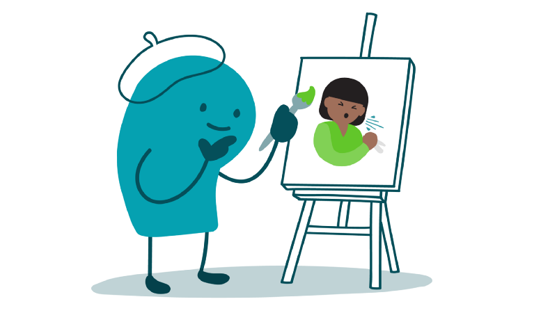
For example, if you’re creating a pictogram to represent sneezing as a symptom, show a person actually sneezing — not just a tissue box.
2. Incorporate realistic details that aid understanding. Use realistic colors and include details that provide context to help people understand your pictogram. In the example below, we’ve put the thermometer in the person’s mouth and added flushed cheeks and sweat on the forehead to more clearly show that the person has a fever.
3. Use a consistent visual style. Did you know that our short-term memory can only hold a few visual elements at a time? Interpreting a series of images can be hard for anyone, and it’s especially tricky for people with limited literacy skills. To avoid cognitive overload (overwhelming viewers with too much information), use a consistent visual style and similar characters across all pictograms in a single material.
In the example below, we’ve used the same character and art style for all 3 images to help avoid cognitive overload.
The bottom line: Pictograms can help us communicate big ideas in an accessible way. Try these tips to create pictograms that resonate with your audiences.
Browse recent posts