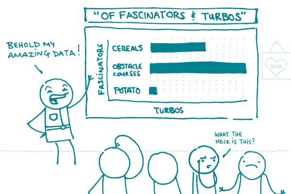
We’ve all seen it: the slick report or presentation with fancy-looking charts and graphs that, despite your enthusiasm and effort, you can’t make heads or tails of. The author or presenter is trying to make an important point, but you’re left squinting at the chart, struggling to remember what you learned in 10th grade about x- and y-axes. It’s not the best.
As our longtime readers know, we ❤︎ representing data visually — from snazzy infographics to simple illustrations of risk. And if you have lots of data, a chart or graph is often the best way to present it.
We could go into all kinds of detail about how to design clear, easy-to-understand charts and graphs (and we may do just that in a future post!). But this week we’re sharing just one simple tip that can make a world of difference: put the main takeaway in the title.
Check out this example from The New York Times:

Now, isn’t that helpful? An equally accurate title for this chart would have been “Rates of Gun Ownership and Gun Murders in Developed Countries” — and sure, that would tell you what data are in the chart. But “More Guns = More Death” tells you not only what the data say, but why the data matter.
Putting the main takeaway in the title also challenges you to focus your message — and to choose data that clearly make your point.
The bottom line: When designing charts and graphs, use the title to tell the story.
Browse recent posts