There are lots of numbers floating around these days in relation to COVID-19. We’ve written before about how people struggle with numeracy — but mix that with a dash of pandemic anxiety, and you’ve got a recipe for widespread confusion.
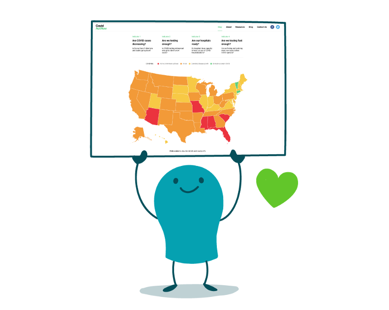
So this week, dear readers, we want to share a favorite go-to resource for helping folks digest some of this data: the Covid Act Now map. Created by a team of tech wizards, health experts, and policy specialists, the map shows COVID-19 data and risk level by state (and county when possible). The tool focuses on 4 key questions:
- Are COVID cases decreasing?
- Are we testing enough?
- Are our hospitals ready?
- Are we tracing fast enough?
As health communicators, we know how important it is to accurately interpret and clearly communicate data to our readers. So let’s take a moment to appreciate how Covid Act Now breaks down key risk indicators into plain language questions that we can all understand.
We also ❤ how Covid Act Now dishes out color-coded visuals to help answer complicated questions without relying only on tricky numbers. And the map is updated constantly, so we can easily absorb what’s happening right now — and use that knowledge to make informed health decisions. (Pretty important in an ever-changing public health crisis.) Now that’s a recipe we’re happy to share!
The bottom line: Share clear, easy-to-understand resources like the Covid Act Now map to help people make sense of big data during the pandemic.
Browse recent posts