 Here at We ❤️ Health Literacy HQ, we’ve been talking a lot (a lot a lot) about equity. You probably have been too, our dearest readers! After all, the COVID-19 pandemic has highlighted longstanding inequities that shape health outcomes — inequities rooted in racism, ableism, and other types of discrimination. Talking about ways to center equity in our work is an important first step. But figuring out what equity looks like in real life? That can get tricky. Luckily, the Robert Wood Johnson Foundation (RWJF) has some visuals to help us do just that.
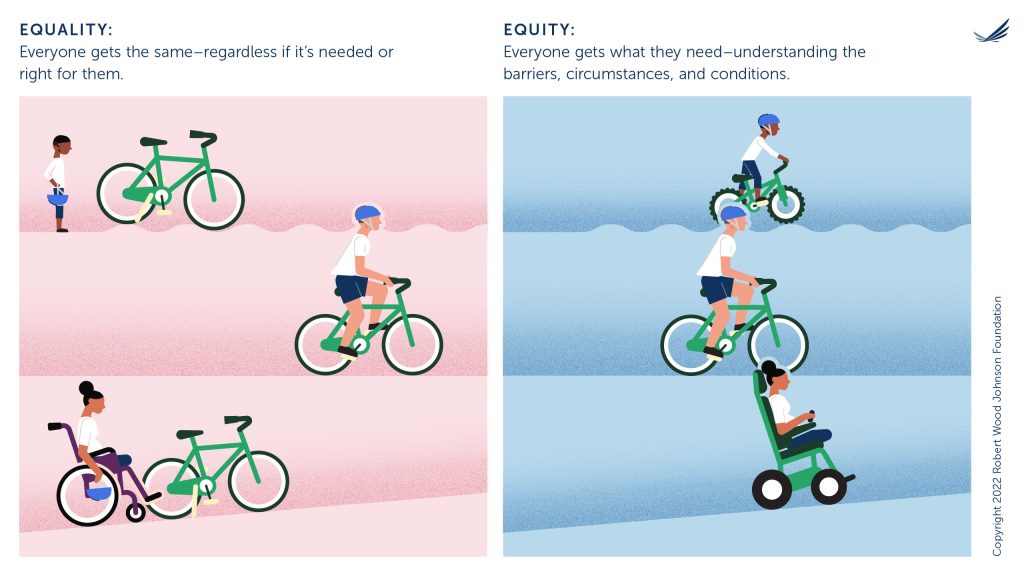
Back in 2017, RWJF crafted a simple illustration of 4 people riding bikes to explain the difference between equality and equity. (To sum it up quickly, “equality” means everyone gets the same kind of bike, while “equity” means everyone gets a bike tailored to their needs.) Tons of people told RWJF that the graphic helped them understand and explain the concept of equity, which is great. But the RWJF team didn’t stop there — they decided to make it even better!
This year, RWJF redesigned the graphic to better reflect the organization’s commitment to advancing health equity. They followed a human-centered design process by:
- Conducting a survey of RWJF newsletter subscribers
- Gathering feedback from people who have experienced barriers to access — like people with disabilities and parents of children with disabilities
- Considering how and where people would use the graphic
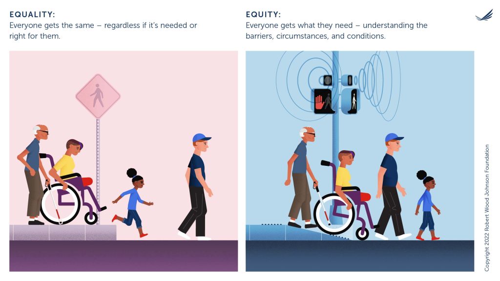
Based on audience feedback, RWJF both updated the bike image and created an all-new graphic with a crosswalk scene. The crosswalk image shows how curb cuts and accessible traffic signals help everyone cross the street safely. Both graphics paint a more nuanced picture, illustrating how barriers to access impact different groups of people. And RWJF added captions to make the main message crystal clear.


In her blog post about the new visuals, graphic designer Joan Barlow said she strives to approach all design challenges with empathy for her audience. We couldn’t have said it better ourselves — as you may know, we’re big fans of empathy in health comm. And we really appreciate how RWJF used human-centered design to make a helpful visual even better. Hats off!
The bottom line: The Robert Wood Johnson Foundation’s new graphics help us visualize the difference between equality and equity. And the RWJF team used a human-centered design process to create them!
Browse recent posts