You may already know that people who are in prison are more likely to have certain health problems, like hepatitis C, HIV, and asthma. Maybe you’ve written about these disparities before — and asked yourself the question behind this week’s post: What’s the best way to refer to people who are in prison?
The obvious choices — like “prisoners” or “convicts” — may seem okay at first. But these words have strong negative connotations and tend to obscure the fact that people who are in prison are … well, people.
Even when the goals of a material are positive, this type of dehumanizing language can have serious negative consequences. It leads to stereotyping and discrimination — which, in turn, can make it harder for people to get jobs or find housing after they’re released from prison. You can probably guess, dear readers, how that affects their health and well-being.
Research has also shown that people who were formerly incarcerated are more likely to have poor mental and physical health. To be clear, we’re not blaming these outcomes on terminology alone — but using stigmatizing language can’t help. So what’s a better option?
Longtime readers know we’re big fans of people-first language here at We ❤ Health Literacy Headquarters. For example, we say “people with diabetes,” not “diabetics.” People-first can also be the right approach when writing about incarceration. It gets the point across without reducing people to one part of their identity.
Keep in mind that some people who are in prison may use words like “prisoner” — and they may prefer that others do, too. Just like so many questions in health communication, the best way to answer this one is to test your materials with your audience!
So the next time you find yourself writing (and testing your writing) about people who are in prison — or even chatting about it in casual conversation — try these alternatives on for size:
- Instead of “prisoners” or “inmates,” say “people who are in prison”
- Rather than “ex-offenders” or “ex-cons,” go with “people who have been released from prison”
- Instead of “convicts” or “felons,” try “people who were convicted of crimes”
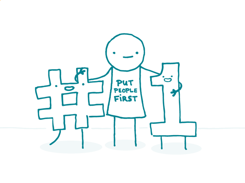
The bottom line: Put people first to humanize language about people who are in prison.