So what exactly is the difference between plain language and readability? And what about health literacy? How do they fit together? Or are they the same?
Never fear, dear readers! We’re here to take a quick look at what it really means to talk about readability, plain language, and health literacy. They’re all important — and they’re definitely related — but each term means something different.
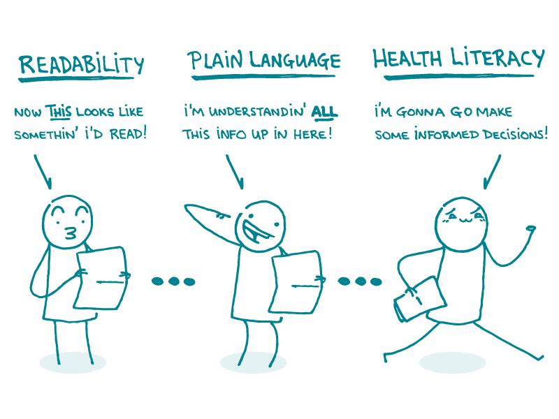
Readability is how easy (or not) something is to read. Readability formulas measure this by looking at the length of the words and sentences in a document. They can tell you what grade level your document is written for, and they’re everywhere — Microsoft Word even has one built in. But we’re not fans of these formulas because they don’t take into account plain language principles or the user’s context.
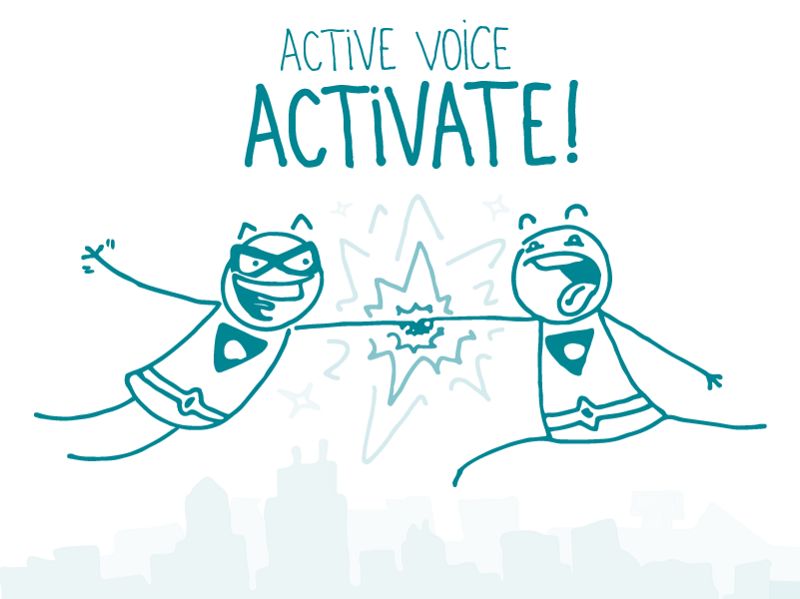
Plain language is writing that people can understand. It ensures that people can easily grasp your message the first time they read it. We’ve written about many plain language principles before, like:
When you get plain language right, readability naturally comes with it. But something written in plain language won’t improve health literacy if people don’t know what to do with the information.
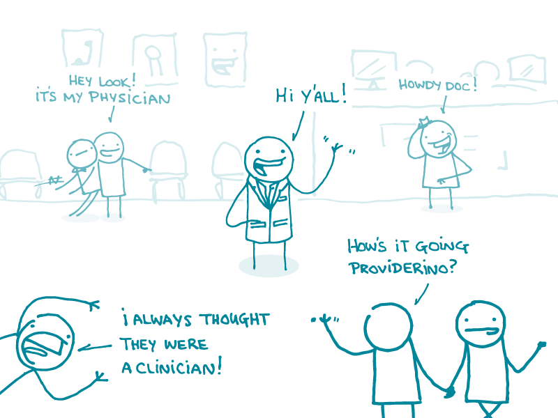
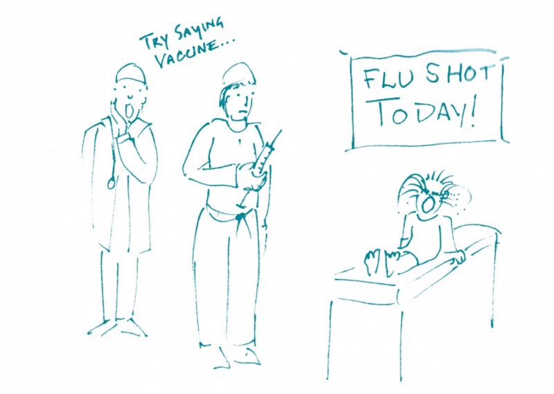
Health literacy is a person’s ability to access, understand, and use health information so they can make informed choices about their health. It’s a complex concept that depends on the quality and clarity of the communication as well as the skills and experience of the user. On the communication side, plain language is important — but writing for health literacy also means making the content relatable and actionable for your audience.
Whew. Now you have the facts you need to settle all those heated cocktail party disputes. (No really. We talk about this stuff at cocktail parties.)
The bottom line: Readability, plain language, and health literacy are all important — so it pays to understand what makes each unique.
Tweet about it: What’s the difference between readability, plain language, and #HealthLit? @CommunicateHlth explains: https://bit.ly/2uLSRsU