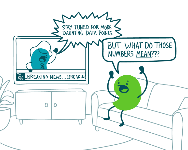
We’ve written before about how numeracy can impact health decisions. And we know numeracy skills tend to decline when we’re under stress — like, say, during a global pandemic! So as health communicators, we need to help our readers parse the data in the COVID conversation.
Use these tips to help your audiences make sense of COVID numbers:
- Use numbers on a need-to-know basis. When people are bombarded by lots of numbers, they tend to tune out. So each time you use a number, ask if your reader really needs to see it. For example, in a short how-to about COVID testing, is the exact false positive rate need-to-know information? Or could that number distract from the key action step of getting tested?
- Define key data terms. Terms like “positive test rate” get thrown around so much these days that they start to feel familiar. But to most people, that’s still unfamiliar jargon. So instead of writing: “Your state has a 20 percent positive test rate,” try: “In the last week, 1 in 5 people in your state who got tested for COVID-19 had the disease.”
- Put numbers in context. Defining data-related terms is only half the battle! Readers also need context to understand why the numbers matter in the first place. So provide the relevant takeaway: “This high positive test rate means that your state isn’t testing enough people. That means lots of people in your state could have the virus and not know it.”
- Follow up with action steps. Turn information into action by pairing numbers with steps readers can take to keep themselves and others healthy. For example, “Right now, there are more than 500 cases of COVID-19 in your county. That’s a very high number — so it’s especially important to stay home as much as possible and wear a mask whenever you leave your home.”
- Help readers visualize data. Use graphics to bring the numbers to life. For example, the Covid Act Now map offers a visual snapshot of how the virus is affecting communities across the United States. These types of colorful visuals can help readers quickly grasp the level of risk in their area — and make more informed health decisions.
The bottom line: Help your readers understand COVID stats and use them to make better health decisions.
Browse recent posts