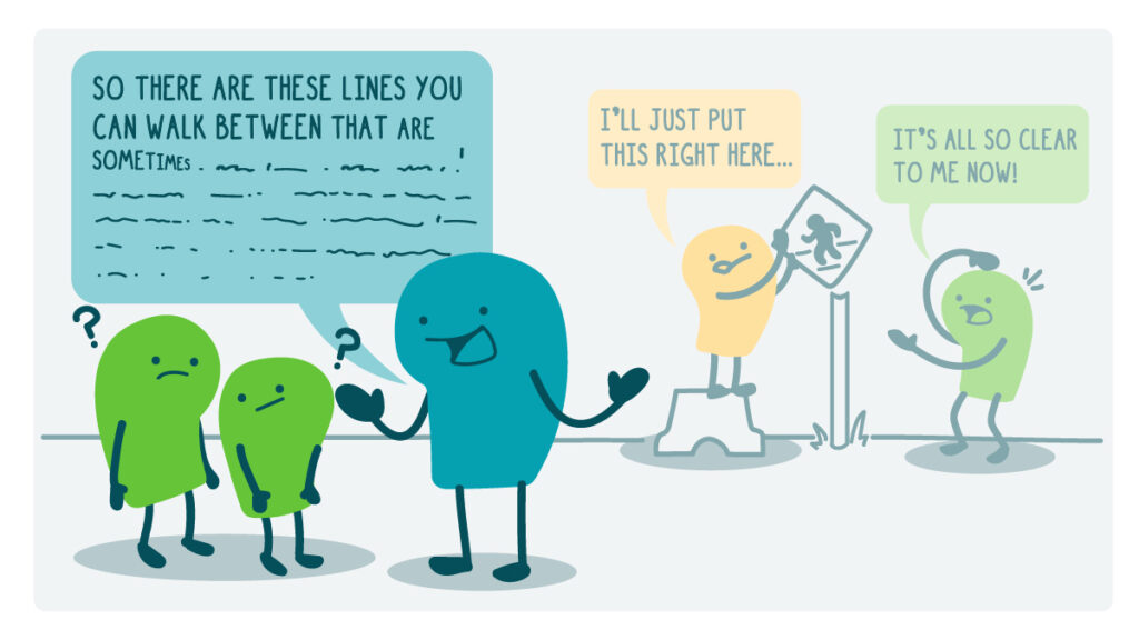
Way back in 2016, we talked about how icons make it easy to communicate with fewer words. And that’s still true! But a lot has changed in the world of iconography since then — especially when it comes to making icons more inclusive. So today, we’re exploring what’s new with our old pal the icon.
Just as we health communicators have been using more gender-conscious language, many designers have been exploring gender-conscious icons and pictograms. For example, you may have noticed the old-fashioned male and female stick figures slowly disappearing from bathroom signs. Now, instead of depicting gender, many bathroom signs depict, well, plumbing fixtures. By showing different combinations of toilets and urinals (and wheelchairs to indicate accessible stalls), these designs keep the focus on what the user needs. And that’s an approach we always ❤️!
Designers and accessibility advocates have also given the classic wheelchair icon a recent glow-up. Rather than a stiff, static depiction of a person sitting, this newer accessible icon shows their movement through space — shifting the focus from the wheelchair as passive object to the wheelchair user as active subject, and highlighting their ability to move and navigate.
And speaking of moves, if you watched the 2024 Paris Olympics and Paralympics, you may have seen the new pictograms for each sport. These designs didn’t default to clunky, static wheelchairs to stamp a design as “paralympic.” Instead, Olympic and Paralympic sports share the same pictogram, unless accessible equipment is key to the action. So the design for archery or swimming is shared, while wheelchair basketball gets a snazzy, dynamic chair added in.
You probably won’t want to use pictograms quite as fancy as the Paris designs in your health materials — the icons should be plain and clear in health comm, just like the language. But the next time you reach for an icon to help get your point across, we hope these examples help you choose a design that’s accessible, inclusive, and welcoming to everyone in your audiences.
The bottom line: Whether you’re creating health materials or designing for public spaces, use inclusive, accessible icons to help your audiences understand and navigate.
Copy/paste to share on social (and tag us!): How can we make icons more inclusive and accessible? CommunicateHealth takes a look at some icon updates: https://communicatehealth.com/wehearthealthliteracy/say-it-even-better-with-inclusive-icons/ #HealthCommunication #HealthLiteracy #HealthComm
Browse recent posts