Here at We ❤︎ Health Literacy Headquarters, we just love an outrageous outbreak flick. The feverish stars! The frantic lab tests! The unrealistic but highly entertaining science-y dialogue!
The genre may play fast and loose with the facts, but there’s one outbreak movie from 2011 that (mostly) sticks to the realm of the possible: Contagion. When a viral pandemic infects a billion people, public health professionals come to the rescue and race to find a vaccine.
If there’s one thing we learned from watching this movie, it’s that public health messages sure are memorable when delivered by Kate Winslet and Laurence Fishburne. Here are some pandemic survival messages that Contagion gets right:
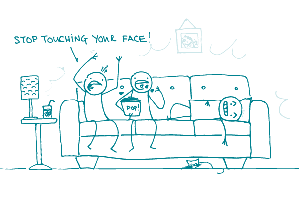
- Keep clean. Simple steps like handwashing and keeping your hands away from your mouth and eyes can be the best defense. As the movie puts it, “Stop touching your face.”
- Practice social distancing. Contagion sums up the best plan for when a virus is spreading like a wildfire: “Don’t talk to anyone, don’t touch anyone, stay away from other people.”
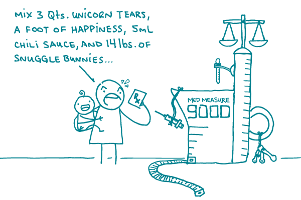
- Beware the wonder drug. The internet is full of too-good-to-be-true miracle cures. In real life, as in the movies, it’s best to get your medicine from the experts — not from Jude Law.
- Try not to panic. Some of the scariest scenes in Contagion have nothing to do with germs. It’s when people start to riot and fight over resources that things get really hairy.
Those steps are a good start, but what about our very favorite topic? That’s right, dear readers, clear communication is also super important when attempting to survive a pandemic. Kate Winslet’s character, who works for CDC’s Epidemic Intelligence Service, models these tips for communicating in a crisis:
- Stick to your key message. In an emergency, people need clear information and a bit of comfort. She keeps a cool head and reminds the public, “We’re isolating the sick and quarantining those we believe were exposed.”
- If you can’t translate a word into plain language, give examples. When her use of the word “fomites” gets blank stares, she rattles off a handy list of surfaces that spread disease: “Doorknobs, water fountains, elevator buttons, and each other.”
- Be honest about the risks. A colleague asks if his wife is crazy to make him bleach all his clothes and bathe in the garage before coming in the house. “Not really,” she replies.
- Work with your partners even when it’s difficult. It may be hard to cooperate with local officials who are more worried about bad press than they are about the rising death toll. But take a lesson from Kate: keep communicating. After all, public health is a team effort — especially in an emergency.
The bottom line: Watch Contagion to learn how to survive a pandemic — and how public health professionals can help save the day.