Here at We ❤︎ Health Literacy Headquarters, we’re just crazy about focus groups. One of our favorite things about focus groups is that they’re super versatile — you can use them throughout the entire product development process. We really ❤︎ that.
But let’s back up a minute to cover the basics.
In a focus group, you get a group of participants together to answer questions and talk about a particular topic. Focus groups can provide valuable insight into participants’ knowledge, attitudes, behaviors, beliefs, and information needs. And the group setting is key because each participant’s comments can stimulate and influence others in the group to think and share more. The result? A dynamic, insightful conversation that can give you a lot of information.
In the early stages of a project (sometimes called the discovery or formative research phase), focus groups let you get to know your audience. Say you’re developing an app for kids with diabetes. You could recruit actual kids with diabetes and ask them questions that get at their beliefs about healthy eating, challenges or frustrations they’re having managing the condition, or how the app would work in their dream world. You could then use the insights gained from the focus groups to shape your product’s technical requirements, design direction, and communication strategy.
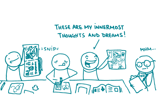
(Pro tip: consider souping up your formative focus group with a collaging activity.)
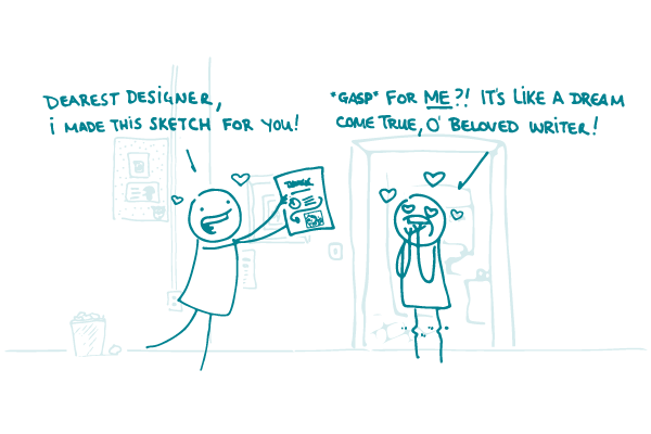
Once you’ve started creating your product, you can use focus groups to explore how well it fits what your audience wants and needs. At this point, you would show participants some components of what you’re working on (like sample messages, design sketches, or a draft material or prototype) and get their reactions. Then you would use this feedback to refine your product to better meet your audience’s needs.
What’s not to ❤︎?
The bottom line: Use focus groups throughout the development process to help you create a product that’s right for your audience.