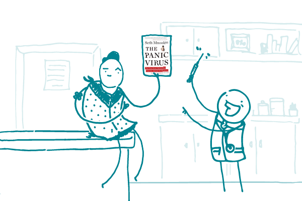
Happy Holidays!

Today we’re tackling a common question: when writing about sexual health, is it best to use “STD” (sexually transmitted disease) or “STI” (sexually transmitted infection)? Sexual health is one of those sensitive topics that health communicators often encounter, so it’s especially important for us to choose our words carefully when discussing it.
“STI” has gained traction in the medical community because it’s more technically correct. By definition, a disease has a set of symptoms, but many STDs/STIs can exist with or without symptoms. That makes “STI” the clear winner, right?
Not so fast, dear readers. It doesn’t matter how medically accurate a word or phrase is if it leaves your readers scratching their heads. Since “STD” is still a much more familiar term, make it your go-to acronym when you’re writing for a general audience.
Instead of bogging your readers down with a technical term that they don’t really need to understand, get right to what matters:
The bottom line: Stick with terms people know — for now, that’s “STD.”
Here at We ❤︎ Health Literacy Headquarters, we spend a lot of time talking about how health literacy and clear communication can help us reach our audiences with important health messages. And, as we’re sure you know by now, a key piece of that puzzle is creating accessible web content — content that everyone can access, understand, and use.
That’s why each year on November 30, we join accessibility- and usability-focused web designers and developers in celebrating Blue Beanie Day. (Observe: Yay, it’s Blue Beanie Day!)
This day is a great reminder that when we focus on accessibility, we create web experiences that benefit all users. For example, say you’re committed to building a health website that’s accessible and usable for people with disabilities. (Awesome — go you!) Well, keeping folks with disabilities in mind when building your site also helps it work on a variety of browsers and devices. Bonus!
Additionally, following best practices in accessible web design — like progressive enhancement and performance optimization — means that users with a shoddy internet connection or lower bandwidth (possibly due to their having lower income) can still access your content. Sure, they might lose some of the bells and whistles, but the essentials will be there.
Perhaps web designer and author Jeffrey Zeldman said it best:
“One small thing designers and developers can do is to make accessibility and usability Job 1 on every project. And to take a broad view of what that means. It means taking people’s messy humanity into account and designing for extreme ends of the bell curve, not just following accessibility authoring guidelines.”
The bottom line: Today, we’re putting on our blue hats for web accessibility — and we hope you’ll join us!
When Hamilton: An American Musical first premiered, it quickly became a cultural phenomenon. The Broadway show (which chronicles the life of Founding Father Alexander Hamilton) won awards left and right and sold out performances months — even years — in advance.
The craze got some Hamilton fans here at We ❤️ Health Literacy Headquarters thinking about what makes it so special — and why it resonates so much with us. What we came up with, dear readers, is that Hamilton has quite a bit in common with plain language. (Stick with us, dear readers — we got this.)
Hamilton is in a category of its own when it comes to musicals. Instead of typical show tunes, it uses hip-hop to transport the audience to Alexander Hamilton’s world. It applies familiar terms from today’s culture to 18th-century American history. It uses casting to make the story relevant (most characters in Hamilton are played by people of color, regardless of the historical figure’s actual race).
Essentially, Hamilton reminds us that if you present information in a way that’s engaging and accessible, it resonates with people — which can help them understand it in a way they might not otherwise. Case in point: Do you think most kids learning about American history in school would rather read about Hamilton in a textbook or listen as his story unfolds through an intricate web of exceedingly clever rap verses?
These days, folks have a lot of choices when it comes to the health information they choose to rely on. If they don’t find what they need in your health materials, no big deal — they’ll move on to the next. This sets the bar high for presenting health information in the most engaging, accessible, and innovative way you can.
And you know what Hamilton would say about that — he’d tell you not to throw away your shot.
The bottom line: What do Hamilton: An American Musical and health communication have in common? More than you might think.
Tweet about it: With Broadway opening its doors again, @CommunicateHlth revisits what #Hamilton can teach us about #HealthComm: https://bit.ly/3B4yjvB
What’s the first thing you look at when you land on a webpage — the colorful image? The headers? The blinking advertisement?
At We ❤︎ Health Literacy Headquarters, we often ask this and other similar questions about sites that we work on. And if you’ve ever been involved in creating a website, you’ve almost certainly found yourself wondering, “What do people focus on when they look at my site?”
Fortunately, eye tracking can help answer that question. Eye tracking is a type of research that measures where people look — the visual path they take through a website. While usability testing helps you learn how well (or not well) features of your site work, eye tracking provides a more complete picture of users’ behavior.
There are many ways to conduct eye tracking, but the most common method is to mount a special camera on a user’s computer or mobile device. The camera then records the user while they look at your site, tracking:
Sounds pretty great, right? It totally is!
When you’re ready to try eye tracking, here are a few things to keep in mind.
The bottom line: Eye tracking gives you valuable information about how people use your site — and what’s catching their attention.
“Please never stop believing that fighting for what’s right is worth it. It’s always worth it.”
— Hillary Clinton
We all know how important it is to keep health-related content short, simple, and direct. But of course that’s not all that goes into clear communication — the order of the words you choose matters, too. Specifically, when you’re writing content that may not apply to all your readers, it’s important to put the context first.
Consider this sentence: You’ll need to get a blood test if you’ve had a TB vaccine (shot).
Concise and direct? Check. Uses simple, familiar terms? Definitely. But this information is only relevant to readers who’ve had a TB vaccine — and you’re making everyone read all the way to the end before they find out if it applies to them.
So instead, try this: If you’ve had a TB vaccine (shot), you’ll need to get a blood test.
This way, it’s immediately clear who you’re talking about, and people who haven’t had a TB vaccine can skip the rest of the sentence. Since we know that readers skim and scan (especially online), do yours a favor and clue them in right away if there’s something that may not be relevant to them.
Putting the context first can also help users with limited literacy skills — who may struggle with working memory — get clearer takeaways from your content.
Consider this one: Call 911 or go to the emergency room at the nearest hospital right away if your child’s fever is 105 degrees or higher.
When you write a sentence like this, you’re asking folks to read — and remember — several things to understand whether they need to call 911. This can be tricky for people with limited literacy skills. The solution?
Context first! Like so: If your child’s fever is 105 degrees or higher, call 911 or go to the emergency room at the nearest hospital right away.
The bottom line: When communicating information that doesn’t apply to all your readers, put the context first.
Tweet about it: When communicating info that doesn’t apply to all your readers, @CommunicateHlth says put the context first: https://bit.ly/37ZpTwG #HealthLit
It’s abundantly clear at this point, dear readers, that the reason we get along so well is that we have a lot in common. We’re all a bunch of health literacy lovers with passionate feelings about things like white space, plain language, and user testing. In short, we’re the coolest.
Unfortunately, not everyone shares our commitment to making health information easier to understand. And the reality is that even your own organization might be stuck in the Dark Ages (and in the Dark Ages, health literacy wasn’t a thing).
Well, grab a torch because it’s time for you to lead your colleagues into the light. Here are some tips you can use to advocate for a health literate organization.
Give the facts.
Explain how health literacy affects us all: 9 in 10 people have limited health literacy, which means they struggle to find, understand, and use health information. And research shows that everyone — not just people with limited health literacy — benefits from health content that’s clear and easy to use.
Dispel the “plain language is dumbing down” myth.
If we had a nickel for every time we heard this one, we’d be kajillionaires (and we’d use it to run as many focus groups as our hearts desire)!
Plain language does not mean dumbing down your content. It means thinking about your readers, telling them only what they need to know, and using simple language to communicate your message.
Make it personal.
Health information is powerful — it can make us feel scared and confused or informed and empowered.
Encourage your coworkers to think about their loved ones and how they might feel reading your materials. Would they want their grandmother to get a fact sheet peppered with impenetrable jargon? How would they describe the issue in a way that would instead put her at ease and help her take action?
Explain the return on investment.
Yeah, yeah, readable health materials help consumers — but what about the big guy? The truth is that health literacy benefits organizations, too. If you distribute clear information, your audiences will be primed to:
Share tools.
Like many of us, your colleagues may have learned early on that good writing is formal writing — or that there’s no significant difference between a website that’s user-friendly and one that isn’t. So give your colleagues a hand by sharing tools they can use on the job. Here are a few of our favorites:
Start small.
Begin with small steps — like getting folks to use contractions when they write or encouraging them to collect a few audience insights before developing a product. Even these small wins can have a big impact on your work.
Who knows? Before long your colleagues may want to join the We ❤︎ Health Literacy family (and we’d really ❤︎ that).
The bottom line: Advocate for health literacy within your organization — it’ll be a win for your audiences and a win for your company, too.
So, you’re building a website — congrats! But before you start designing, dear readers, we have something very important (and possibly surprising) to tell you: when it comes to designing a website, it’s best to be predictable.
Designing a predictable site helps users get where they need to go quickly and easily because they intuitively know where to look for important things. This is especially important for health websites, because users may be stressed out or otherwise not feeling their best when they’re searching for health information.
In Don’t Make Me Think, Steve Krug says: “When you’re creating a site, your job is to get rid of the question marks.” In other words, users shouldn’t need to ask themselves questions like:
Years of usability testing with all sorts of folks has taught those of us at We ❤︎ Health Literacy Headquarters some important lessons about how to design websites for predictability. Here are some tried-and-true tips:
And don’t fret, dear readers: predictable doesn’t mean boring! You can still dazzle your users with a gorgeously designed website that’s easy to use and great to look at.
The bottom line: Design your website to be predictable — your users will thank you!
In today’s fast-paced world, more and more people are getting their information from social media. And as you know, dear readers, it’s part of our job as health communicators to meet folks where they’re at.
Different forms of social media have different strengths, and we’ll talk about that in future installments of our social media series. But to begin with, we’re giving a shout-out to perhaps the oldest form of social media: the blog.
Why blog, you ask? Here’s why.
Of course, there are fewer things sadder than an old, abandoned blog — so make a plan to post regularly and be sure to respond to comments as they come in.
Now go forth and blog!
The bottom line: Blogging is a great way to build your brand and engage with your audience.