It’s summertime, dear readers, and that means it’s time to dive into your summer reading lists! In this edition of the We ❤ Health Literacy Book Club, we’re talking about one of our very favorite books about the intersection of culture and health.
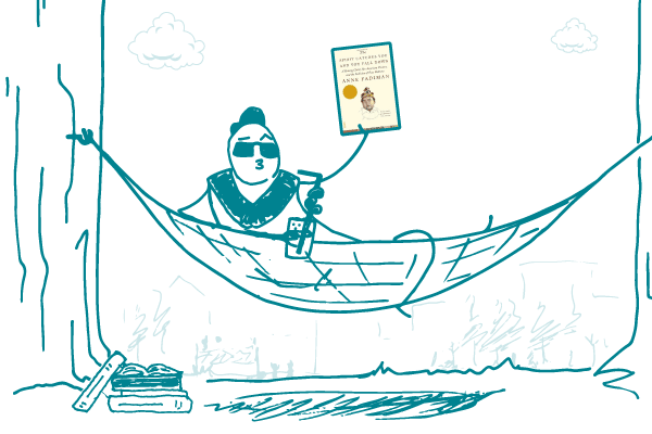
Written by Anne Fadiman, The Spirit Catches You and You Fall Down is the true story of a Hmong toddler named Lia Lee and her immigrant family’s experience in the American health care system. Lia had epilepsy, a condition that causes seizures. But in her family’s culture, epilepsy is known as qaug dab peg, which translates as “the spirit catches you and you fall down.” The Hmong believe that seizures happen when a person’s soul is captured by a spirit.
Lia’s parents chose to work with a shaman to call back her soul, but they also sought treatment at a hospital near their home in Merced, California. Lia’s doctors had trouble communicating with her parents because of a language barrier and a lack of translators. There was also a deep, cross-cultural misunderstanding between the Lee family and her American doctors:
“[Lia’s doctor] had no way of knowing that [her parents] had already diagnosed their daughter’s problem as the illness where the spirit catches you and you fall down. [Lia’s parents] had no way of knowing that [her doctor] had diagnosed it as epilepsy, the most common of all neurological disorders.”
The Spirit Catches You and You Fall Down is a moving story that highlights the importance of acknowledging and respecting people’s beliefs as part of their health care — in other words, cultural competence. And thanks in part to this book, cultural competence is now a required lesson in many medical schools.
The bottom line: Read about how people experience health and illness differently based on their culture in The Spirit Catches You and You Fall Down.