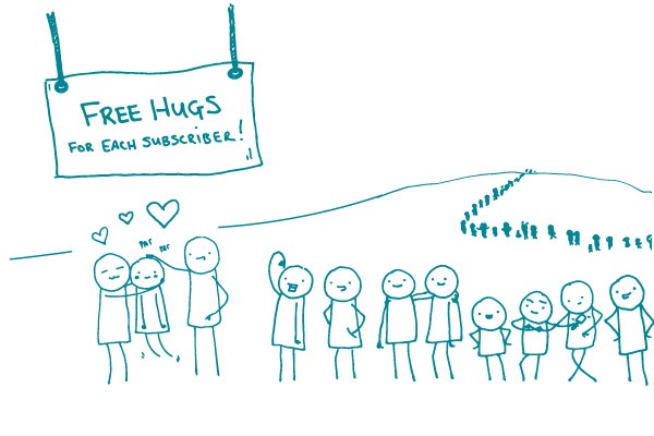
We’re taking a break from our usual tip to give a very big thank you to each and every one of you. This little idea we had nearly 2 years ago now has well over 1,000 subscribers — not to mention our fans on Twitter and our blog.
We love interacting with our readers, so don’t be shy — send us an email, leave a comment on our blog, or tweet to let us know what YOU want to hear about. Are there certain jargon terms you wrestle with and just haven’t found a great alternative for? What battles are you fighting with subject matter experts who still aren’t buying this plain language thing? What health literacy resources make your heart go pitter-patter?
And please spread the word. Let your colleagues know they can sign up today.
Thanks again — we really can’t do it without you. (Well, we could, but it’d be pretty silly.)
Cheers, The We ❤ Health Literacy Team at CommunicateHealth
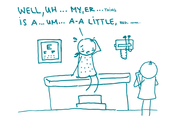
Have you ever clammed up while expressing concern about a loved one’s health? Or felt embarrassed when talking with the doctor about bodily functions? Or dreaded having to explain to the receptionist why you need to see the doctor ASAP?
It’s not just you. We think it’s safe to say most of us have. And that’s because talking about personal health issues can be anxiety inducing (not to mention off-limits in polite conversation!) — so we tend to avoid it. And that can get in the way of health.
That’s why we want to draw your attention to a format we ❤ for talking about tough issues: conversation tools. Creating a conversation tool gives people the language they need to communicate effectively about a challenging health topic. And that can make a really big difference.
Conversation tools are different depending on what you’re trying to accomplish, but they all offer questions or statements to use when talking about a health issue.
For example, conversation starters can help someone find the right words to talk with a loved one. Offering questions for the doctor can help a person communicate better with a provider. And more comprehensive step-by-step conversation guides are great for a person preparing for an in-depth, challenging discussion.
The next time you’re developing health information, try incorporating a conversation tool. We think your audiences will ❤ it.
The bottom line: Talking about health isn’t easy — help people communicate better by giving them the language they need.
In our last installment on testing techniques, we talked about card sorting — a simple exercise that helps you develop an intuitive, logical sitemap for your website.
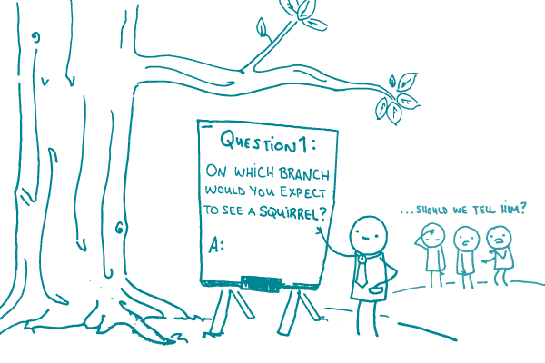
Card sorting is great when you’re building a website from the ground up. But what if you’re trying to find out how well an existing website is organized? That’s where tree testing comes in.
Think of a website as a tree with branches that keep dividing. The more branches you follow, the further you go into the site. Tree testing helps you learn how intuitively those branches are organized. Do the branches — or paths — lead people where they expect? Is information located where they think it will be?
The process is simple. Participants sit down with the testing software, which is loaded with a basic version of the sitemap. You pre-load instructions with a few tasks — things like, “How would you get driving directions?” or “Where would you find out about treatment options?”
Then you let participants do their thing. They don’t see the whole sitemap at once. Instead, it’s revealed as they go — like a real website. Once a participant clicks on an initial topic, the software shows the available subtopics.
The tree testing software records where participants clicked and if they completed the task. The results will tell you a lot. Did they find the right spot directly? Did they hit a dead end and backtrack? Did they give up altogether?
We ❤ tree testing because it gives potential users a powerful voice. Their choices tell you what’s working on your site and what’s not — and then you can fix it.
And a pro tip: This isn’t a great testing technique for users with very limited literacy skills. However, the results you get from other participants will improve the website for all users. What’s not to ❤ about that?
The bottom line: Tree testing helps you create a website where users can easily find what they want — because it’s exactly where they expect it to be.
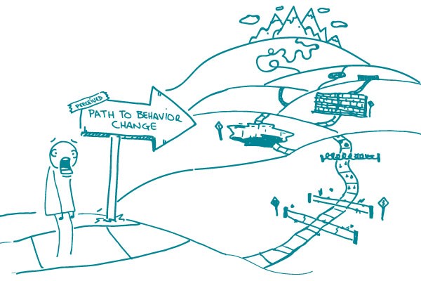
Change is never easy — and convincing your target audience to take action and change their behavior is harder still. Using plain language and good design are key, but health communicators also need to know how to motivate their audiences to make a change.
Fortunately, smarty-pants academics are hard at work developing models and theories that help us understand how and why people change their behavior. Our Useful Theory series takes a look at some of these models. Last time, we checked out the Stages of Change. Today, we’re exploring Icek Ajzen’s Theory of Planned Behavior.
The gist of the theory is that a person’s behavior depends on the answer to 3 main questions:
What do I think will happen if I do this behavior? How likely is a good outcome versus a bad one? (Behavioral beliefs)
What do others think about this behavior? Do other people expect me to do it? How much do I care about their opinions? (Normative beliefs)
Do I think I can realistically do it? What’s going to make it easier or harder for me? (Control beliefs)
Let’s say you’re trying to convince your audience to quit smoking (which is a great idea!). Talking about the harmful health effects of smoking might work — but what if your audience’s main concern is that all their friends do it and think it’s cool? Or maybe they already know it would be healthier to quit, but think it’ll be too hard.
As you develop your health content, think about how your audience might answer the 3 questions. (Or, better yet, do some user testing and find out for yourself!) By addressing likely barriers and concerns, you can empower your target audience to make positive, healthy changes.
The bottom line: If you want your target audience to change their behavior, identify and address the factors that might be holding them back.
As we may have mentioned once or twice, we ❤ testing with your target audience — especially when the audience is people with limited health literacy skills. Your product will be more useful, relatable, and relevant because of it. But recruiting participants with limited health literacy skills isn’t easy.
After all, you can’t just walk up to someone and ask, “What’s your level of health literacy?” But you can find the right participants by partnering with local, community-based organizations — like adult learning centers, community health centers, social service organizations, and senior centers.
Check out some of these tried-and-true tips to recruit participants with limited health literacy skills:
Screen for participants by demographic measures associated with limited health literacy. For example, look for people who have a high school education or below, a low household income (this differs by state, but it’s usually around $40,000 or less), and who haven’t searched for health information online in the last year.
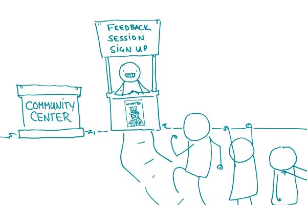
Create outreach materials in plain language. Skip terms like “usability” and “participant.” And whatever you do, don’t call it “testing!” Try a phrase like “feedback session” instead. Use a conversational tone to help folks feel more comfortable.
Conduct research in a place that’s easy to get to and comfortable for the target audience. We ❤ trusted community centers on public transportation routes.
Set a relaxed tone by dressing casually, interacting in a friendly manner, and offering healthy snacks. You don’t want your participants to feel like they’re being tested or studied. Remember, you’re testing the product, not the people.
Offer cash incentives when you can. Gift cards and pre-paid credit cards have limitations — they can’t be used to pay bills and other living expenses.
The bottom line: To recruit people with limited health literacy skills, connect with community-based organizations and screen for participants from demographics associated with limited health literacy.
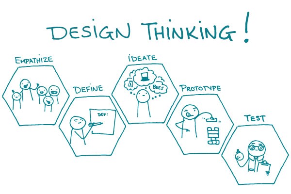
Design thinking is a step-by-step way to approach the creative process. Much in the way that you would follow steps to conduct an experiment or program an app, you can use design thinking to guide your creative process. And it puts the end-user at the center of your thinking, which is something we really, really ❤.
The best part is that you don’t have to be a designer to use design thinking! It’s intended for anyone trying to come up with a creative solution to a problem. Try it the next time you’re faced with a health communication challenge.
Here’s how it works:
Empathize with the target audience by becoming an audience member or involving yourself with the group (for example, try to do the activity yourself or observe and talk with members of the target audience)
Define the specific problem based on your observations during the first step
Ideate as many possible solutions to the defined problem — push yourself to think outside of the box
Prototype by building working examples of the possible solutions
Test your prototype with users to see if it successfully addresses the defined problem
You can repeat any step as often as needed until you find a solution or product that works.
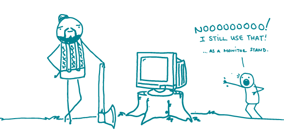
Because it’s our — err, we meant your — favorite kind of post, we’ve got another installment of our unofficial “use simpler words” series. On the chopping block this week: “monitor.”
Consider these somewhat vague statements:
We’ll be monitoring your blood pressure from now on.
Monitor your child’s fever to make sure it’s not getting higher.
Use this home kit to monitor your blood sugar.
Now take a look at these simpler, clearer, and more specific alternatives:
We’ll be checking your blood pressure regularly from now on.
Take your child’s temperature every hour to make sure her fever isn’t getting higher.
Use this home kit to test your blood sugar each day.
And there you have it, dear readers. The word “monitor” implies an ongoing action, but it doesn’t say anything about frequency. Your health information will be more useful and specific without it.
Plus you won’t run the risk of anyone thinking you’re talking about a computer screen. That’s what we call a win-win.
Bottom line: Be more specific and less confusing by retiring the word “monitor.”
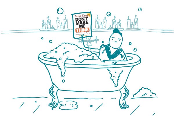
For today’s We ❤ Health Literacy Book Club, we dive into a book that’s required reading at CommunicateHealth. Now in its third edition, Don’t Make Me Think: A Common Sense Approach to Web Usability by Steve Krug is a quick read, but the lessons it contains have true sticking power.
If you’re creating or managing a website and you only have time to read 1 book, dear reader, make sure this is it.
The title tells you a lot about Krug’s recommendations for creating easy-to-use websites. The book does a great job illustrating the differences between what you probably want to build (a website with great, detailed content and logical information architecture) and what your users will be looking for (obvious clues that quickly and easily lead them to the information they want).
Krug gives us health communicators the harsh truth: People usually scan pages quickly and just muddle through a site until they stumble on what they’re looking for. So if we want all of our great content to be findable, we have to pay attention to things like visual hierarchy, simple design, and following web conventions.
The book tells you how to do all this and more — in fewer than 200 easy-to-scan illustrated pages with plenty of white space.
And if you have time to read a second book, a great companion to Don’t Make Me Think is Ginny Redish’s Letting Go of the Words. Keep these books nearby and refer to them often. Your website users will thank you!
The bottom line: Set your website users up for success and happiness by following the tips in Don’t Make Me Think.
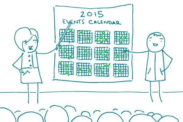
National events and conferences are great places to pick up new ideas, get perspective and inspiration, and strengthen your health communication muscles. They’re also excellent opportunities to meet other health literacy advocates, swap resources, and share strategies.
Here are just a few of our favorite health literacy events coming up this year:
The bottom line: There are lots of great events in 2015 where you can connect with other health literacy advocates.
Update: Silly us — we forgot to mention Plain Talk next week on March 12–13 in Arlington, VA where you can check out our very own Stacy Robison, Sandy Hilfiker, and Adam Moorman presenting!
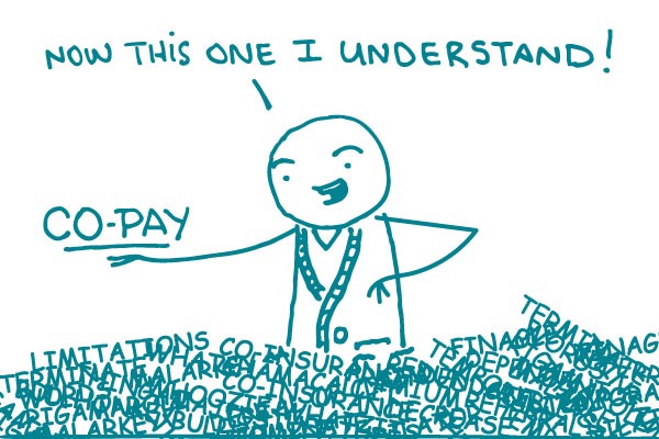
Because of the Affordable Care Act, more people are getting health insurance than ever before. Yay!
On the less fun side of things, these new customers are wading through a pile of complex terms. Words like premium, deductible, co-insurance, and co-pay are just the beginning (don’t get us started on actuarial value). It’s enough to make anyone’s head spin.
As a health writer, you can help keep the chaos at bay by using plain language words and phrases as much as possible. When readers do need to know a term, don’t just use it — teach it.
The teaching approach is what we suggest for “co-pay.” Since this is a term that people are going to see again and again in the health insurance world, explain what it means and give an example:
What is a co-pay? A co-pay is the amount of money you pay when you get a health care service. For example, if you have a $20 co-pay for doctor visits, you’ll pay $20 each time you go to the doctor.
The question we tend to get from our health insurance friends is, “What if they haven’t met their deductible yet, and what about the out-of-pocket maximum?” Our answer: “co-pay” is a relatively simple term on its own, and it’s best to keep it that way. If you have to, explain the deductible and out-of-pocket max separately. But don’t bog down the explanation of “co-pay” with more detail than your readers need.
Oh, and were you wondering where that mysterious “ment” went? “Co-pay,” not “co-payment,” is the term you’ll hear in everyday conversation. So keep it simple and stick with “co-pay.”
The bottom line: “Co-pay” is a health insurance term people need to know. So teach it — simply.