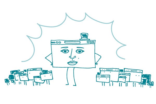
Every writer needs a topic. But for health writers, a topic alone won’t do the trick — you need both a topic and a message.
To communicate effectively, be sure to give your readers a take-away. Offer information on a health topic, and then provide a message that answers questions like, “What do I do with the information you’ve given me?” or “How is this information relevant to me?”
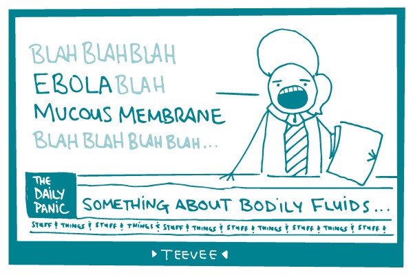
Take global warming, er… climate change, for example. Here’s some text on the topic of climate change:
Earth’s average temperature has risen over the past century, and will likely continue to rise over the next 100 years. This increase in temperature will cause big changes that may harm our water, food, energy, environment, and health.
If you’re like us, you read these sentences and think, “So what?” You’re looking for a message. Maybe it’s something like:
Earth’s average temperature has risen over the past century, and will likely continue to rise over the next 100 years. This increase in temperature will cause big changes that may harm our water, food, energy, environment, and health. You can help lessen these effects by recycling paper, glass, and plastic.
In the second example, there’s still background information on the topic, but it goes one step further to let readers know how they can take action. In other words, there’s both a topic and a message.
The bottom line: When you write about health, make sure you include a message that helps your readers take action.