As health communicators, we know that writing for behavior change is a challenge — especially when recommendations are evolving quickly and time is of the essence.
With so many people worried about their health, their loved ones, and the massive economic impact of shutdowns and quarantines, COVID-19 is no laughing matter. So memes definitely aren’t the right fit for public health communication about coronavirus. Right?
Well, it might not be that simple, dear readers! Over the past few weeks, we’ve seen some memes circulating that educate, engage, and add some much-needed levity to a stressful situation. In that spirit, this week we’re sharing a few timely memes we just ❤.
Wash Your Lyrics
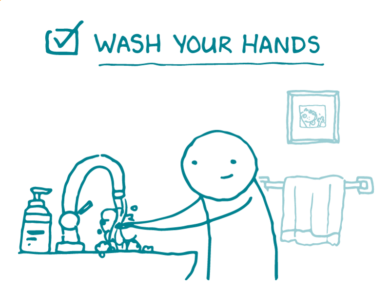
Early on in the outbreak, good old handwashing was the name of the game. Easy shortcuts, like telling people to sing Happy Birthday twice, can help people wash their hands for the recommended 20 seconds without watching the clock. But having Happy Birthday stuck in your head for an entire 2-week quarantine isn’t good for anyone’s mental health.
Fortunately, there are plenty of other 20-second ditties to choose from! That’s the idea behind Wash Your Lyrics, a tool created by a UK college student that creates custom handwashing posters for any song your heart desires — from Dolly Parton to Daft Punk.
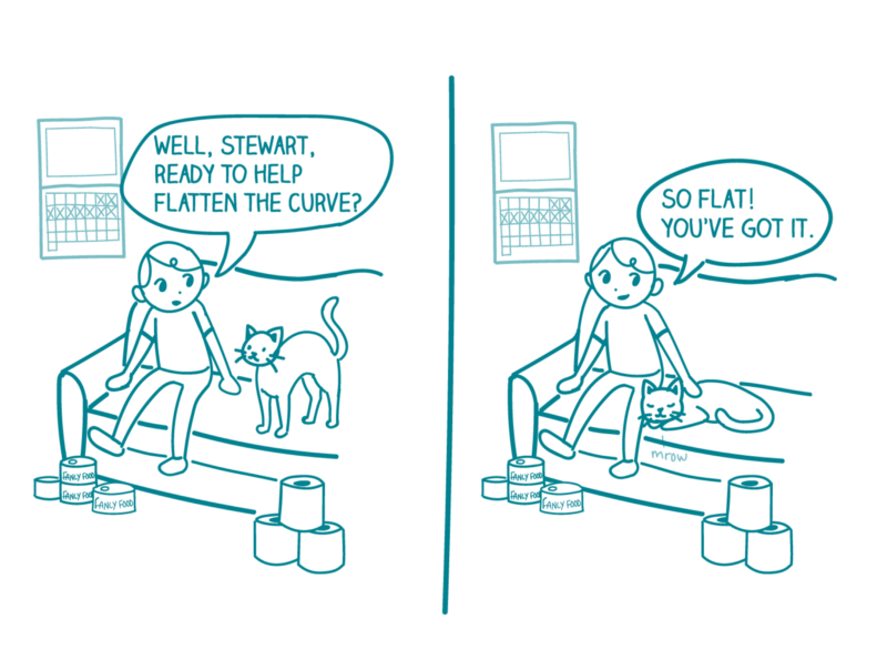
Cattening the Curve
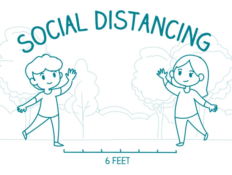
As the outbreak progressed, public health messaging expanded to more complicated ideas like “flattening the curve.” And that inspired some more creative memes!
We all know cats and the internet go together like peanut butter and jelly. Epidemiologist Dr. Anne Marie Darling knows this, too — so she turned a basic “flatten the curve” public health graph (yawn) into an adorable kitty PSA about the importance of social distancing.
#QuarantineCats
Now that most of the country is well into quarantine territory, memes are emerging that play on the new normal of daily life under stay-at-home orders.
The #QuarantineCats Twitter hashtag may not have an obvious public health purpose, but this meme isn’t just raising people’s spirits: it’s also a clever use of social norming (and cute cat pictures) to encourage people to stay home and avoid spreading the virus.
The bottom line: COVID-19 is no joke — but we ❤ how memes can promote behavior change and help to spread time-sensitive public health messages.