(First, apologies for that title. We couldn’t help ourselves.)
Here’s a true thing, dear readers: government websites often get a bad rap. This makes sense, since people often visit them to do or find something very specific and un-fun — like signing up for insurance or downloading a tax form. In these moments, the stakes are high and there’s a good chance that users are already frustrated. Too much jargon and annoying usability issues only make things worse.
That’s why we wanted to share our top 3 tips for creating user-friendly government websites — and showcase some sites we ❤.
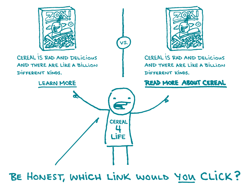
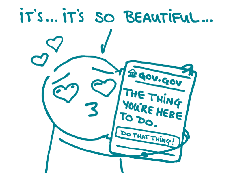
1. Make it easy for people to do the thing. Most people don’t visit government websites for kicks. They need to get something done or find something out. So don’t make them read through a massive history of your agency or wade through a sea of reports to get to the content they need.
Case in point: HealthCare.gov. Shopping for health insurance can be super overwhelming and it sure isn’t most people’s idea of a good time. HealthCare.gov’s homepage features big buttons with some of the most common action steps, like signing up for a plan. One click and you’re on your way.
2. Don’t assume your users are insiders. If you work for the government, you probably know the name of every department and program in your agency. But guess what? (That’s right, you guessed it.)
We ❤ how Vets.gov uses everyday words in the site navigation to guide people through the benefits available to Veterans and their families. The site doesn’t assume that people already know the ins and outs of the VA health care system or the names of all the VA programs. It just invites people to explore and apply for benefits. Zero insider knowledge necessary.
3. Don’t be afraid to be human. It’s okay to show a little personality or emotion — really! It might even be the key to engaging with users.
The folks behind Smokefree.gov aren’t afraid to tap into the emotions of their users. In fact, that’s a big part of how they help people quit smoking. They tell visitors that quitting is a journey. They encourage people to be proud on their Quit Day and reassure them that a slip-up doesn’t mean they’re failing. A little empathy can go a long way.
The bottom line: Government websites really can be clear, easy to use, and even fun!
Tweet about it: 3 tips for making government websites that are clear and easy to use from @CommunicateHlth: https://bit.ly/2NExGnD #HealthLit