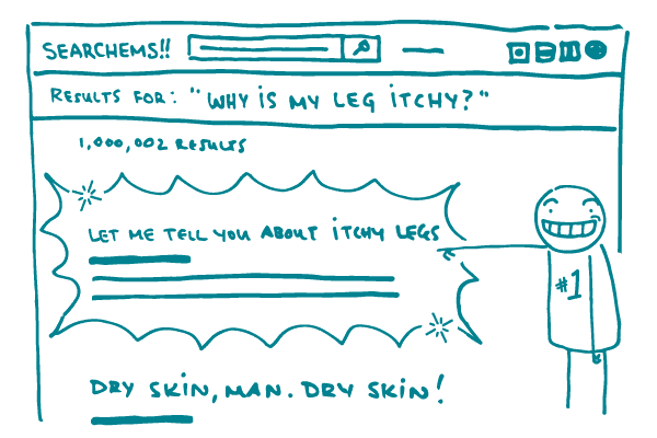
We self-professed health nerds love logic. We love researching, exploring, experimenting, and drawing conclusions. But even we don’t always rely on logic to make decisions in our day-to-day lives. Every day, people make decisions based on gut reactions — a phenomenon also known as the affect heuristic. These gut reactions cause us to automatically and unconsciously label things as good or bad in a split second.
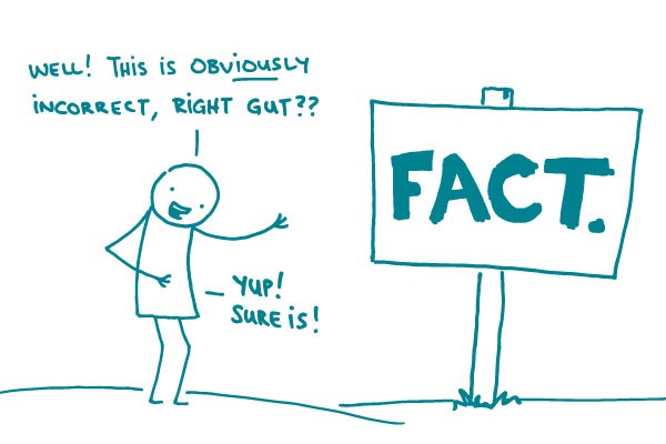
Gut reactions aren’t always bad. They tell us to stay away from rattlesnakes. They remind us to give a trustworthy person another chance. But there are occasions where gut reactions and actual facts are at odds. For example, many people who are afraid to fly still get into a car multiple times a day — even though, statistically, a car trip is much riskier.
When we’re communicating about health, we need to be particularly aware of our audience’s gut reactions. This dynamic is clearly playing out in the current discussion over a parent’s choice to not vaccinate their child.
Historically, the public health community has focused vaccine messaging around the importance of herd immunity, fighting back with statistics, and dispelling myths (which often involves repeating the myth — one of our health literacy no-nos). None of these methods have been particularly effective.
In contrast, the anti-vaccine community has relied almost entirely on eliciting emotional responses from parents. Support for the anti-vaccine movement is born from emotion: a parent’s fear that vaccines will harm their child, a parent’s instinct that they know best how to protect their child, or a parent’s mistrust of modern medicine.
Here’s the good news: with this latest measles outbreak, the public health community is countering the anti-vaccine base with an emotional appeal for vaccination. We’re telling parents why vaccines matter. We’re telling them that vaccines keep children and people with compromised immune systems safe. We’re putting a face to the outbreaks of vaccine-preventable disease.
And that evokes the emotional response that can help us change minds and get kids vaccinated.
The bottom line: Always address your audience’s gut reaction to a topic — it’ll help your facts go further.