Much Ado About Fonts

3 doodles converse in a library, with words in different fonts, including Gill Sans, Lucida Grande, and Georgia Palatino.

Just a mention of the font Comic Sans makes the designers at We ❤ Health Literacy Headquarters shudder. Some might call this font snobbery, but we prefer to think of it as a necessary part of being a dedicated plain language advocate. That’s because fonts are key to making content easy to read (or not).

Users are more likely to skip over content that looks overwhelming or hard to read — even if it’s written using simple words. Think of it like this: Choosing a font for your content is like choosing an actor to star in a play. The actor needs to look the part.

While there are now thousands of fonts to choose from — thanks to services like Adobe Typekit, Cloud.typography, and Google Fonts — this doesn’t necessarily mean that all available fonts are user friendly.

To improve readability:

  • Look for sans serif fonts. They tend to be cleaner and simpler (even though the great debate about the readability of serif vs. sans serif fonts is inconclusive). We like Verdana, Open Sans, and Proxima Nova.
  • Make the font large enough to read. For print, use at least a 12-point font — larger if you’re writing for older or low-vision populations. For the web, select 16 pixels or larger.

Lastly, make your font stand out! Show it off by including plenty of white space in the margins and between paragraphs.

The bottom line: For easy-to-read health content, use sans serif fonts and make them at least 12 point or 16 pixels.

How do you explain a deductible… in plain language?

Word deductible in large letters.

With the launch of the Health Insurance Marketplace on October 1, millions of Americans must quickly learn a foreign language: health insurance speak.

Many of these words and concepts are very complicated and technical. The trickiest ones have no simple plain language alternatives. Take the word “deductible.” It’s not an intuitive word, and it’s specific to two of the least understandable subjects: taxes and insurance. Yet understanding this word is key for making important financial decisions.

If we can’t simply substitute a plain language word or phrase for a complicated word, we teach readers about the term instead. That means both explaining what it means and giving examples.

When writing about a health insurance deductible, we might include a section like this:

What is a deductible?
Your deductible is the amount of money you have to pay for your health care before your health insurance plan will start to pay for medical services. In other words, your health insurance plan “kicks in” only after you’ve paid the amount of your deductible out of your own pocket.

For example: Your health plan has a deductible of $1,000. That means that you need to spend $1,000 of your own money on health care before your health insurance plan will start to pay for things.

There are some costs that your insurance will cover before you have paid your full deductible. There are also some costs that may not count toward your deductible. Contact your health insurance company if you have any questions about what’s covered or what counts toward your deductible.

As you can see, this can get a bit wordy. But if you’re able to drive home the meaning of important concepts like “deductible” for your readers, it’s worth it.

The bottom line: Like it or not, “deductible” is here to stay. Help your readers by putting it in context and providing relevant examples.

Other Things We ❤: usability.gov

Screen Shot 2013-09-26 at 1.25.56 PM copy

This week, we wanted to share one of our favorite online resources: usability.gov. Usability.gov is the federal government’s leading resource for free user experience (UX) resources, including guidelines, tips, and tools to help you make content easier to use.

So, why are we talking about usability in We ❤ Health Literacy? Because health literacy isn’t just about words — it’s also about how you organize and present those words. Health information needs to be presented in ways that make it easy to find, read, and use — so readers will want to interact with it.

Check out usability.gov (which was recently redesigned), and you’ll see that the site practices what it preaches. Look for:

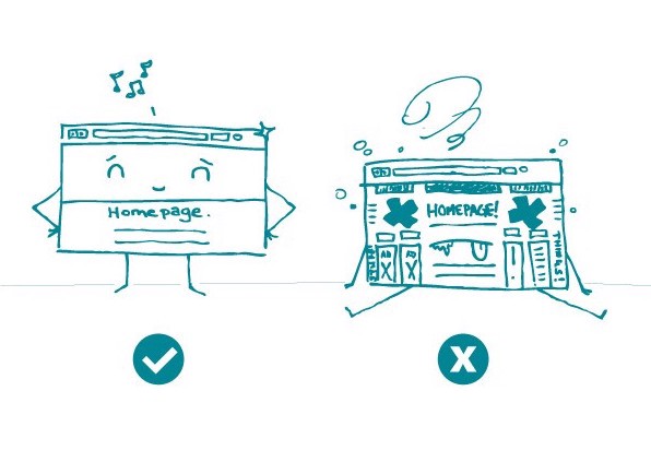
  • Big headers that clearly organize content
  • Plenty of white space that makes text easy to read
  • Adjustable font size on every page
  • Simple navigation with icons that guide users through the site

Today, people get health information in lots of different ways: from smartphones, tablets, computers, and more. Each of these sources presents its own usability challenges. That’s why we’re glad usability.gov is here to help.

Trust us — you’ll never use a yellow font again. Ever.

The bottom line: How you present health content is just as important as the content itself. Get tips at usability.gov.

Tell me a story, not statistics.

A person with a small cat on their head speaks to a group of people with cat-head, saying "I know it's hard to use the cat head shampoo every day, but it's worth it."

When we talk about storytelling in public health, we mean bolstering your campaign or intervention using personal stories of real people who have dealt with a health issue or condition. And there are many reasons to use storytelling to support your health messages.

Research has shown that storytelling improves people’s self-efficacy to make important changes to their health behaviors. Another benefit is that storytelling has the potential to change how people feel about health organizations and the information we communicate — and that’s a big deal.

A key step toward improving health literacy is treating patients as partners in their health care. When you use storytelling in messaging and materials, you invite “non-expert” voices into the conversation.

Study after study is sending the same message: if you want your public health campaign to reach people and make a difference in their lives, it helps to include stories of real people facing real health challenges. So in your next strategy meeting for a new campaign, remember to tell your target audience what they need to hear: a story.

The bottom line: Storytelling is an effective way to communicate your public health messages. Try it out!

Everybody’s talking about the Affordable Care Act.

09-ACA

Affordable Care Act (ACA), ObamaCare, Socialist Death Panel Tax: We’ve been hearing these names for years now. And with the October 1 open enrollment start date fast approaching, it’s pretty much impossible to avoid talk of health care reform.

But have you heard this? About half of us don’t understand it. That’s right, according to a recent Kaiser Health Tracking Poll, almost half of Americans say they don’t have the information they need to understand how the ACA will affect them. In fact, for many Americans, the ACA might not even be on their radar: 4 in 10 don’t know that the ACA is a law that will actually be enforced.

And here’s the catch: People who don’t have health insurance or who live in low-income households are less likely to know about the big changes coming to our health care system. Essentially, the people who don’t have enough information about the law are the same people the ACA is designed to help.

Perhaps you can guess where we’re going with this (hint: what do we love?). Yep, these groups are also disproportionately affected by limited health literacy. And we’d argue that with numbers like these, the confusion about the ACA is putting the problem of health literacy in the spotlight.

So no matter what you call it, let’s keep talking about the ACA. People need to hear it.

The bottom line: A lot is riding on our ability to understand the ACA. Health literacy is more important than ever.

Which is better: a photo or an illustration?

2 side-by-side images: a photo of a person stirring coffee, and step-by-step illustrated instructions for stirring coffee.

Have you ever had trouble choosing between using photos or illustrations for your health materials? It’s not always black and white (ha!). Here’s a nifty trick to help you decide: think about your main objective. Is it most important to make a personal connection with your readers? Or are you trying to convey something more like an abstract idea or process?

If you answer, “I want to make a personal connection with my readers,” you’re probably better off using a photo. Photos evoke emotions. If the woman on the diabetes website looks like she could be your grandmother, good. That’s the idea. Photos help people feel like they’re in familiar, friendly territory — which can help readers connect with your message.

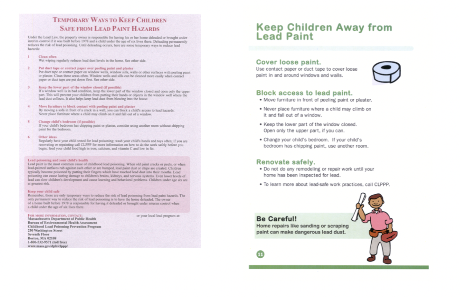
If you answer, “I want to convey an abstract idea or process,” simple illustrations or icons may work best. At We ❤ Health Literacy Headquarters, we’re often tasked with creating visuals for concepts (like user-centered design) or multi-step actions (like how to safely wipe up lead dust). These concepts can be difficult to convey with photos.

Worried about cost? We know that creating original illustrations and icons can be pricey. The Noun Project is one of our go-to resources for a wide variety of free or low-cost icons and symbols. Whether you need an icon for happiness or a helicopter parent, there’s an option for you.

Smiling icons of faces entitled "The Happiness Collection"                Helicopter parent icon

The bottom line: Visuals are really important. Use an illustration to convey an abstract idea or process. Use a photo to evoke emotion.

When It’s Helpful for One to Write 1

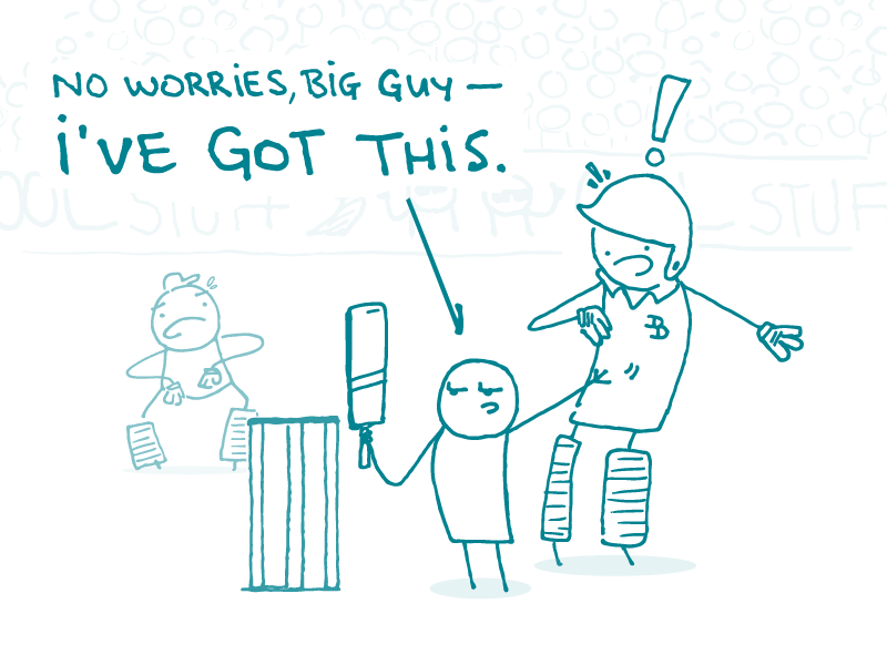
Doodles at a sports game with jerseys with spelled out numbers, while a confused doodle looks on, wearing a regular jersey with a numeral.

What was the rule in English class again? Write out all numbers under 10 as words (so, one through nine) then switch to numerals at 10? That sounds right. But wait, maybe ten should be spelled out, too…

Never mind. We’d like to introduce a new rule. When writing about health for consumers, write every number as a numeral. 1, 2, 3, 4, 5, 55, and 100 — they’re numbers, after all.

Why? Because presenting numbers clearly and consistently can help readers with limited literacy skills know what they’re dealing with. And when it comes to math, most of us need a little help.

Health information involves a lot of numbers. Among others, these numbers include:

  • Levels (blood glucose, cholesterol)
  • Doses (2 tablets, 1 tablespoon)
  • Vital signs (heart rate, blood pressure)
  • Frequencies (once a week, twice a day)

And those are just the basics! People also need to make calculations (like figuring out what a 20% increase would be) and evaluate risk (like whether a 1 in 10 chance of side effects is good or bad).

When the information is complicated, we need to make it as clear, simple, and accurate as possible — including writing numbers as numerals.

The bottom line: When writing about health for a general audience, write every number as a numeral.

Plain language is not “dumbing down.”

Illustration of tired confused doodle listening to another doodle say "blah blah blah blah what you need to know blah blah blah"

Want to know the quickest way to upset a writer at We ❤︎ Health Literacy Headquarters? Say that writing health content in plain language is “dumbing down” the information. This not only upsets us, but it insults the 9 out of 10 Americans who struggle with understanding and using health information.

A big part of the “dumbing down” myth stems from the need to limit information. Deciding between need-to-know and nice-to-know information is an important step in developing clear health communication materials. We often hear medical experts say that if we don’t give people all the information, we’re doing them a disservice. But we argue that the disservice is in overwhelming people with so much information that they miss the key message.

If your mechanic gave you a detailed explanation of how your car engine worked every time you went for an oil change, you would probably:

  • Have no idea what she was talking about
  • Zone out
  • Start looking for a new mechanic

Most people just want to know whether their car is okay, and if not, how much it will cost to fix it. If they want to know more, they’ll ask.

Being clear, straightforward, and easy to understand isn’t dumb. In fact, it’s really quite smart — and a challenge to do well. If it were easy, everyone would be doing it!

The bottom line: Plain language is smart. And when you use it to write health information, there are big payoffs for readers.

CAPS unLOCK

A doodle at a library saying "HELLO DO YOU HAVE THE LATEST BOOKS PLEASE" to a startled librarian, while another doodle says, "Shh! Please turn off your caps lock voice!"

Let’s be honest — how many times have you gotten an email written in all caps that has left you with a positive impression? Never, right? Except maybe that email letting you know YOU WON THE LOTTERY!

Fantasies aside, a quick survey of folks at We ❤︎ Health Literacy Headquarters shows that getting an email in all caps leaves the reader feeling that the author:

  • Is angry and yelling
  • Doesn’t have the vocabulary to get his point across
  • Must be working on an ancient computer that doesn’t have different font styles to indicate emphasis
  • Accidentally hit the “caps lock” button when she fell asleep on her keyboard

In addition to leaving us with an all-around yucky feeling, the consensus is that using all caps negatively affects readability and legibility. Most people read by scanning the shapes of letters. Using all capital letters removes a lot of that variation — forcing the reader to work harder to understand the text.

Don’t believe us? Compare these examples:

  • If you need a nurse right away, dial 111 on your bedside phone.
  • IF YOU NEED A NURSE RIGHT AWAY, DIAL 111 ON YOUR BEDSIDE PHONE.

Now ask yourself:

  • Which one of those would you prefer to read when you’re sick, stressed, and confused?
  • Which version makes it easier to scan and find the emergency number?

The bottom line: Do your readers a favor and unlock your caps.

What goes in must come out.

A teacher says to a gathered class of young children, "Gather round, kids! Today's book is 'Everyone defecates'" while a child looks on, saying, "It's POOPS!"

Here at We ❤︎ Health Literacy Headquarters, our goal is clear communication. Whenever we use a medical term or other jargon in consumer materials, we offer a plain language definition using everyday words. Most of the time, this is a fun and interesting challenge.

But then there are the times we need to define things that people don’t like to talk about — like bodily functions (even that term is problematic!). When it comes to our bodies and what comes out of them, we’re faced with 3 categories of terms:

  • Medical/clinical (like defecate, urinate, and vomit)
  • Words for kids (think poop, pee, or puke)
  • 4-letter words for grown-ups that we won’t print here

What’s a plain language health writer to do? Using only medical terms sounds impersonal and detached — and your audience might not know what you’re talking about. Using the words for kids may give the impression that you’re talking down to your audience. And using the 4-letter words… well, we like having clients, so we don’t see that as an option.

The answer is to keep it simple. Usually this means providing the medical term and then using familiar words from childhood to define it. For example:

  • Diarrhea (watery poop)
  • Vomiting (throwing up)

Is it ideal? No, but it gets your point across! After all, it’s better to be understood than to be demure.

The bottom line (no pun intended): Always give a plain language definition for medical terms, even if it means using slang or words from childhood.