The holidays are upon us, dear readers. Festive sights, sounds, and smells abound, and we hope you’re enjoying the season as much as we are. To that end, we wanted to bring you a special holiday treat!
Here’s the deal: Our darling Betti the Plain Language Yeti is on a quest for the Gift of Plain Language, and it’s up to you and your plain language know-how to help her! Using your keyboard, follow the path and choose plain language words to get to the center of the maze. And keep an eye out for some of our Doodle friends — following directions isn’t really their strength…
The bottom line: Warm wishes and holiday cheer to you and yours from all of us at CommunicateHealth!
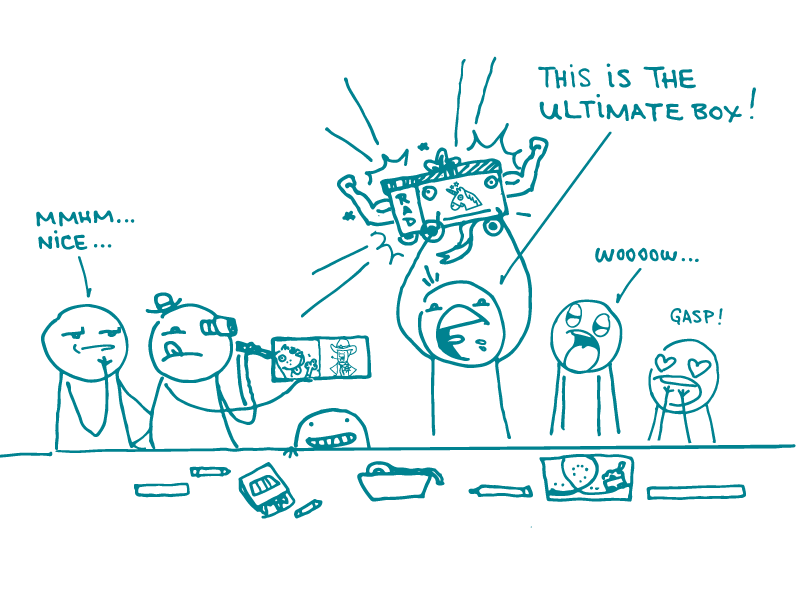
Is your team lost in the product development process? Do you want to see how someone else might envision this thing you’re making? Maybe you’re interested in getting at the je ne sais quoi of a successful product? Never fear, dear readers! Our latest installment on testing techniques is about “design the box,” a research activity that asks participants to decorate a physical box representing a (digital or tangible) product.
The goal of design the box is for participants to capture the product’s most important qualities and visually represent how they could be displayed — and how they might interact with each other. Folks can do this by writing words on the box, gluing magazine pictures to it, or any other crafty approach they please.
To prepare, you’ll need to gather supplies — including, of course, boxes (shoeboxes work great). You’ll also want to provide things like markers, scissors, tape, magazines…you get the idea. Then divide participants into teams. We find that teams of 3 to 6 people work well, but if you have fewer people, you can also have people work in pairs.
Now it’s time for participants to channel their creativity! Ask them to imagine that the box is the package for the product in question — and their job is to design it in a way that helps sell the product. For example, if you’re working on a new app for tracking physical activity, you can tell participants to think about things like:
Who is the app designed for?
What’s important to that audience?
What will make them want to buy and use the app?
What makes this app different from other, similar apps?
Give teams a set amount of time to design their box — say, 30 minutes — and ask them to prepare some talking points about why they designed the box the way they did. When time’s up, have each group present their creation. Then facilitate a sure-to-be enlightening discussion about participants’ choices and their vision for the product.
Keep in mind that participants can be either internal stakeholders or end users of the future product. Each of these groups represents a unique perspective. If you can, do 2 separate sessions with both types of participants!
The bottom line: Design the box taps into creativity, collaboration, and fresh perspectives for product development. It might just be exactly what your research process needs.
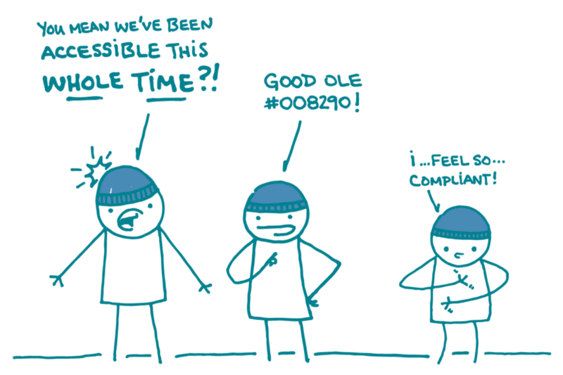
Here at We ❤︎ Health Literacy Headquarters, we always have accessibility in mind — but on this day each year we think about it with a little extra love. That’s because it’s Blue Beanie Day, a worldwide celebration of the importance of web design that makes content accessible to and usable for people with a diverse range of needs. (Hooray!)
As you may know, dear readers, we’ve shared accessibility tips before — on topics like alt text and labeling, designing for keyboard navigation, and accessibility plug-ins. This week, we’d like to draw your attention (get it?) to color contrast.
Color contrast is the difference in color between elements on a page. Things with low contrast (for example, dark blue text on a black background) can be hard to see. Using text with high contrast (like black text on a white background) makes your content easier for everyone to read — and it’s especially important for people with low vision.
So, how much contrast is enough? We recommend using Section 508 guidelines. Check out these tools to make sure your site passes high-contrast muster:
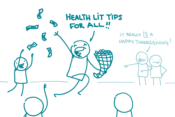
It’s that time again, dear readers, when we say to you: Happy Thanksgiving! As always, we’re thankful for all of you — and for the chance to chat about health literacy with you every week.
With all the focus on food and cozy indoor hangs this time of year, there are plenty of opportunities to share health information related to physical activity and nutrition. But it’s important to make sure those turkey tips and ground rules for the dinner table are accompanied by a dash of plain language — and a generous helping of sensitivity.
With that in mind, we’ve harvested a cornucopia of tips to help you communicate about Thanksgiving so everyone feels like they have a place at the table.
Acknowledge the holiday’s less-than-savory origins. You can promote safe turkey-cooking temperatures without erasing Thanksgiving’s colonialist history. For starters, skip the graphics of smiling Pilgrims and Native Americans.
Make room for diverse food traditions. Biscuits or corn bread? Apple or pecan pie? There are lots of regional, ethnic, and cultural differences on the Thanksgiving menu. Be aware of the range of traditions, and remember that not every table has a turkey on it!
Balance health with happiness in menu advice. Healthy food choices are important, but so is sharing and enjoying food with family and friends. Focus on the health benefits of a homemade meal instead of the pie-related value judgments — because no one is ever thankful for body shaming.
Skip the tips for “working off” the feast. We all know physical activity is key to good health, and it’s no secret that Thanksgiving means extra calories. But rather than focusing on stressful caloric calculations, try highlighting fun ways to help families get moving together. After all, spending time with loved ones is the real reason to celebrate.
The bottom line: When writing public health messages about Thanksgiving, a bit of sensitivity and thoughtfulness can make a big difference.
As longtime We ❤︎ Health Literacy readers know, all content is not created equal. Some words, phrases, or ideas are usually more important than others. So how can you draw attention to your high-priority content?
Designers have all kinds of fancy tricks up their (super-fashionable) sleeves. But today we’d like to focus on bolding, a simple visual cue that you can use to emphasize any content — no designer needed.
Bold text is easy to read, and it really stands out on a page. Done right, it can help people find and understand your key ideas and messages — especially readers who are skimming or scanning.
We use bold text for most of our emphasizing needs, including:
Highlighting the topic of a bullet or paragraph, so readers who skim can quickly see what the section is about
Calling attention to a particularword, especially if we’re teaching a key word they might see again
Underscoring key takeaways — 1 or 2 sentences max!
Why do we like bold best? Because it’s head and shoulders above the alternatives:
Underlining also isn’t great for readability. And, in our digital world, users can easily mistake it for a hyperlink. Next, please.
Italics can be hard to read for users with lower literacy levels, so we mostly avoid them in plain language materials. For savvier audiences (like you, dear readers), we use ’em sometimes — mostly to stress a single word or to indicate a book title or foreign phrase.
Remember, when you’re bolding, a little goes a long way. It can be tempting to just bold everything — but trust us, it’s not a good look. If everything is emphasized, nothing stands out. And patchybolding is especially confusing — readers often don’t know where to look, and they can end up feelinggoogly eyed, woozy, and disoriented.
The bottom line: Bold text draws your readers’ eyes to key messages and ideas. Use it wisely!
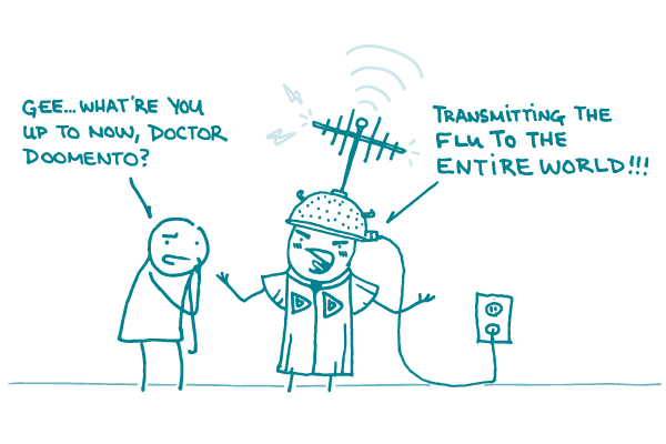
Alt: A doodle says, “Gee… what’re you up to now, Doctor Doomento?” A doodle with an antenna on its head says, “Transmitting the flu to the entire world!!!”
It’s time for yet another installment in our “use simpler words” series. This week’s target: “transmit.”
Why? Because this verb sounds like it’s straight out of a sci-fi novel or ham radio how-to. And the related noun, “transmission,” is more hot rod than Hot Zone.
Consider these examples:
The flu can be transmitted easily from one person to another.
Mothers who take HIV medicine while they’re pregnant can lower the risk of mother-to-child HIV transmission.
Holy jargon, Batman! All this fancy fuss, dear readers, when we could use a plain language word like “spread” or “pass.”
Try these instead:
The flu can spread easily from one person to another.
Mothers who take HIV medicine while they’re pregnant are less likely to pass HIV to their babies.
The bottom line: When writing about infectious diseases, skip “transmit” and use “spread” or “pass” instead! (When writing about radios, aliens, or cars, it’s up to you.)
Have you ever wondered why you say hello when you’re introduced to someone or put on clothes before you leave the house? It’s not because you have to, dear readers. It’s because it’s the norm — the social norm, that is.
Social norms are a set of unspoken rules for acceptable behavior in a group or society. Behavior that’s outside of social norms may seem rude or offensive — or, at the very least, odd.
Think about the last time you ate at a restaurant. Did you eat your soup with a fork? Yell “Potty time!” when you got up to use the restroom? Or perhaps you helped yourself to your neighbor’s dessert? If you answered no to these questions, congratulations! You’re clearly an expert on social norms.
Social norms are everywhere, and they can be exceedingly useful in the realm of public health and health communication — you know, our very favorite realm. Studies have shown that social norms can influence health behaviors like eating habits and physical activity. Or take teen vaping: Teens who think it’s normal for their peers to vape are more likely to start doing it themselves.
These unspoken rules can help us understand, predict, and influence health behaviors. For example, this message challenges misconceptions and helps establish a healthier social norm: “Everyone is notdoing it — in 2021, about 8 out of 9 high school students said they aren’t vaping!”
As health communicators, we can use the power of social norms to encourage healthy behavior change. So give it a try! After all, everyone’s doing it.
The bottom line: Harness the power of social norms to promote healthy behaviors.
Today, we’re digging a little deeper into a topic near and dear to our ❤︎s: user testing! Diehard We ❤︎ Health Literacy fans have read our tips and musings on user testing techniques like focus groups, usability testing, and tree testing. One question we get a lot is: “Where do I actually do the testing?”
Never fear, dear readers, you have options! You can do user testing either in person or remotely. Here are pros and cons of both options.
In-person testing You can do in-person testing any number of places, from a fancy observation lab to a public library or community center. Choose a space that’s comfortable and conducive to a friendly chat.
Pros:
It’s easier to build rapport with people when you’re face to face.
You can see participants’ body language and facial expressions, which can be telling — especially for sensitive topics.
It’s easier to do certain activities, like collaging, in person.
Cons:
Renting out a research facility can be expensive, especially if you need an observation room.
Traveling to the testing location may be a barrier for some participants.
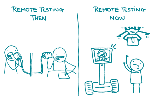
Remote testing There are lots of free or inexpensive tools available to help you do user testing from anywhere. For example, you can conduct interviews over the phone or lead focus groups via video chat.
Pros:
It’s generally less expensive than renting a facility.
Some participants, like busy professionals, may find it logistically easier to volunteer for remote testing.
For testing methods where you need a larger number of participants to get valid results, like card sorting, remote testing can be more convenient.
It’s easier to get geographic diversity in your mix of participants.
Cons:
Using technology can be a barrier for some folks, including those who are likely to struggle with health literacy.
You’ll miss out on participants’ body language and non-verbal cues.
There’s always the risk of a technical glitch or outage.
The bottom line: When it comes to user testing, both in-person and remote testing have pros and cons. Pick the approach that’s best for your project!
In our last social media installment, we talked about Facebook, ruler of the social media kingdom. Today we’re moving on to another key player in the social media game — Facebook’s little brother, if you will: Instagram.
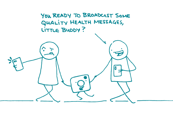
Instagram is the biggest photo-sharing app. What does this mean for you, dear readers? New and exciting opportunities to share relevant and meaningful content with your audience! It’s a great way to start a conversation about health — and you know we ❤︎ that.
Let’s dive in. Here are just a few of the things you can do with Instagram:
Model healthy behaviors. Every day, Instagram is flooded with workout tips, healthy recipes, and inspirational messages to help people live happy and healthy lives. This makes it a great place to share your health messages.
Get real. A picture is worth a thousand words — and when it shares a story from someone directly impacted by the work you do, it’s worth even more. Instagram is the perfect place to get up close and personal so users feel connected with your brand and inspired to engage.
Dress up your data. Grab your audience’s attention and spread awareness about the importance of your work by sharing facts in a way that’s visually appealing, like with an infographic or interactive video.
Promote content for a wider reach. If it’s in your budget, paid promotion is a great way to make sure your target audience sees your content. Plus you can run ads on both Facebook and Instagram using Facebook’s Ad Manager platform to maximize your potential reach.
The bottom line: Use Instagram to share real, relevant, and visually engaging health information with your audience.
It’s probably not news to you that the United States has high rates of obesity, and that the public health community has identified the issue as a top priority. Obesity is something that health communicators often need to write about — and it can be a tough subject to tackle.
There’s strong evidence that overweight and obesity are correlated with a host of health conditions, including high blood pressure, type 2 diabetes, depression, and arthritis. But the fact is that improving health outcomes isn’t as simple as telling people to lose weight. People with obesity have likely been told to lose weight throughout their lives, and many have already experienced cycles of weight loss and regain.
So how can you write about weight in a way that’s actionable, compassionate, and effective? We’ve shared general advice for writing about sensitive topics before, but today we’re adding a few weight-specific tips:
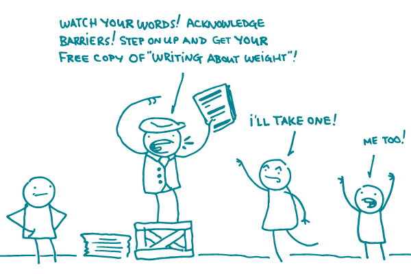
Watch your words. Use person-first language and avoid stigmatizing terms like “morbidly obese.” Remember, no one is their disease. Consider writing about people who have overweight or obesity rather than people who are overweight.
Skip the value judgments. Avoid language that places moral value on food, like talking about “good” and “bad” foods or “guilt-free” substitutions.
Acknowledge barriers that people may face, like issues with access to healthy foods and limited opportunities for safe, affordable physical activity.
Use images your audience can relate to. Choose realistic images with people of all sizes engaging in healthy behaviors.
Focus on specific stepspeople can take — like trying new vegetables or getting more physical activity — that can improve health regardless of whether they result in weight loss.
And keep in mind, dear readers, that these tips aren’t just for consumer materials. Doctors often have their own biases about weight, and that can translate to worse health outcomes for people who have overweight or obesity — even if their health concerns aren’t related to weight at all.
By writing in a positive, non-judgmental way, health communicators can model respect and help make sure biases don’t get in the way of good health care. And we really ❤︎ that.
The bottom line: When writing about weight, there’s a lot you can do to create respectful, empowering health messages.