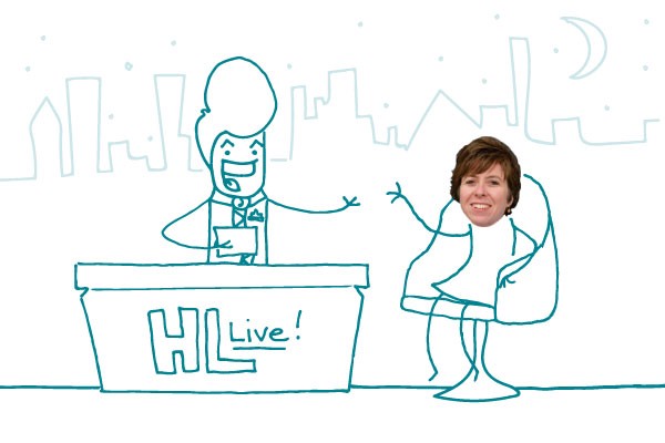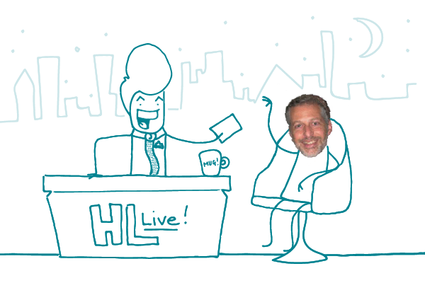
“Health Lit Live” is our series of interviews with the movers and shakers on the health literacy scene. In this edition, our imaginary illustrated host Doug Doodleman sits down with renowned health literacy expert — or as he describes himself, “notorious health literacy recidivist” — Dr. Michael Paasche-Orlow, Professor at Boston University School of Medicine. Dr. Paasche-Orlow collaborated with the National Library of Medicine (NLM), RTI International, and CommunicateHealth to create the Health Literacy Tool Shed.
Doug: Welcome, readers! Today we have — who is this? Oh yes, Dr. Paasche-Merlot, who’s going to chat with us about this Health Literacy Tool Shed he helped develop in his backyard.
Paasche-Orlow: Thrilled to be here!
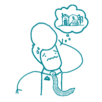
Doug: Listen, I’m going to cut right to the chase. I already have a tool shed in my yard. It’s kind of ramshackle and I’m a little scared to go in it because tools can be so pointy. And, you know, spiders. I ask you this: Why should I go in your tool shed?
Paasche-Orlow: Doug, I’m going to be blunt here. It’s not that kind of tool shed. It’s a growing, curated online database of over 200 validated health literacy tools and assessments. It’s on the web, but there are no spiders.
Doug: Oh, they’re tools you get on the interwebs, eh? So tell me what these e-dealies do.
Paasche-Orlow: Well, health literacy is often a key variable in research. We want to know things like: How might a person’s health literacy affect her overall health? Or, did a new health campaign have an impact on a population’s health literacy? We need reliable tools to measure health literacy to find that out.
Doug: That makes sense.
Paasche-Orlow: There are a lot of health literacy assessments out there — many have been developed in just the last 10 years. Our idea was to create an interactive, one-stop shop where researchers could check out a variety of these tools and choose the one that best meets the needs of their project.
Doug: How would a researcher actually use the Health Literacy Tool Shed?
Paasche-Orlow: You can browse the tools or sort them by different criteria — like the type of health literacy you’re measuring, the specific focus, language, or how long it takes to do the assessment. Once you find what you need, you download it.

Doug: Cool! So can anybody hang a tool up in the shed? Just so happens I whipped up this pretty sweet tool backstage on construction paper with crayons and glitter and macaroni and —

Paasche-Orlow: Afraid not, Doug. We have clear criteria for what gets included. For example, every tool has to have been published in a peer-reviewed journal — we need a clear description of how the tool works and how it was developed.
Doug: Bummer. So how extensive is this collection? Do you have a measure of health literacy related to, say, dentistry and oral health?
Paasche-Orlow: We have several, actually.
Doug: Color me impressed. How about a tool to assess health literacy in Cantonese-speaking patients with diabetes?
Paasche-Orlow: Yep.
Doug: Amazing! What about a tool to assess “transcripts” of fictional health literacy focused talk shows hosted by fabulously telegenic doodles — in Elvish?
Paasche-Orlow: You got me on that one.

Doug: Kind of an oversight, don’t you think?
Paasche-Orlow: Sure, Doug. But you can suggest it using the online form on the website. We encourage users to recommend tools they think we should add, so the site is as useful as possible.
Doug: Ooh! I’ll do that right now! Thanks! And readers — take a shortcut through the Internet’s backyard to the Health Literacy Tool Shed! Lots of helpful assessment tools! And no spiders!
The bottom line: The Health Literacy Tool Shed is a one-stop shop for quality health literacy assessment tools.
![doodle_102215[1][1]](/wp-content/uploads/whhl/doodle_10221511.png)