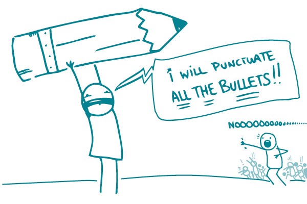
As bulleted list enthusiasts, we often get asked about how to punctuate them. Style guides are all over the place on this issue, but we like to keep it simple (no surprise there). That’s why our answer is: Whenever possible, don’t punctuate bullets in consumer health materials.
If you have a list of things or incomplete sentences, never punctuate them.
We ❤ Health Literacy is:
An excellent resource that I forward to all my friends
The best
Helpful
If you have a list of complete sentences, you really don’t need to punctuate those either.
Our favorite use of lists is for action items. Be sure to:
Use lists to break down information into helpful pieces
Add lists to your top 10 favorite things
Make lists about lists every day
See? Clear information, no punctuation needed!
If you feel like your list isn’t clear without punctuation, rethink it. Does the information need to be broken down into smaller chunks? Is it more appropriate for short paragraphs than a list?
And please, whatever you do, don’t use semicolons.
The bottom line: Keep your bulleted lists simple and skip the punctuation.
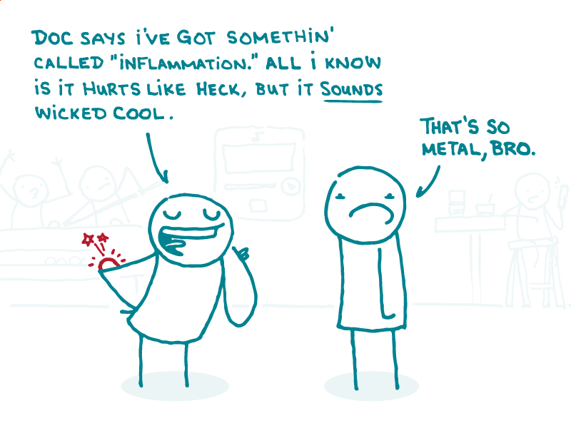
Alt: A doodle says, “Doc says I’ve got somethin’ called ‘inflammation.’ All I know is it hurts like heck, but it SOUNDS wicked cool.” Another doodle says, “That’s so metal, bro.”
Picture this: you’re drafting an oh-so-health literate health material, slicing through jargon with your razor-sharp plain language skills, when you hit a medical term that leaves you stumped: the dreaded “inflammation.”
At first, you may think it’s an easy fix. In plain language circles, it’s not uncommon to say inflammation = swelling, the end! But not so fast. “Swelling” might work for an inflamed knee or elbow, but what about chronic inflammation that causes sneakier problems?
The truth is, inflammation isn’t the same as its symptoms — it’s a complex process in the body. So unfortunately, you can’t change every “inflammation” to “swelling” and still be medically accurate.
So what’s the solution? As is so often the case, it depends on the context. First, decide if your audience needs to know the word “inflammation” at all.
When people have inflammation from a cut or injury, they may not need to know the underlying cause of their symptoms. So stick to what they can actually feel or see.
Instead of:
Call your doctor if you see signs of inflammation near the cut.
Apply ice to reduce inflammation in the knee.
Try:
Call your doctor if the area near the cut gets red, swollen, or hot.
Put ice on your knee to help reduce swelling.
But when people have inflammation as part of a chronic disease, they need to know the lingo — and “swelling” won’t cut it. In that case, follow these tips to explain inflammation:
Start with the system. Inflammation begins with the immune system — so your story should, too. Explain how inflammation can mean that the body is fighting an infection — or, in the case of autoimmune diseases, that the body is fighting… itself.
Skip cytokines and the like. As a health whiz, you may be comfy discussing all the teensy molecules at work in inflammation. But people with complex health conditions are likely already drowning in scary jargon. So don’t drag their attention down to the molecular level.
Tailor the symptoms to the situation. In some health conditions, swelling might be the only sign of inflammation. But inflammation can also affect less visible body parts, like the heart — and cause more subtle symptoms, like fatigue. So list specific symptoms for each condition, and ditch the one-size-fits-all approach.
The bottom line: Don’t inflame your readers with unnecessary “inflammation” — and when you need to use the word, explain it in plain language.
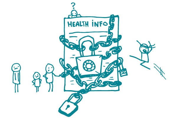
Let’s face it: The best-written web content is useless if your audience can’t access it. Many of us take our ability to find information online for granted, but did you know that about 1 in 5 people copes with some type of disability? Unless you make sure your content is accessible, many people may not be able to get your otherwise wonderful health information.
Don’t panic. We’re here with some tips to make your web content accessible to everyone.
Images Many people with disabilities use assistive technologies, like screen readers, to access information on the web. Screen readers are software programs that “read” electronic text and graphics out loud. They allow people with visual impairments to hear what’s being displayed on a screen. That’s why you need to include clear text descriptions of the images you use in your content. This language is called alternative (alt) text.
Good alt text is descriptive and explains not only the image, but also how it relates to the content on the page. For example:
Okay: “man washing hands”
Way better: “a man washes his hands with warm, soapy water before cooking his meal”
Content The most important step you can take is to follow health literacy best practices and make sure content is clearly written and easy to read. But you already knew that! Also be sure to provide:
Headings for text and tables
Alt text for images and graphics
Link labels that make sense out of context — for example:
Okay: “Sign up”
Way better: “Sign up for the We ❤ Health Literacy weekly email”
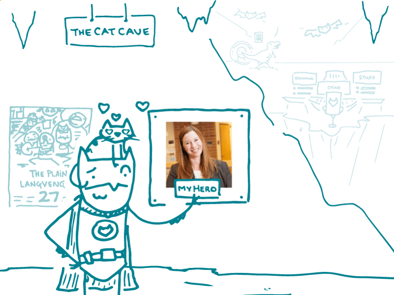
Alt: A superhero doodle looks at a framed picture of Grammar Girl labeled “My Hero.”
Are you looking to settle a heated grammar debate with a coworker? Maybe you’ve come to harsh words over the Oxford comma and need some backup? Or perhaps you can’t remember precisely what a comma splice is, but you have a sinking feeling you may have spliced something you shouldn’t have?
Well good news, fellow grammar nerds (and grammar newbies): there’s a superhero ready to come to your rescue. And her name is Grammar Girl.
Grammar Girl’s tips and podcasts are smart, useful, and fun — just how we like ’em! Because here at We ❤ Health Literacy Headquarters, we know there’s no reason for grammar rules to be boring and incomprehensible.
Seriously, who wouldn’t want to learn how to kick your annoying preposition habit? Well, not your habit. We’re not saying that you, dear reader, have an annoying preposition habit. But if you have a colleague who does, you might want to “accidentally” send them this link — or any of the other handy tips that Grammar Girl churns out on a regular basis.
Whether you’re looking to polish up your own prose or hand out some helpful content at your next staff meeting, look no further than Grammar Girl. We ❤ her — and we think you will, too!
The bottom line: No matter what your level of word nerdiness, Grammar Girl has tips to up your grammar game.
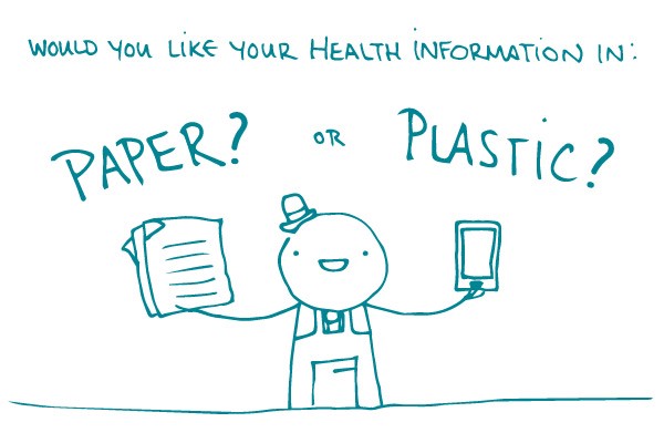
So, what does this mean for those of us who strive to make health information easy to find, understand, and use? Should we forget about pamphlets and focus on widgets?
Not necessarily. Some groups, like people with disabilities, still have limited access to certain technologies. And some people say they don’t use the internet because they don’t know how or find it frustrating.
Before you jump to coding, learn about your audience. If they’re glued to their smartphones, a mobile app might be a good fit. If they don’t own mobile phones or have internet at home, an ol’ fashioned print material may work best.
Remember that a brochure or fact sheet created with the user in mind will be more effective than a website developed in a vacuum.
The bottom line: Avoid developing digital resources just because they’re trendy. Choose the format that’s most appropriate for your audience.
There’s been a lot of buzz lately about medication adherence. It’s understandable, of course. Doctors who prescribe medicine want patients to take it as directed. Patients who are prescribed medicine want to feel better.
But following prescriptions, especially multiple daily prescriptions, is hard. So let’s not make it worse by using overly complex language to talk about it.
Saying “medication adherence” is okay when talking to your colleagues… if you must. But when you’re talking to or writing for patients, throw it out the window! There are many better and clearer options. For example:
It’s important to follow the directions for taking your medicine.
Follow all instructions for your medicine.
Learn about your medicine and take it correctly.
Take your medicine as prescribed.
Take your medicine as directed.
Thus, we challenge you never to write something like: Medication adherence is an important part of being actively involved in your health care.
Don’t do it! The message might not stick. Instead, try one of our friendly, plain language alternatives. Or write your own. We know you can.
The bottom line: Stick to plain language and skip “medication adherence.”
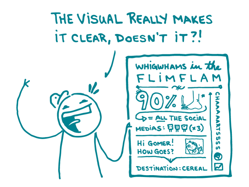
Alt text: A doodle gestures at a complicated illustration and asks, “The visual really makes it clear, doesn’t it?!”
A while back, we talked about the dangers of crummy stock photos. This week, we’re tackling a different variety of dangerous visual: bad illustrations.
It’s no wonder that health communicators love illustrations. Lots of people learn better when information is presented visually, and a good illustration can make your point more elegantly and directly than text alone.
But illustrations can also go so, so wrong. Whether the offender is a cartoon, chart, graph, or infographic, a bad illustration can really muck up your health materials.
[Disclaimer: We’ve probably all created a bad illustration at some point in our careers. People in glass houses, etcetera. But in the name of health literacy, let’s pick on a few.]
We’re pretty sure the message here is: a California Raisin invites yellow peanut M&Ms on a wild ride through your innards. And what do you, the host of this internal-organ slip n’ slide for snack foods, get in return? Hairy, swollen, purple feet — and kidneys where your lungs should be.
The takeaway here? True love means sacrificing your eyes and blasting polka dots from your lungs into your partner’s gaping face hole.
But not all bad illustrations are confusing (or disgusting). Many of them just don’t need to exist. They may look fine at first glance, but then…
When all you’ve got is 2 numbers showing a boring 10 percent difference, spice things up by adding a meaningless x-axis, unnecessary lines, and 4 different colors. Voila! It’s argyle.
Heed these warnings, dear readers. People look to illustrations to help them understand what you’re talking about. So don’t make them waste their time trying to understand nonsense.
The bottom line:Don’t toss in illustrations or infographics just because. Use them carefully — and make sure they communicate your message clearly.
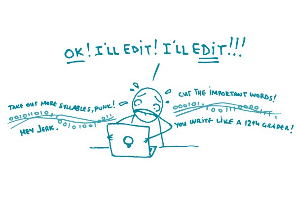
Readability formulas give you a rough idea of how easy a material is to understand, but they’re imprecise and often inaccurate. Nearly everyone agrees on their limitations, yet many agencies and organizations require materials to meet a certain readability score. Why?
First, readability scores have been around a long time — the earliest Flesch formula is almost 70 years old — so people trust them. They have the feeling of tradition, objectivity, and scientific rigor. People like the idea of a systematic way to evaluate good writing.
Second, they’re just so easy to use. When you finish writing, you run the Flesch-Kincaid analysis built into Word, tweak a few sentences, and boom, you’ve done your plain language due diligence. Easy-peasy.
Third, there’s the issue of scalability. Let’s say you’re a huge hospital or health plan and you need some way to make sure all of your communication materials are clear. What are your options? Some organizations will invest in training and building the capacity of their communication staff (hooray!), but many will turn to an automated readability formula.
Readability formulas aren’t awful at evaluating finished text — as long as you remember they’re a hint that you’re on the right track and not a seal of approval. The problems start when you use a readability score as a be-all and end-all measure. They easily tempt good writers into writing like bad writers in order to beat the formula at its own game.
For instance, let’s say you wrote this:
If you have any of the following symptoms, you might have a life-threatening infection. It’s very important for you to go to the hospital right away.
Seems pretty clear, but it scores a 9.2 grade reading level. Not good. So you try again.
If you feel sick, go to the hospital.
A score of 2.2! You totally nailed it.
And there’s the problem: You use shortcuts to get the score you want. You cut out a perfectly clear word (like “important”) because it has more than 2 syllables. You skip key concepts because they require words that will bump your score higher (like “life-threatening”). If you do these things, you will get a lower score — but it will also be much harder for your reader to get the full context of your message.
You’re a good writer — don’t let an algorithm boss you around.
The bottom line: Don’t go for the quick fix of a low readability score. As you write and edit, let the subject and your audience guide you — and trust your communication experience.
The Nielsen Norman Group (NN/g) is a leader in the field of user experience. And we really, really ❤ improving a user’s experience.
They offer many of their reports for free. If you’re looking for tips on recruiting for usability studies, making an iPad app, or improving the accessibility of your website, check them out!
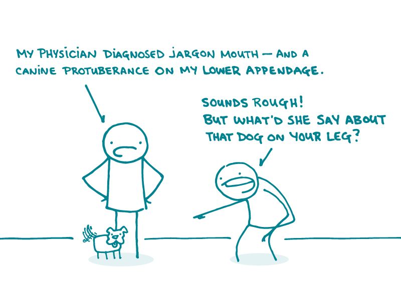
Alt: One doodle with dog leg says to another doodle, “My physician diagnosed jargon mouth — and a canine protuberance on my lower appendage.” The other doodle says, “Sounds rough! But what’d she say about that dog on your leg?”
Google “diagnosis and prognosis” and you’ll find a whole bunch of webpages devoted to explaining the difference between these 2 words. And the difference is clear — diagnosis is what you have, and prognosis is how it will probably play out.
So why all the confusion, dear readers? Most of us only hear these words in a medical context. And that context may be scary! When someone’s getting a stressful health update, it’s no time to make them parse medical speak.
That’s why we say avoid the diagnosis-prognosis confusion altogether and skip ’em both.
For diagnosis, just tell people what they have.
Instead of: He was diagnosed with jargon mouth disorder.
Try: He found out he has type 2 jargon mouth.
Instead of: Your diagnosis is dog leg.
Try: You definitely have dog leg. Anyone can see there’s a dog stuck to your leg.
For prognosis, just tell people what to expect.
Instead of: Here’s your prognosis for your chronic jargon mouth.
Try: Here’s what may happen next with your jargon mouth if you don’t change your arcane ways.
Instead of: The prognosis for people with dog leg is very good.
Try:Your life with dog leg won’t be so bad — you’ll always have a friend, and your left calf will never get cold.
(Okay, so maybe don’t use those exact words — but you get the idea.)
The bottom line: The “prognosis” for “diagnosis” is confusion — so just tell people exactly what they need to know.