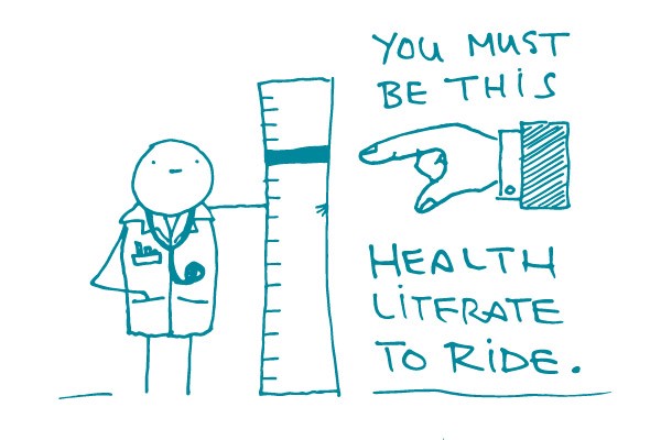
User Testing on a Budget

Illustration of "Pilot Test" flyers being thrown from an airplane.

When budgets get tight, user testing often ends up on the chopping block. But there’s a way to do it on the cheap when more formal testing isn’t an option. Take it to the people — do a pilot test!

Pilot testing allows you to develop or improve your health materials together with your priority audience. Let’s face it: All materials have problems (some more than others). These problems may not be obvious to you, but your users will always spot them. Use this to your advantage.

You can do pilot testing with just about anyone. Ideally, you have 3 to 8 people from your priority audience test your materials. If that’s not possible, settle for the “1 is better than none” approach. The feedback of a single coworker not involved with your project is better than nothing. Parents and grandparents are often good to test with, too — plus it counts as a phone call!

Although your results may not be generalizable in the academic sense, even a test or 2 will catch usability issues that you likely wouldn’t have caught on your own.

We like to pilot test anywhere people wait: clinic waiting rooms, community centers, libraries, adult education centers, campus student centers. And recruiting is pretty easy as long as you’re prepared to hear about 10 “no thanks, I’m in a rush” responses for every 1 person who stops to talk with you.

The questions you ask will depend on what you’re testing, but here’s our greatest hits collection:

  • What catches your eye?
  • Who do you think this material is designed for?
  • Tell me in your own words what this is trying to say.
  • What is it telling you to do?
  • What do you think of the pictures? Do these people look like anyone you know?
  • Do you think you could do what this material is suggesting?
  • Do you think people will take any of these steps after reading the material?

And, we’d like to give a friendly reminder to always get the needed organizational approval for testing (e.g., Institutional Review Board (IRB) clearance). Small pilot tests are often exempt, but it’s best to check before you start.

The bottom line: Pilot testing can be an easy and inexpensive way to get feedback from your audience. Try it with your next project.

We ❤ This: CDC’s Keeping It Simple

Alt: A doodle knight in full armor asks, “Does this mean I’m protected?” A second doodle, wearing a shirt that reads, “I am PrEPared,” and holding out a bottle of PrEP responds, “That’s one way. Here’s another!”

In 2014, the Centers for Disease Control and Prevention (CDC) made a front page-worthy decision that’s still worth noting today. In response to efforts by HIV activists, CDC decided to officially update its term for sex without a condomThis link is external to communicatehealth.com. from “unprotected sex” to “condomless sex.” (We love this so much that we almost want to use all caps to tell you how much. But we won’t.)

Why did this decision thrill us here at We ❤ Health Literacy Headquarters? Because, dear readers, when people say “unprotected sex” in health information, what they’re actually talking about is sex without a condom.

“Unprotected” is a vague — and potentially misleading — term where sex is concerned. Consider these scenarios:

  • A woman who’s on the pill has sex with a man, and they don’t use a condom. She may be protected from pregnancy, but she could still get an STD. Did she have protected sex or unprotected sex?
  • A man has sex with his monogamous partner who’s HIV-positive. They don’t use a condom, but his partner has an undetectable level of HIV in his blood — and they’re both taking preventive medicines. Would it really be accurate to say that’s unprotected sex?

Interesting questions, right? And maybe even a little loaded since the word “unprotected” can convey a bit of judgment or blame — if you’re doing something “unprotected,” the implication is you’re being careless.

So CDC has sent the vague “unprotected sex” packing, replacing it with exactly what they mean: “condomless sex.” Although we prefer the phrase “sex without a condom,” this change is a huge improvement — and will hopefully be adopted by every sex ed teacher in the land.

This is a prime example of health literacy in action — and why it matters.

The bottom line: “Condomless sex” is more specific than “unprotected sex,” and it takes away the blame.

Tweet about it: This week from @CommunicateHlth: When you’re talking about sex without a condom, follow @CDCgov’s lead and ditch the word “unprotected”! Details: https://bit.ly/2G3wzLQThis link is external to communicatehealth.com.

Home Sweet Homepage

alt: A happy, simple homepage with a check mark under it smiles and whistles next to a dazed, overcomplicated homepage with an X under it.

It’s a fact: more and more people are seeking health information online. This means that websites need to be — and look — easy to use. And nowhere on your site is this more important than the homepage.

You can’t judge a book by its cover, but you can judge a website by its homepage.

The homepage is often your audience’s introduction to both your brand and your content. So it needs to make a good first impression, and fast. Research showsThis link is external to communicatehealth.com. that users decide within just 10 seconds of landing on a webpage whether to stay there or go elsewhere.

How can you make your homepage compelling and user friendly? Here are some tips:

  • Keep it clean. Brief text and a simple color palette help you create a clutter-free page. In other words, white space is your friend.
  • Make your purpose clear. Use text and graphics to clearly state the purpose of your website right there on the homepage.
  • Provide a simple navigation. This will enable users to quickly scan and understand the different sections of your website.
  • Implement responsive design. Chances are users will access your website from all kinds of devices. Make sure people can easily view it on a computer, phone, tablet, plane, train, or automobile.

But don’t just take our word for it. Test your homepage with your audience and see what they think.

The bottom line: When designing your website’s homepage, keep it simple. This will set the tone for your brand and content.

Tweet about it: Less is more! Find out why @CommunicateHlth recommends keeping #HealthLit homepages clean and simple: https://bit.ly/2MQ3MgVThis link is external to communicatehealth.com.

Let’s Think About Empty Space

Illustration of person with an empty think bubble above their head.
alt: A solitary doodle stands looking thoughtfully upward. An empty thought cloud above their head is labeled “Empty Space”.

In Episode 3 of our space series, we want you to think about empty space. And no, this isn’t philosophy class or your latest meditation — it’s an important part of communicating health information. When you’re developing health content, think about the space it will occupy ahead of time.

It’s like furniture shopping — you need to know the size of your apartment before you purchase that oversized La-Z-Boy sofa set.

For example, if you’re creating a website, make the navigation labels descriptive but short. Your users want to know what’s in each section of the site — but if they’re viewing it on mobile (as many people do), you don’t want lengthy menu items taking up a lot of space.

On the other hand, if you’re writing a tri-fold brochure, we’re very sorry. Kidding! Make sure your content will fit in each panel with comfortable margins and a readable font — and room to fold the paper.

If you have too much content for your chosen medium, you have 2 choices: cut back your content or pick a new way to present it. Maybe that content you want in an app really belongs on a full website.

As we’ve discussed before, dear readers, white space is incredibly important for health content. So make sure that you’re thinking about space from the beginning.

The bottom line: Design starts with content. Think about how your text will work in its space.

Tweet about it: Think about white space as you write your content. https://bit.ly/2Marlwl via @CommunicateHlth #HealthLitThis link is external to communicatehealth.com.

Is the Health Brochure Dead?

Image of "Here lies PRINT" on a tombstone.
alt: A phone screen shows a headline that reads “OMG Print?” Below the text, a doodle stands in front of a tombstone with the words, “Here lies print?” written on it. The doodle cries and says, “Why, print?! WHHHYYYYY??”

With so much health information available online these days, you might be wondering: Does anyone still need health brochures?

We say… maybe. How you deliver content depends on your audience. If you’re rocking a Twitter feed but your audience is watching Golden Girls episodes on Betamax, you’ve got a problem.

Don’t get us wrong, dear readers — we ❤ digital content. It lets you reach more people in fun and innovative ways. In particular, mobile is becoming a great equalizer across income levels.

That said, you need to meet your audiences where they’re at. Like it or not, they may be at the doctor’s office staring at a rack of brochures — or they may be at home, without access to the computer they use at their local library.

And sometimes, people want both. For example, when we’re doing usability testing, we often hear testers say things like, “This webpage is great. I would print it out and show it to my mom.”

So keep on with digital and mobile. Find new and creative ways to get your messages out there. But always research your audience, including how they want to access and share your content.

The bottom line: Go bold with digital and mobile — but do your homework to be sure you know how and where your audiences get their health information.

Tweet about it: Is the health brochure dead in the digital age? Not yet. bit.ly/2MRCLFj via @CommunicateHlth #HealthLitThis link is external to communicatehealth.com.

I Think I Can, I Think I Can: A Tribute to Self-Efficacy

A doodle marches up to bat in a game of cricket, and the catcher and umpire jump back in surprise. The batter holds out their hand and confidently says to the umpire, “No worries, big guy — I’ve got this.”

Picture this: you’re in the park and you come across some kids playing a sport you’ve never played before — let’s say cricket. They invite you to take a swing. Do you think, “there’s no way I can do this” or “I’ve totally got this”? If you said the latter, then you have high self-efficacy in this situation. (Whether or not you actually hit the ball, dear readers, is a different story.)

Self-efficacy is a person’s belief that they have the ability to succeed in a specific situation. Dr. Albert Bandura, the psychologist who first wrote about self-efficacy, theorized that people with high self-efficacy see a difficult task as one they need to work at — while those with lower self-efficacy might shy away from it altogether.

When it comes to health, people often avoid things they think are difficult — like getting more active. So what’s a health communicator to do?

  • Encourage readers by breaking behaviors into small steps. “Getting in shape” may sound too vague or overwhelming. But a simple, concrete action step — like taking the stairs instead of the elevator — sounds doable.
  • Offer suggestions for overcoming obstacles. For example, lack of time is a common barrier to physical activity. So you could encourage folks to multitask with active chores, or remind them that even 5 minutes of activity has health benefits.
  • Make your content clear and easy to understand. Complicated language can make healthy behaviors seem complicated, too. So rather than telling people to “decrease sustained periods of sedentary behavior and increase intermittent bouts of aerobic exercise” (eep!), lead with clear and simple messages like “move more, sit less.”

The next time you’re creating health content, think to yourself: What can I do to help my audience feel more confident that they can change their behavior? Then do that!

The bottom line: Increase your readers’ self-efficacy by focusing on small steps, addressing barriers, and writing in plain language.

Tweet about it: I think I can, I think I can! @CommunicateHlth talks self-efficacy in #HealthLit content: https://bit.ly/3xP2u8L #HealthCommThis link is external to communicatehealth.com.

Let’s Put a Premium on Plain Language

alt: A doodle holds a piece of paper up in the air and says, “I don’t know what a ‘premium’ is, but it sounds fancy.” Another doodle frowns at their own paper and says, “Weird…I just have this lousy old payment.”

Update (May 2018): Since we wrote this post more than 4 years ago, HealthCare.govThis link is external to communicatehealth.com. has updated its definition of “premium” from “the amount that must be paid for your health insurance or plan” to the way more conversational “amount you pay for your health insurance every month” (pause for applause).

Today, we tackle the ever-present health insurance “premium” — or, as it’s sometimes defined: “The amount that must be paid for your health insurance or plan.”

Hang on. Wouldn’t the “amount that must be paid” be … a payment? Why not just say “monthly payment” instead? To most folks, that’s what “premium” usually means in the context of health care.

One of the health literacy principles we live (and write) by is to always use the simplest words available to communicate information. If a complicated word is essential, by all means, use it — being sure, of course, to define or explain it. But if a term isn’t essential, just don’t use it.

Let’s put “premium” to the test. Is there any difference in meaning between the following sentences?

  • Your premium is due on the first of the month.
  • Your monthly payment is due on the first of the month.

Right. Our vote here: “premium” isn’t essential.

If you really think your readers needs to learn the term “premium,” we recommend saying “monthly payment (also called a premium).”

The bottom line: Terms like “deductible” and “co-payment” are essential when talking about health insurance — but “premium” isn’t. Try “monthly payment” instead.

Tweet about it: If you mean payment, say payment (not premium): http://bit.ly/1aaPyOI #HealthLit via @CommunicateHlthThis link is external to communicatehealth.com.

In the Eye of the Beholder: Sign vs. Symptom

alt: The word “sign” on a glowing sign points at a doodle’s head, which has a cat sitting on it. The word “symptom” in a thought bubble floats above a second doodle who’s experiencing pain in their body.

This week we’re addressing the difference between a couple terms that are easy to confuse when writing health information. “Symptom” and “sign” are often used interchangeably when talking about the health effects of conditions or diseases — but guess what? They aren’t actually the same at all.

Ever heard the saying, “Beauty is in the eye of the beholder”? Well, our favorite way to remember the difference between these similar words is that it’s in (you guessed it!) the eye of the beholder. In other words, whether something is a sign or a symptom depends on who’s able to notice it.

Technically speaking, a symptom is something that only the person experiencing it can observe. A sign is something that other people can observe, too. So instead of thinking about the health effect itself, think about the person who notices it. Symptoms are what a patient feels (like a headache) and signs are what a doctor can see or measure (like high blood pressure).

Now that you know the difference, dear readers, here’s a curve ball. For some audiences, “symptom” is an unfamiliar word. And since both signs and symptoms fall into the category of “things that happen when you’re sick,” it may be appropriate to use “sign” regardless of who notices it.

The bottom line: A symptom is something only you know is there. A sign is something other people can notice.

Tweet about it: Ever wonder about the difference between signs and symptoms? http://bit.ly/JKUcGN #HealthLit via @CommunicateHlthThis link is external to communicatehealth.com.

Into the Great White Open

In Episode 1 of our space series, we discussed the importance of using space to improve readability by “chunking” text. Now, in Episode 2, we’re discussing the wonders of including white space in the visual design of your content.

Let’s start with a non-writing example. Think of your closet before and after you clean it. Before, it’s a jumbled, anxiety-provoking mess. After, you can easily find what you need, without getting distracted by things like jeans you haven’t worn since high school.

Content works the same way. If it’s crowded and cluttered, your readers may be turned off. If it’s clean and orderly, your readers are more likely to see it as clear and understandable.

Of course, white space doesn’t always need to be white. The phrase “white space” refers to the background and in-between areas — the space without text or images. To increase white space, add extra space (or padding) around images, call-out boxes, and sections of text.

Adding white space can go a long way toward making your health communication materials more appealing. But don’t just take our word for it, dear readers! Ask yourself: Which of these examples* would you be more likely to pick up and read?

a before and after view of a fact sheet about lead poisoning. the revision is much easier to read.

*Courtesy of the Massachusetts Department of Public Health

The bottom line: Make your content more appealing and easier to read by adding white space.

Tweet about it: Why add white space to your next #HealthLit material? It’ll be more attractive and easier to read. http://bit.ly/2GVq2hP via @CommunicateHlthThis link is external to communicatehealth.com.

Reduce sodium (salt). Increase plain language!

Picture of a salt shaker with the symbol for Sodium (Na) written on it.

It’s that merry time of year when celebrations often involve eating. A lot. And how about that gravy — was it sodium-rich enough for you? Or did you practice your healthy principles and have a low-salt holiday meal?

Sodium is the actual mineral that causes high blood pressure if we eat too much of it. Salt is the most common source of sodium and the word most people use when talking about eating healthy. As veteran health literacy advocate Dr. Rima Rudd of the Harvard School of Public HealthThis link is external to communicatehealth.com. is famous for saying, “You don’t sit at the family table and say, ‘Pass the sodium, please.’ ”

When writing for health behavior change, it’s important to write clearly and use familiar words — while also educating readers about key terms they need to know. Whether it’s reading a Nutrition Facts label or talking to a nurse about blood pressure, sodium is a word people are likely to come across.

So how do you sprinkle some salt into your sodium? Follow one of our favorite (and simplest!) principles of writing for health literacy: Use the medical/scientific/technical term and then provide the plain language equivalent. Here’s an example:

9 out of 10 Americans eat more sodium (salt) than they need. Too much sodium increases your risk for health problems like high blood pressure.

The bottom line: Don’t shy away from the word “sodium.” Just be sure people know you’re talking about salt.