Everybody has that one friend whose home is always meticulously clean and organized. They’re so OCD, right? Actually, they’re probably not. They’re just, well, organized! And though flippant use of mental health terms like “OCD” might seem harmless and even funny, it’s not.
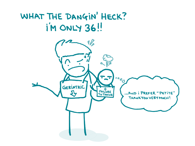
For one thing, it trivializes mental illness. Say you describe someone who changes their mind a lot as “bipolar.” Kinda makes bipolar disorder sound like just an annoyance, when it’s really a serious illness. See what we’re getting at?
Casual use of mental health terms can also perpetuate stigma. And research has shown that the desire to avoid stigma causes people with mental health conditions to avoid getting treatment. As health communicators, it’s our job to think about how our language, even in casual conversation, can shape people’s perceptions of health — or worse, contribute to stigma.
So if you’re ever tempted to use a mental health term to describe something that’s not actually a mental health condition, pick more accurate words. And if you hear someone else doing it and the situation is right, consider starting a conversation about why it’s not so great.
On a related note, when you need to refer to someone who actually has a mental health condition, people-first language is a good rule of thumb. But, as always, see what your audience prefers.
The bottom line: Watch out for cheeky use of mental health terms — even casual conversations can contribute to stigma.
Copy/paste to share on social (and tag us!): Be on the lookout for flippant use of #MentalHealth terms, says the CommunicateHealth team: https://bit.ly/4bPf6kh #HealthComm #HealthLiteracy