If you’ve done any spring cleaning lately, chances are you got some inspiration from tidying expert Marie Kondo’s KonMari method. Kondo encourages people to jettison objects that don’t “spark joy” and embrace a simpler, tidier lifestyle. This week, we’re applying Kondo’s rules to another space that may be in need of some decluttering: (y)our beloved health websites.
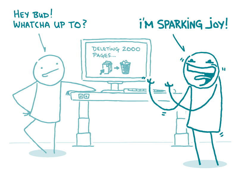
That’s right, dear readers, it’s time to sweep out the cobwebs and take out the trash before your website devolves into a hoarder’s paradise. Effective content maintenance doesn’t just mean updating and adding pages — it means retiring content that’s outlived its usefulness.
Here’s our spin on Kondo’s 6 basic rules of tidying, web content edition:
1. Commit yourself to tidying up your web content. Don’t let maintenance slide when shiny new projects come along. Implement a regular content maintenance schedule and stick to it.
2. Imagine your ideal website. When deciding whether to keep or kill content, it’s important to have a guiding vision in mind. Make sure you’re working toward well-defined goals for your site, and not just retiring pages willy-nilly.
3. Finish discarding problem content first. We’ve all seen it: the site that invests in flashy new homepage content every week, but clearly hasn’t done a full content inventory since the early 2000s. Remember, users could end up anywhere on your site — so prioritize weeding out content you don’t want them to see.
4. Assess content by category, not just by location. Kondo says to tidy up category by category, not room by room. And looking at content by type rather than by location on your site can help identify miscategorizations, duplications, and content areas that are turning into silos.
5. Follow the right order in your content process. It can be tempting to jump right in and start tossing troublesome pages down the trash chute of web history — but skipping steps can lead to wasted effort. Make sure you have buy-in from all your stakeholders before you start making updates.
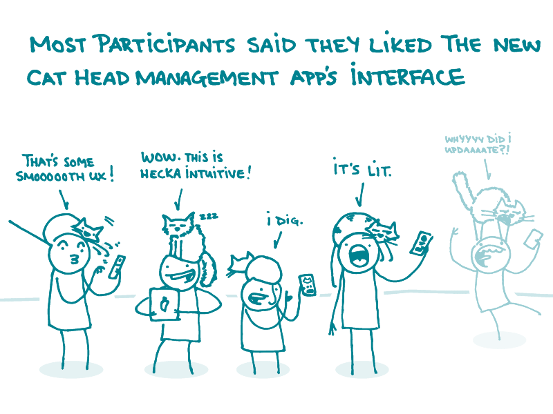
6. Ask your users if the content sparks joy. You may squeal with happiness over your content, but does it send your users into similar fits of ecstasy? Without user research, you can’t know for sure. Investing in user research will help you make informed decisions about your content and ensure that it sparks joy for the end users — not just for the content creators.
The bottom line: Tidying up your website means figuring out what sparks joy for your users — and letting go of content that sparks… less joyful feelings.