Alt: Below the words “10 years,” a doodle party for CommunicateHealth’s birthday is in full swing. The CommunicateHealth principals are there, celebrating with a large group of doodle characters.
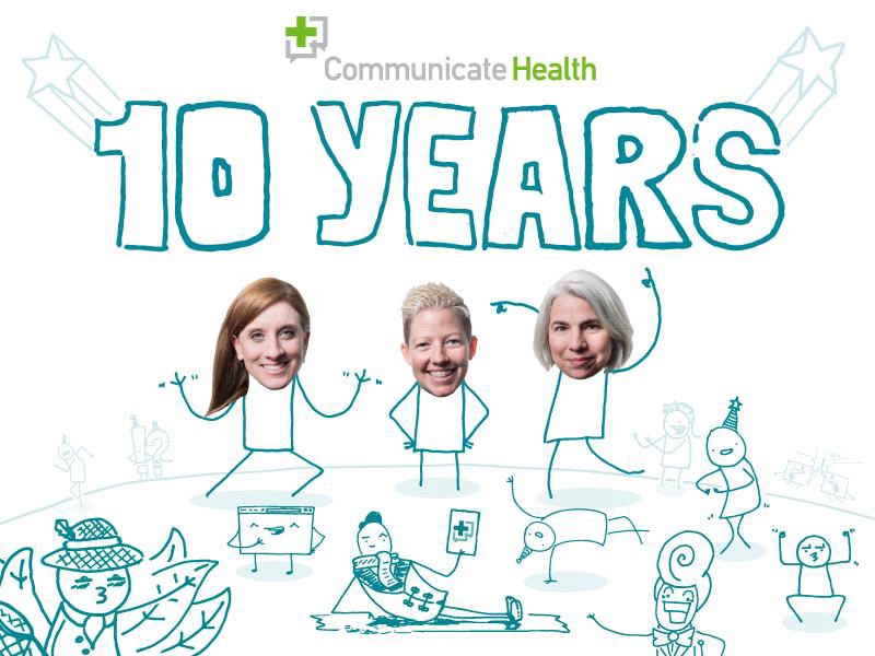
Put on your party hats and grab some cake, dear readers — it’s CommunicateHealth’s 10th birthday! We’ve officially been in the business of health literacy and clear communication for a full decade, and we couldn’t be more excited.
You know we love a good statistic here at We ❤ Health Literacy Headquarters, so here’s an interesting one. According to the Bureau of Labor Statistics, only 3 in 10 businesses make it to their 10th birthday. We’re so proud to be one of them, and we can’t wait to see what the next decade brings. Of course, we’d be nothing without our fans and supporters — that’s you! Your devotion to our shared cause truly inspires us every day.
We ❤ Health Literacy is our very favorite way to keep in touch with plain language enthusiasts like you — so if you want to hear our thoughts on a certain topic, just let us know! It’s all we want for our birthday. Well, and for you to encourage your fellow health literacy geeks to sign up. Oh, and… just kidding. We wouldn’t want to get greedy.
The bottom line: On our 10th birthday, we send huge thanks to our supporters — we couldn’t champion health literacy without you.
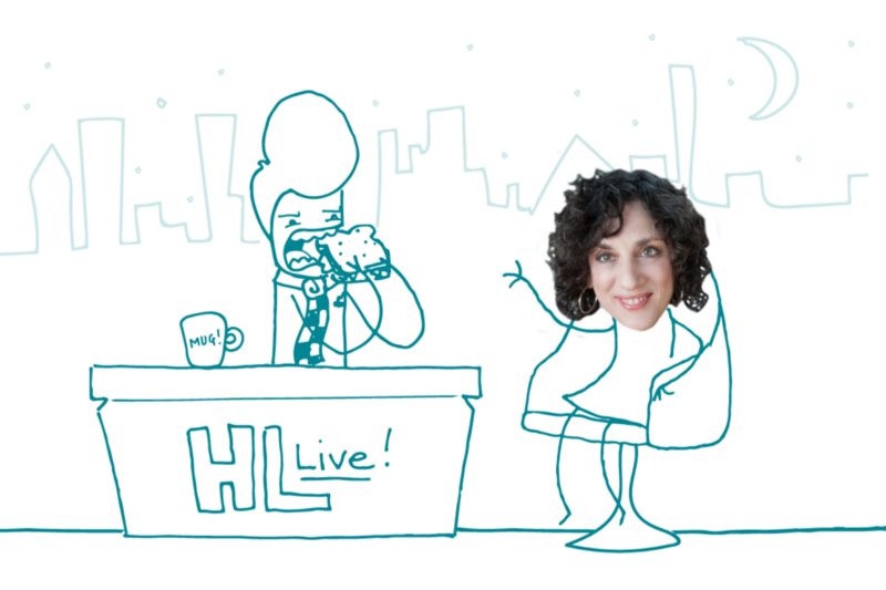
Alt: Doug Doodleman, eating a sandwich, sits behind a talk show host desk that says “HL Live!” Leslie O’Flahavan is in the hot seat, waving.
We’re back with a new installment of “Health Lit Live,” where our illustrated host Doug Doodleman interviews movers and shakers on the health literacy scene. This week, Doug chats with Leslie O’Flahavan about her “bite, snack, meal” approach to writing for the web. Leslie is a writer, writing teacher, plain language advocate, and owner of E-WRITE.
Doug: Hello, readers! Welcome back to me, and welcome to my guest, whose name I have here somewhere… Aha! Why, it’s the creator of a tasty little concept we in the biz call “bite, snack, meal” — a certain Leslie O’Flavor-han.
O’Flahavan: Hello, Doug. Lovely to be here.
Doug: Now, Leslie, these snacks and these bites. Tell me, just what kind of celebrity gloop cleanse are you selling? Will it purge my toxins? Tidy up my colon?
O’Flahavan: Actually, Doug, “bite, snack, meal” is a metaphor I developed in 1996 to explain an approach to web writing. It describes a user-centered thinking process in which we acknowledge that different readers are interested in different amounts of information. So we need to do them the service of offering them content in various sizes.
Doug: No diet tips, then?
O’Flahavan: Sorry, but no. The metaphor of content hunger is saying, “I understand you, readers. You’re not all the same, and each of you is not the same every time you engage with the content. So I’m going to alter the way I write my content to meet your needs in all their variety.”
Doug: Ah, I see! Tricky, tricky. So you start off with your tease-y bites, when all the while you’re laying a delicious trap — whetting the appetite, if you will. And before they know it, readers have gobbled up the bite, the snack, and the whole darn meal. Ingenious!
O’Flahavan: That would be cunning of me, Doug. But the point here isn’t to trick the reader. You want to let readers choose. If they’re full after reading the snack and they skip the meal, it’s all good. Or maybe they read the bite and the snack one day, and come back for the meal another day.
Doug: I don’t want to brag, Leslie, but I’ve been told my meals are phenomenal. Life altering. Not to be missed. How do I get my readers to linger at the table over digestifs and a cheese course? Do I torture them with tiny amuse-bouches of content? Save the real conversation for dessert?
O’Flahavan: Withholding the main message is never the right approach. Take a common type of content like Terms and Conditions — that’s a case where the content provider withholds the content until you read and agree to something. And we click “accept” without even reading said terms and conditions! Withholding content is a mean thing to do to your reader — and it doesn’t even work.
Doug: So, let me clarify: You expect me to cook up a beautiful 3-course content menu, and then let the reader gobble up the apps and ditch the entrée? Where’s your sense of leisurely, sophisticated dining? Haven’t you been to France?
O’Flahavan: I can see you’re a doodle of refined sensibilities, Doug. But the idea that we can make people read the whole thing if they don’t want to is just wrong. We can’t. What we can do is engage them so that they read as much as they need. So we entice — with the bite and the snack.
Doug: Saucy! I like it. But seems to me you could say all that without the fancy metaphors. Why’d you start using all the food words? Were you very hungry?
O’Flahavan: I teach writing to people from many different fields. Engineers, actuaries, communication professionals — and they all approach writing differently. When you’ve got them all in one room trying to learn, the metaphor helps everyone connect. And “bite, snack, meal” sticks. People understand it right away, it’s memorable, and it provokes behavior change in writers. And, sure, I was probably a little hungry.
Doug: Engineers? Actuaries? What’s the point of teaching numbers people how to write?
O’Flahavan: People in every field deserve support when their work calls upon them to grow as writers. Writing for online readers can be hard!
Doug: I don’t know, Leslie… web writing seems pretty simple to me. A little clickbait here, a couple hyperlinks there…
O’Flahavan: Well, when I started teaching in the ’90s, the web was a lot of “Click here” and then you’d get a 99-page PDF. I thought, we need to explain that there’s a better way.
Doug: The ’90s, you say? What with kids these days and all the hip new websites, aren’t these snackeroos a little past the sell-by date? [Exaggerated wink.]
O’Flahavan: Actually, “bite, snack, meal” is very relevant today because of the changes around responsive design. Sites present content in tiles that can shrink down to mobile sizing — and the bite and snack are great content units for small screens.
Doug: Personally, when I surf the World Wide Web on my cellular phone, I’m on the hunt for one thing: cat videos. But only when they walk upright like people. How does “bite, snack, meal” apply to cool stuff like cat memes?
O’Flahavan: Well, since the snack is likely to be visual content now, the bite has to carry the weight — er, the message. We can’t have a bite that says “Webinar recording 2019” (or just, you know, “Cats”) and make people watch a 45-minute video to figure out the main message. The “bite, snack, meal” concept stands the test of time because people’s needs haven’t changed, even though we’re presenting content differently.
Doug: What was that? Sorry. I was watching a video montage of cats wearing pants. But thanks for talking with us, Leslie! And readers, head over to E-WRITE and check out the article that started it all: The Bite, The Snack, And The Meal.
The bottom line: Use the “bite, snack, meal” approach to help readers find the serving size of information that’s right for them.
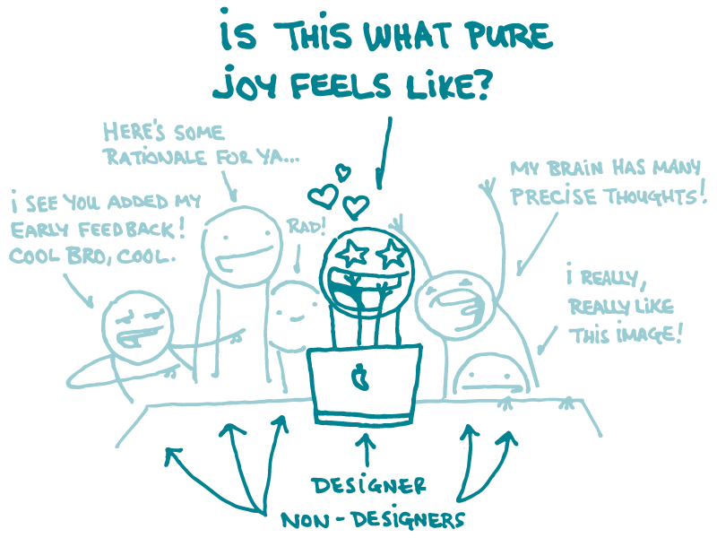
Alt: A designer doodle gazes with delight at a computer screen, and wonders aloud, “Is this what pure joy feels like?” A small crowd of non-designer doodles in the background are giving feedback on the design: “Rad!” says one. “I really, really like this image!” says another.
We’ve talked from time to time about how important good design is for creating effective health materials. And, as it turns out, giving and receiving feedback is a crucial part of the design process. But discussing a design can be tricky if you’re not a designer yourself.
That’s why this week, we’re bringing you tips for giving helpful and effective feedback to your more visually inclined colleagues.
Give feedback early and often. By weighing in early in the design process, you help the designer know they’re heading in the right direction. In other words, don’t wait until most of the work is done to announce that you want to prettify your health content with icons instead of photographs.
Keep it positive. Designers spend a lot of valuable time thinking through tons of different options before sharing the first draft of a new design. Keep that in mind and lead with positive comments — this tells the designer you understand how much time and effort goes into creating an original design.
Identify the why. Resist the urge to simply state a solution (like, “Make the title font larger”). Designers also need to hear why you think a change is important. And when you explain your rationale, you give the designer an opportunity to apply your feedback to other aspects of the design, too.
Get specific. It turns out that designers aren’t so fond of quips like “It doesn’t look right,” or “I’m not feeling these colors.” Before you make comments like those, think about which specific things aren’t working — for example, would you like the colors to look more vibrant or more subdued? This type of feedback will help the designer figure out where to go next.
Ask questions. It’s okay if you don’t have a solution in mind — that’s why you’re working with a designer! Asking thoughtful questions can help create space for a new approach if it’s needed.
In the end, if language fails and you just can’t get to the root of what you want, try sharing visual examples that show what you mean. (You can even take a crack at sketching something yourself!) Or get a second opinion from a colleague. Remember, effective feedback pushes work forward. It’s always better for the project — and the project team — to hear and consider different perspectives.
The bottom line:Keeping design feedback positive and specific means a happier team and a better finished product.
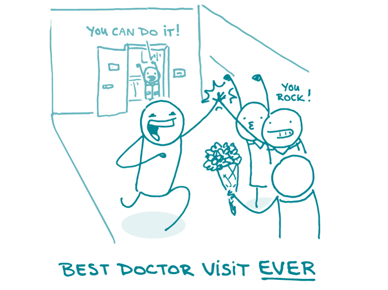
Alt: A small crowd of doodle nurses cheer on their doodle patient. One shouts, “You rock!” In the background, a doctor doodle is yelling, “You can do it!”
In one study of doctor-patient interactions, half the participants could remember a time when a visit to the doctor made them feel ashamed. Obviously, shame and guilt are feelings that we generally try to avoid. So if your experience with your doctor makes you feel ashamed about a health problem or a not-so-healthy habit you’ve picked up, how motivated will you be to keep going to that doctor for help?
Whether a condition or risk factor is minor or life-threatening, anything involving our bodies is inherently personal. And even things that may be easy for some people to do (John really didn’t have a problem ditching his soda habit for seltzer!) can be really difficult for others (Moira got so stressed trying to give up soda that she doubled her intake!).
That’s why it’s best to motivate your readers to make a positive change by showing them that it’s possible, not by rehashing ad nauseam all the reasons why what they’re doing is bad. (Spoiler alert, lots of people already know.)
We’ve shared advice on making your health messages positive and writing about sensitive topics before. Here are some of our favorite tips for positive and encouraging health writing:
Acknowledge your readers’ emotions. Fear and shame can keep people from making healthy choices, but you can help your readers by acknowledging how they feel.
Consider the differences between these 2 statements:
“If you don’t start getting more physical activity, you’re going to keep having [insert various health problems here].”
“Lots of people have trouble finding time to get physical activity. Try taking a short walk every day after dinner — even 5 minutes of activity can boost your mood and energy!”
Enough said, right?
The bottom line: Positivity and empowerment are more motivating than shame and guilt when it comes to encouraging healthy change.
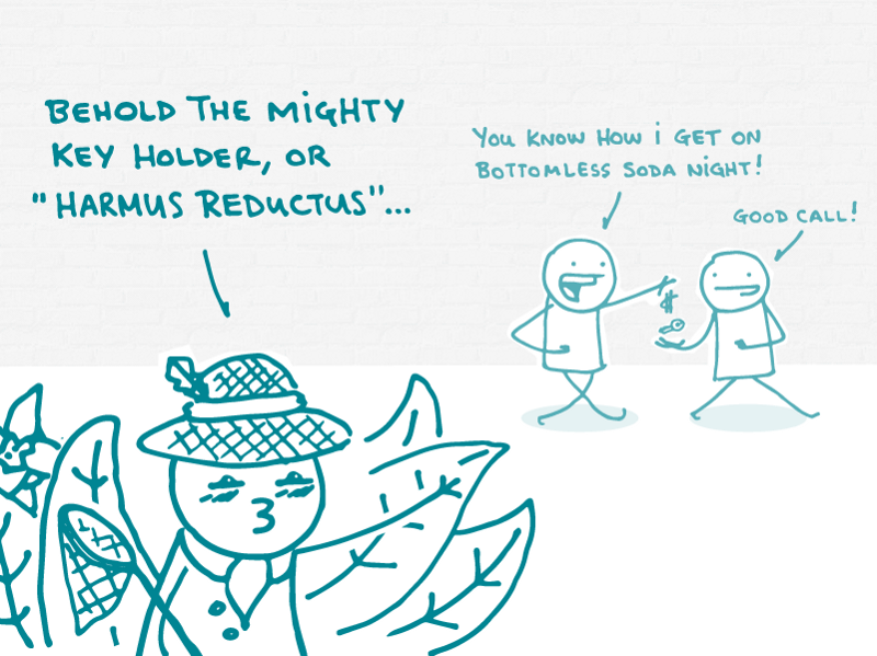
Alt: A doodle passes their keys to another doodle saying, “You know how I get on bottomless soda night!” A safari doodle watches, exclaiming, “Behold the mighty key holder, or ‘Harmus Reductus’…”
We’ve written a lot in the past about behavior change theories, like Planned Behavior and the Stages of Change. We’ve talked about how behaviors are shaped by the social and physical environments we’re exposed to. And we know that no matter how well we communicate the risks, people will still sometimes do things that are harmful.
That’s why we’re talking about harm reduction this week. It’s a strategy for making risky behaviors a bit less risky — and it’s a great tool for health literacy advocates like you, dear readers.
The idea is that people are going to make their own choices regardless of what lawmakers, health professionals, or anyone else tells them to do. So while we try to help people stop doing dangerous things, our work as health communicators doesn’t always end there. Sometimes, it also makes sense to help people lower their risk of negative health consequences when they don’t plan to — or aren’t able to — stop a risky behavior altogether.
The harm reduction approach was originally developed as a response to substance abuse and its public health implications: think needle exchange programs and supervised injection sites that help prevent infections and overdoses. But harm reduction principles can apply to other things, too — like risky sexual behaviors.
What could it look like to use harm reduction strategies in health communication materials, you ask? Let’s say you’re writing a webpage for people trying to manage alcohol addiction. Of course you will:
Include encouraging words about how stopping is possible
Note the health and safety benefits of not drinking
Offer resources for how to get help
But what about also including content to reduce harm for people who are still drinking too much? You could say:
“It can be hard to stop drinking completely. If you do drink, take steps to stay safe — for example, give your car keys to a friend before you start drinking.”
A harm reduction perspective acknowledges the gray area around risky behaviors — it’s not all or nothing. Even if people are doing something that public health professionals unequivocally agree is dangerous, it’s still possible for them to do it in a less dangerous way. Harm reduction can help us meet people where they are with the information and tools they need.
And doesn’t that sound like just the sort of thing we ❤?
The bottom line: Harm reduction means giving people tools to stay safer when they do things that aren’t 100% safe.
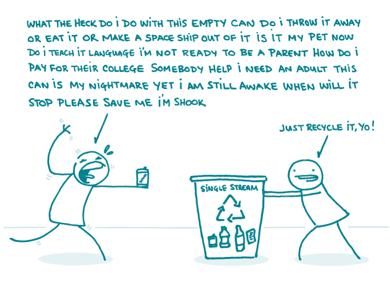
Alt: A doodle holding an empty seltzer can laments, “What the heck do I do with this empty can do I throw it away or eat it or make a space ship out of it is it my pet now do I teach it language I’m not ready to be a parent how do I pay for their college somebody help I need an adult this can is my nightmare yet I am still awake when will it stop please save me I’m shook.” “Just recycle it, yo!” says a second doodle, gesturing towards a recycling bin, labeled “Single Stream.”
Have you ever considered how many choices you make each day? From the moment you wake up, you’re making choices large and small (starting, perhaps, with whether or not to snooze your alarm!).
As health communicators, our job is to make it easier for people to make healthy choices. And the way we offer those choices can influence the decisions people make — this, dear readers, is called choice architecture.
Let’s look at an example. Jane might be more likely to recycle her empty can of seltzer instead of throwing it out if there’s a recycling bin next to the trash can. She might be even more likely to recycle if the bin has a label with examples of recyclable items! The choice Jane is making is how to dispose of her can. The choice architecture is everything from the kinds of receptacles available to where they’re located — and even how often they’re emptied.
Smart choice architecture can have a positive impact on health. Consider organ donation: studies have shown that countries that automatically opt people in to their organ donation program have much higher donation rates than those that require people to take the extra step of signing up on their own.
One way that health communicators can use the concept of choice architecture is by considering what action we want our audiences to take and creating tools or resources that make it easier for them to do so. For example, if you want someone to talk to their doctor about a health screening, give them a printable or mobile-friendly list of questions to ask.
The bottom line: Use the concept of choice architecture to help audiences make healthy choices — easily!
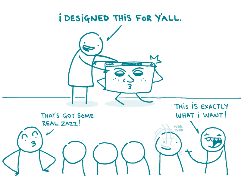
Alt: A doodle presents a shiny new website to a crowd of onlookers, saying, “I designed this for y’all!” One doodle says, “That’s got some real zazz!” Another says, “This is exactly what I want!” A third doodle nods in agreement.
In this installment of our occasional series of posts about how to build your own website, we’re talking about the almighty “look and feel.”
What’s that, you ask? Well, the “look” of a site refers to its visual design aspects — like the color palette, font choice, and image style. The “feel” refers to interactivity and functionality, like how buttons work, as well as the overall vibe of the site.
As you know, dear readers, first impressions matter — and that goes for websites, too. How your site looks and functions can cause users to stay and explore . . . or to leave right away. So when you’re planning the look and feel of your site, keep these tips in mind:
Think about your audience. Who will be visiting this site? If the site’s for kids, think about bright colors and fun animation to keep youngsters engaged. But if you’re building a website for teenagers, consider using a more sophisticated color palette with photographs or realistic illustrations. In other words, give ’em what they want.
Make it quick. You know what users really ❤? A site with a fast load time (the time it takes a browser to open a webpage). Things like image files and widgets increase load time — so sometimes, it’s best to keep it simple. And don’t forget to factor in the type of device your visitors are likely to be using.
Be consistent.Stick with the same font choice and icon style throughout — and keep the navigation consistent, too. If you’ve decided that external links should open in a new browser tab, make sure that’s true across the board.
Design for plain language.Remember, visual design is an important part of effective plain language materials. Use simple, familiar typography — and don’t be afraid of some white space.
Finally, remember it’s a process — and there’s always room for improvement. Consider doing usability testing before and after launch to make sure your website looks and works the way users expect it to.
The bottom line: To keep your website users coming back, take time to develop a look and feel that meets their expectations.
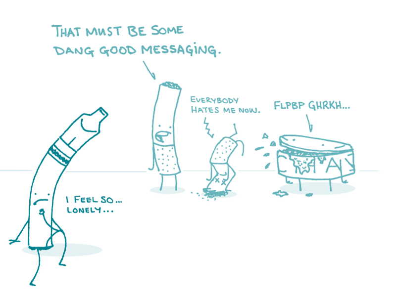
Alt: Various tobacco product doodles stand around lamenting effective tobacco use health communication. “I feel so lonely,” says the e-cigarette. “That must be some dang good messaging,” says one cigarette. “Everybody hates me now,” says another.
Get this: tobacco use is still the leading cause of preventable disease and death in the United States. Cigarette smoking causes about 1 in 5 deaths each year — and that includes deaths caused by breathing in secondhand smoke.
Tobacco use and quitting smoking can be tricky topics to cover — but it’s super important that we do it well, dear readers. Here are a few things to consider when writing plain language content about smoking and tobacco use.
Be compassionate. Quitting smoking is a journey, and that journey is different for everyone. So keep your tone empathetic and avoid sounding condescending or judgmental. Remember, we’re talking about an addiction — try to put yourself in the shoes of people who smoke and use that perspective to inspire them to quit.
Use person-first language. Rely on phrases like “people who smoke” or “people who use tobacco.” Skip terms like “smokers” or “users,” which imply that using tobacco defines who someone is.
Keep it brief. When you’re writing for people who are trying to quit smoking, keep in mind that your readers may be dealing with withdrawal symptoms like stress, anxiety, and mood swings. Since mental and physical challenges can affect people’s ability to process information (hello, health literacy!), home in on the need-to-know content that will motivate readers to meet their goals — and skip the nice-to-know information for now.
Focus on the benefits. Quitting smoking has many health benefits. Try clearer skin, a healthier heart, slowed-down lung damage, a stronger immune system, and breaking the cycle of addiction. That’s just to name a few! Emphasizing the benefits of quitting can be a helpful reminder — and an extra push — for people who want to quit smoking.
Remember friends and family. Friends and family members can play a huge role by encouraging their loved ones to quit smoking — so consider creating some content for them, too. Their support can go a long way in helping people who smoke kick the habit for good.
The bottom line: When it comes to communicating about smoking and tobacco use, meet your readers where they are.
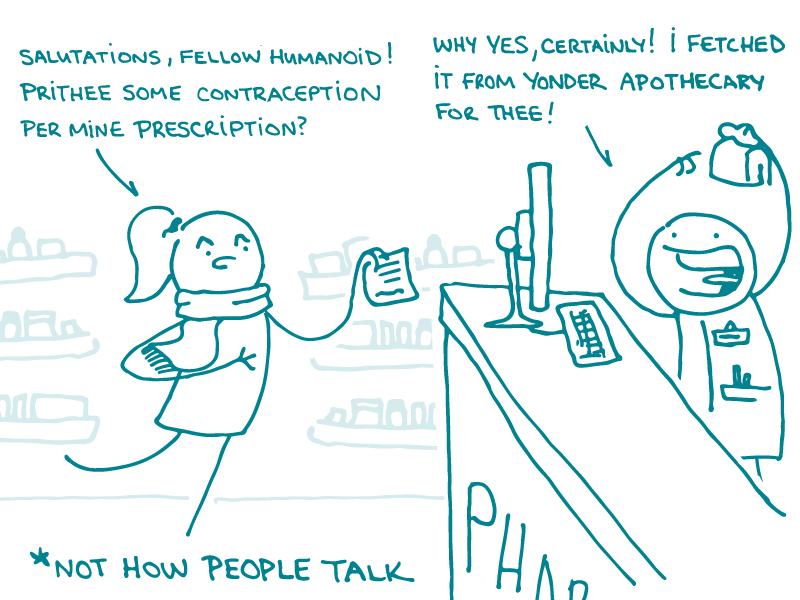
Alt: A doodle enters a pharmacy with a prescription in hand. She says to the pharmacist, “Salutations, fellow humanoid! Prithee some contraception per mine prescription?” The pharmacist responds, “Why yes, certainly! I fetched it from yonder apothecary for thee!” At the bottom of the page is an asterisk with the clarification, “Not how people talk.”
Here at We ❤ Health Literacy Headquarters, we work hard to eliminate big, scary words from health writing. So today, we’re urging you to take the word “contraception” out of your content-writing vocabulary. Why? Because there’s almost always a more conversational or descriptive term you can use.
Before you use the word “contraception,” ask yourself how often you hear people say the following things:
“I’d like a prescription for contraception.”
“I’m going to the pharmacy to pick up my contraception.”
“Oh no, I’m out of contraception!”
“I’m trying to get pregnant, so I’ve stopped taking my contraception.”
See, dear readers? Most people just don’t use the word “contraception” in everyday speech. So when you write about this topic, it’s better to use the terms that your audience would, like:
Birth control pills
IUDs
Condoms
If you’re talking about contraception, you may be promoting or describing certain methods, like the ones listed above. But if you’re talking about it in general, just say “birth control.”
In any case, be sure you know your audience, understand what they’re looking for, and use terms they’re familiar with. When your readers are comfortable with the words you’re using and can easily understand the information, they’re better able to make positive health decisions.
The bottom line: “Contraception” is a big, unwelcoming word — so use terms that are more descriptive or conversational instead.