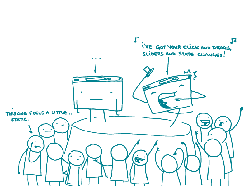
Here at We ❤ Health Literacy Headquarters, we get really excited about innovative research methods (Design the Box! Collaging! OMG see?!). So this week, we’re plugging another technique that falls a bit outside of the norm.
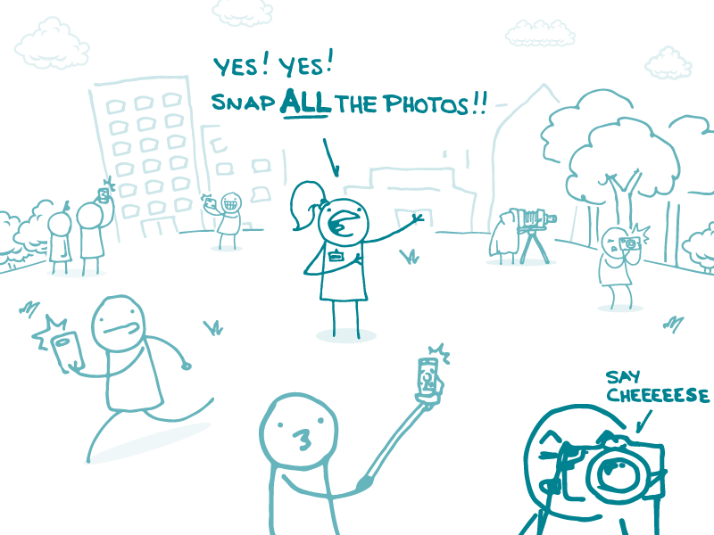
Photovoice, created by Caroline Wang and Mary Anne Burris, is a research technique that encourages members of a community to document and discuss their values, needs, and behaviors using original photographs.
The idea is simple: enough with outsiders barging in and assessing the needs of communities they don’t really understand. Instead, if you ask people to show you what’s going on for them, you’ll get better information about their everyday lives.
Let’s say people in a community are worried about air pollution and want to show policy makers how it affects their lives. Here’s an example of how you could do photovoice with them:
- Start by giving participants a brief rundown of ethical considerations around visual research
- Encourage them to spend 1 to 2 weeks taking photos of pollution’s impact on their lives
- Gather everyone together to share their photos and discuss common themes
- Display or present the photos to policy makers or other groups
- Write up the study findings based on the community’s discussions and presentations
Like other research techniques, photovoice has limitations. (After all, if a perfect method existed, we’d be using it all the time and our Testing Techniques series would be really short.)
In this case, photovoice’s greatest asset can also make it tricky to pull off. Since photos can be so personal — and, ultimately, an outsider will be writing up the research results — community members may not always feel comfortable with the approach. For example, some communities may be reluctant to take photos related to things like mental health or substance abuse.
But when it works, dear readers, the results can be pretty amazing. Getting an actual snapshot into the lives of community members we’re trying to reach? Yeah, we really ❤ that.
The bottom line: Photovoice empowers community members to show us their lives and communicate what matters to them.
Tweet about it: Use photovoice to get a snapshot into people’s everyday lives and needs: http://bit.ly/2DsuQZX #HealthLit