Here at We ❤️ Health Literacy HQ, we’ve been talking a lot about audience segmentation lately. New to the term, dear readers? Not to worry! In a nutshell, audience segmentation is a way to narrow down the audience for your health messages from a really big group — like “the general public” — to a much smaller one. (You might remember our post about writing for your audience — it’s one of our favorite things to nerd out over!)
Identifying a specific group as your audience helps you focus your messages on the things they care about. That makes them more likely to pay attention — and more likely to take your advice about a health behavior.
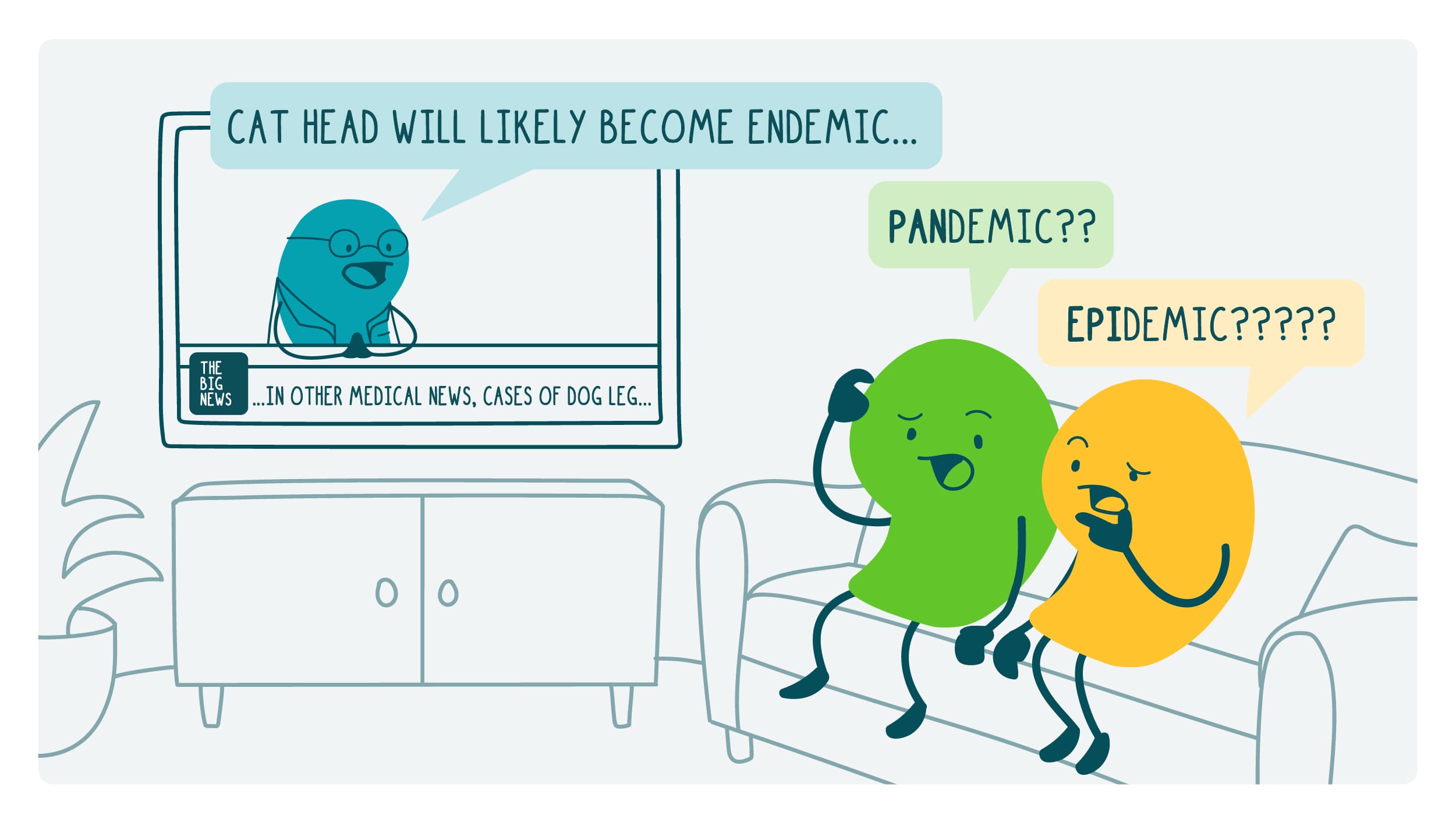
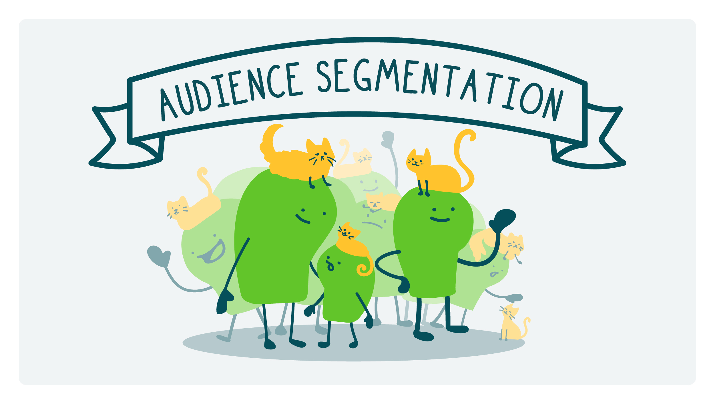
Say you’re writing a series of PSAs about how to prevent late-stage cat head. Your first step is to find out who your audience is — who are the people most at risk of late-stage cat head and what are their information needs? But audience segmentation isn’t just about making your priority audience specific. It’s also about choosing which group (or audience segment, if you will) could benefit the most from getting health information. Ask yourself: Who’s been overlooked by other communications?
You can segment your audience based on demographic factors — like age, gender, level of education, income, or where they live. One way to find that information is by looking at public health data, like from the CDC’s National Center for Health Statistics. But you also want to look at things that may be less clear-cut. For example:
- Cultural factors — people’s native or preferred language, cultural heritage, or religious beliefs
- Behavioral factors — how people get information, how they make choices about their health, and how willing they are to change their behavior
- Other factors that play a big role in people’s lives — like values, attitudes, interests, and lifestyles
Just because 2 people are roughly the same age and have a similar income, it doesn’t mean they care about the same things. And that means the way they respond (or don’t respond) to messages about their health will be different.
These things also give you clues about where to place your messages so your audience will see them. After all, in today’s digital environment, it seems like everything’s tailored to us — you know, you google “Does cat head cause runny nose?” and an ad for allergy medicine pops up in your Facebook feed.
So how do you find out what it is your audience cares about? The best way is… wait for it… to ask them! There are lots of ways to gather insights from folks — focus groups, in-depth interviews, or online surveys. And if you don’t have the budget for formative research, try reaching out to your professional or social circle to gut check your ideas and assumptions.
However you go about learning more about your priority audience, the outcome is the same. Audience segmentation helps health communicators make products that resonate with our audiences — and that’s a win for everyone.
The bottom line: Audience segmentation is a great way to narrow down who you want to reach — so you can focus on the things they care about.